← All ideas
25 Jul 2021
mahdi
Open
User Interface
mahdi
Alumx
Branskugel
Dangry
Darknoodles
Draise
IIIFGIII
JayeAntony
LalaGhost
Lauloque
ManBlender
Mpc46
ParallelMayhem
RC12
TaiSeiButsU
Vik
XanzulsCG
alexisb38
bleedgfx
blenderdumbass
costa
emerald
eon
gatis.kurzemnieks
gorro.rojo
ivek.burek
jozehicks
lacina.vojtech
lebibibioihandsomeboy.ghost
mblender
merio.designer
neko1
omarte1416
oxicid2019
pupa1
radi0n
renggli
roger.menzi.schweiz
sion
slowk1d
sti-naus
tc8
toxicbits
undecidedusername

12 Comments
This is already done in Bforartists, a fork and an installable distributable you can use already, if you want - so you have options. They keep them up to date weekly and add new ones for any new node, even for the GN system.
I love opensource.
A major issue with icons is that it will mean that every time a new node gets added (these days there's at least a couple new every week) someone has to design an icon for it.
For example, right now there is a modifier for Grease Pencil that is ready to go, except for the icon. We need an icon designer.
Edit: Just to be clear, I personally would love to have icons for more items in the UI, but it adds a lot of work and there's no one available for doing it at the moment.
Can the community get involved in the icon design?
edit: If so can I get some guidance?
Community contributions are very much welcome! The more people involved the better, as long as the design is consistent with previous icons.
Unfortunately there is very little documentation on the process. Last week I wrote a guide on how to add/edit icons wiki.blender.org/wiki/Source/Interface/Icons
But there is no guideline on style yet, so for the time being just following the style of previous icons is the best way to go.
Would like to see colored icons, the current flat icons are a bit too minimalistic in Blender considering it's a 3d software.
There is another independent build that has this. wink wink
I have been asking that for so long. The community can come foreward if they give us some guidance. Would really love to see Blender become more colorful.
i find it wrong that this doesent exist in geo nodes
Here I assume, that users need illustrations only to find an item in the menu for the first time when they do not know its name yet. Because after that they can easily find it only by name, by muscle memory and by word's shape (location of uPpeR and loWER cases, spaces, ascenders and descenders).
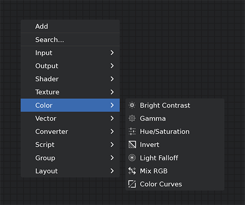
I'm not sure if tiny icons as in your illustration will do the work - the icons don't provide any help at guessing what the node is for. E.g. why a cog wheel is an icon for gamma? What does a triangle (the invert icon) mean in the context of color? Why hue/sat is illustrated with regulators, but bright/contrast is not? I understand that your example is just for illustration and actual icons can be made more descriptive. I think some nodes can't be illustrated at all: Fresnel, Bump, Displacement and Normal Map, Black body, Vector Math and so on. If you then decide to illustrate Shaders or Textures sub-menu, you'll find that the only reasonable option is to use an example of the shader or texture as an icon (which is bound to be small).
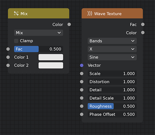
But that will be completely incomprehensible with you tiny icons. It would be much more descriptive to show big icons in the menu, organized in a grid, like an asset manager. The only problem is that it breaks the flow: some sub-menus contain small icons and text, others - grids of big icons.
imgur.com/LHnms2r
imgur.com/NFpHSYw
Instead we could have : "Oh right I see it, the one with circles around a point, Light Falloff, that's the one."
It's a recurrent issue with blender, having everything in dark menus, accessible via shortcut makes for a fast workflow when you are used it it. However when you're learning new things, little icons like this can help a lot.