
OUTLINER -> Let's make dimmed restriction toggle icons much dimmer / option or more default clarity = faster workflow
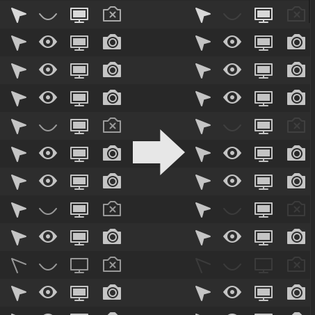
Hi guys! It's real pain.. to look for something by toggle icons in outliner. Everything ironicly "blends" in the eyes. Don't take it personally, for now UI in this section is a little bit like art for art's sake. After all, the cleanliness of the layout was supposed to make it more functional and usable, not "blendable". :)
PROPOSAL:
a) Lets make dimmed toggle icons much dimmer. MORE CLARITY = FASTER WORKFLOW
b) Or give us the option to set that value in theme settings.
c) lets make both options :)
Thanks Blender Dev,
4 Comments
The configurable dim-ness seems useful: I have one screen where contrast is fine, but another with glare from outside that really needs a much dimmer ‘disabled’. Style. Oh, and I do like the sunshine :)
* @Ivo * Thanks! I'm working on some Led IPS with good contrast but always have problem with quick finding something with low contrasty combination of icons. :P On default theme and even more so on the darker ones
Can we not post all-caps spam? My gut reaction is to downvote without even reading your proposal and I'm sure I'm not the only one.
* @testure * ok :) I'm sory, you're right! My first proposal title so thanks for pointing it out. :)