
Proposual: more clear visual appearance of modifiers stack
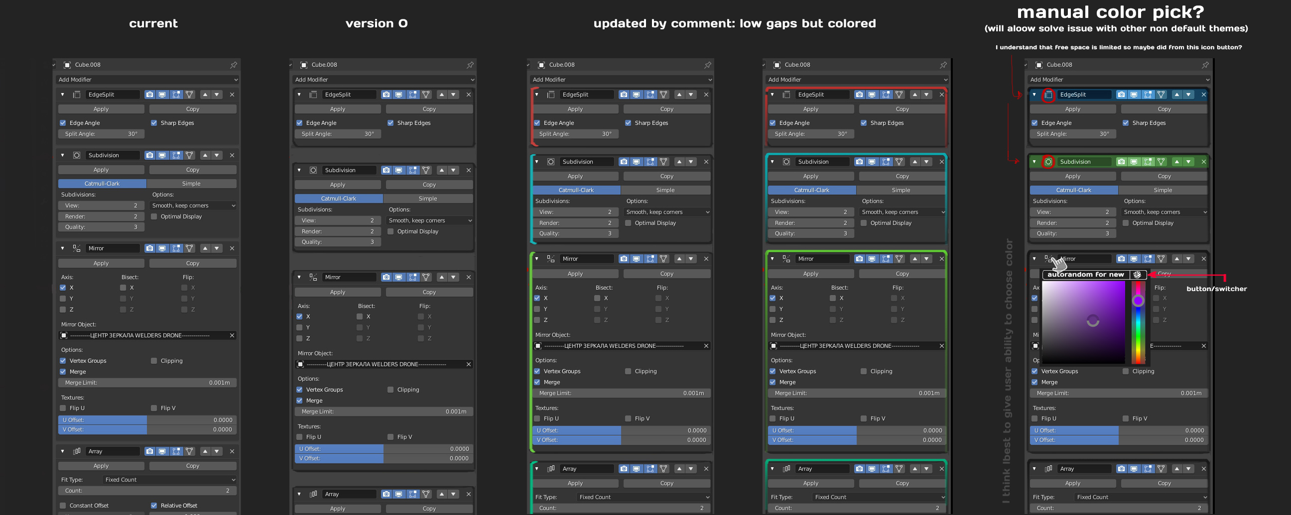
After some working time with modifiers, I found myself that it really hard to fast understand which one where is started/ended [when they all opened], when you have a fast look. So it have just some times to try figure out and find needed modifier, each time. This some sort of example in mockup, but I dunno, maybe will be better another solution.
Updated to coment Lordvigore. About colors. I think it really good idea, but will work good only with default color sheme. So to avoid this maybe will good give flexible ability (like on the last optin in exapmples) When user might choose any color manually and at once put button/switcher 'autorandom-clolor' (I'm not sure thet for random botton good place there - meybe better in 'Preferences' menu )
8 Comments
why bothering ? it will be replaced with everything node
* @dodododorian * If you sure... I didn't know that. So.. do I need to close request?
* @Ruslan * It's still a good idea, and Everything Nodes is a long way away. However, the devs are not putting any more manpower on the current modifier system, since it's gonna be replaced. EN is only being developed by one person right now, but it's showing progress.
* @dodododorian * Everything node for me is scary it will lose the Newbie and easy to understand appeal ... i am strongly AGAINST All Nodes , it should be an OPTIONAL thing ....
How about Color bracket on the left side of modifier just like RightClickSelect does. Better this way then extending modifier vertical length even more
* @lordvigore * clever idea, mockup was updated :)
check this dude on twitter > twitter.com/FinEskimo
* @Omgzdenek * that dude on twitter did a great job. I really like his approach