
Improved readability for the bottom left status line
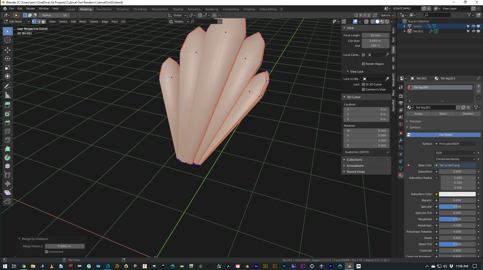
The verts/edges/faces are displayed in the bottom left status line, but I've always found them Less-Than-Useful for a number of reasons:
- They are quite small.
- They are not justified with the right edge of the modeling area, and are thus conceptually separated from their subject (layout matters), and in a visually 'busy' area of the screen.
--and something I just perceived and I think really contributes to their unreadability-- 3) They jump around. If there's an alert they jump to the left and the alert squeezes into the right end. (And then the alert fades away before I notice/can read it.)
There are addons that will put the same info in the vuport, so that's a bit of a solved problem. But if Blender.org wanted to fix this, I wouldn't complain.
Modified mockup attached. --It's a tiny thing.
4 Comments
@jeric_synergy Go to the Viewport Overlays pulldown and enable Statistics. Additionally remove them from the status bar by right clicking on it and deselecting Scene Statistics.
* @Lloyd Almeida * , yup, thanks, see above.
in recent versions of Blender you can actually relocate this information to the viewport
* @testure * , yeah, I saw that just the other day (in a video tutorial). So, it's all good! (Too bad I spent time on the mockup. 😭)