
Solving the Side/N-Panel Clutter
The N-Panel can easily get cluttered with addons and It's even more frustrating when you want to use a certain tool but can't find it.
Thanks to ChippWaltters, we have simpletabs but still, It's not really enough to completely get rif of the clutter. I came up with a simple UI Suggestion that might solve this by introducing categories/Containers where people can easily store the addons.
I did it in a hurry in photoshop but I think it'll be enough to try and explain where I'm going with this.
I'm a beginner in Python development and I'm not sure if it can be easily integrated via an addon instead of bothering the development team with something so simple.
I'll try my luck in making it the addon but it would be better if someone more exprienced could take this on as it would save the community a whole lot of trouble.
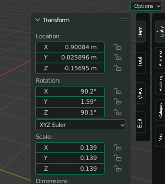
Combining my idea with the confirmed ticket.
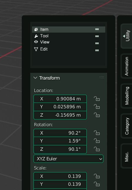
3 Comments
When 2.8 was announced and early betas showed up I was really hyped for the revworked T-/N-Panels especially considering what a cluttered thing the T-Panel used to be until 2.79 but really the way it is now it's really not ideal either.
The Tools in the T-Panel are fine but they are just a few and they can't really be customized or changed to individual shortcuts. They seem to have become the equivalent of the standard tools in Photoshop-like image editors. Bread and butter tools many artists will swap for hotkeys as soon as they are familiar with the program.
The N-Panel on the other hand has become the place to hold the rest and since the design philosophy is to separate those two areas it has prety much become the only place any more. And it sucks when you have to switch between Addon-/Plugin-Panels and other important panels like the transforms. It's really doing much more harm than good here.
I know it goes angains the philosophy of what Blender UI set out to do but maybe at this point at least for the T- and N-Panels we should ackonowledge that it hasn't worked out the way it was supposed to.
The uncluttering for this kind of thing needs a good solution I don't currently have but really, the way it's now is so restrictive that it makes it sometimes much much too longwinded to be productive.
There is already a ticket about this topic:
developer.blender.org/T76023
They just haven't started implementing it. And it's also unkown when they will start.
But yes, the n-panel is pretty nasty and needs to be fixed ASAP.
IMHO Blender biggest usability issue.
I vigorously read through the topic and it's actually a great idea IMO. However, the proposed idea still has it's drawbacks.
First, Organizing tabs in lists wouldn't be so wise as it would eventually lead to clutter, it would also be so inconvinient and frustrating when you have to scroll through a long list of tabs in order to find a tab for a newly installed addon. Second, just like someone in the thread mentioned, It would deprive people off the ability to view all the addons in one place.
Still, change has a chance. They can simply counter these two problems by introducing categories/Containers just like I had mentioned in my originaI post. I have added an extra image to illustrate how they can implement the two effectively.