
Some suggestions about interface that makes it comfortable & speeds up workflow.
The suggestions may be rather of minor importance, but I still would like to share some thoughts.
-
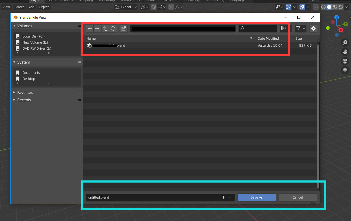
In the file Browser since 2.81, the location to enter the file name has been moved to bottom (Cyan Box). The majority of information, such as the file path and files within the folders, are shown on the upper part of window (Red Box). Thus, the attention can't be sufficiently drawn to the file name. And after getting to the right file path, I need to draw my attention to the lower part of window to change file name. My proposal is that, is that possible to make this panel just under the place where file-path has been shown? It will be easier to see and easier to reach and manipulate, increasing the speed of workflow.
-
In blender 2.80, the hand to move viewport was in a horizontal layout on the right-upper corner of 3D viewport. In blender 2.81, this has been vertical and on right border of 3D viewport.
I forgot the reason that Pablo mentioned this change, but I think this isn't a good idea. While all other options are horizontal, only this seires of options are vertical. It seems an interruption of harmony. The other reason is that, this layout simply puts these options very far from the center of 3D viewport. If by any chance I am going to use those options, I need to go farther to reach that option and it's not as convinient as in blender 2.80. My proposal is to revert this back to what it was in blender 2.80; Or would anybody tell me the reason why this has been changed, how will it actually benefit us? Personally speaking, although it's of minor importance, but it causes some uncomfortable.
6 Comments
This is really two proposals and they should be separate posts.
* @Jason van Gumster * Probably, but I can have billions of proposals, and in this specific case both of them are kind of small. I didn't want to flood this channel with small questions. So I just group them together with such a title "some suggestions about interface...".
* @Hoffman * The preferred practice here is to keep them separate. Don't worry about flooding the site. If that becomes a problem, we'll address it then.
* @Jason van Gumster * Got it, will do later on.
While I agree with the filename suggestion, i strongly disagree with ur navigation gizmo placement.
The vertical placement helps when u are in portrait mode, say art tablets, or when u have shortened the area width. And it also reduces the clutter up top.
* @yashpalgoyal1304 * Thanks for replying and sharing your opinions. For the second proposal, I don't use portrait mode/art tablets at all so I may not be familiar with these issues for other users. Thanks for letting me know your opinions! If it causes lots of uncomfort to other user groups, I will not strongly push it. Wish to hear more opinions. Also thanks for supporting the first proposal.