
UI Global interaction modes relocation
currently, the 3d view editor hosts a variety of buttons, some of them change settings locally in the 3d editor they are located in, and then there are some that change settings throughout blender and dictate your interaction with the program and across editors.
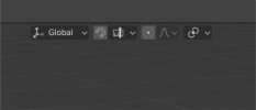
My proposal is regarding the transform interaction modes (the snapping menu, the gizmo orientation and proportional editing ). These modes change or activate the settings in all editors, but are currently located in every editor that has the option.
This means that if you have more than one editor open, you have the same setting in all of them, and activating one will activate it everywhere. Blender is already overloaded with buttons, and redundant settings are not ideal. Also, people learning the application are confronted with two rows of shiny buttons in every editor,when not all of them are specific to the given editor.
these settings are universal, and should be present on one single location always visible and not changing location throughout layouts
I have put together a short presentation explaining my position on the problem
4 Comments
This has already been tried and has many problems.
* @Alberto * I see the benefit of having the option to change some setting at several distinct locations randomly spread throughout your screens, but at the same time you cannot deny the disadvantage of the current solution.
To draw a parallel with the automotive industry, you can change the AC airflow of every passenger seat in a car, but you only turn on the headlights from the drivers seat. Imagine a car built around blender’s ui philosophy.
I am aware of the industry and I did not notice any problem working on max, maya or mood on multiple 4 k monitors. And all Of them have their interaction modes on a fixed position at the top portion of the screen
* @george.mitev *
Yeah, other software can do it in a similar way that you tell, but it don't mean that are a better solution.
Blender is know by the speed in workflow, no other program have that speed ¿why? by this type of decisions. Also blender have a modular interface that needs, mandatory, the controls in the editor. For example ¿Why I need that controls in the interface when I edit video? When I sculpt? When I write a script?
When people think in a proposal for blender don't have to think only "it's good for me?" they must to think "this is worst for somebody?". Because the proposal never will work if users think only in them but destroy other people experience or workflow, also the blender interface concept.
* @Alberto * I do not mean to spoil people’s workflows. The visualisation is put together quickly on purpose. My intention is to point out the problems I see. Yes you could work with the interface the way it is now, the focus of 2.8 is workflow, so we should discuss the workflow.
My critique of the ui is that there are parts of it that are not necessary. And in my opinion they impede the ui by taking the place of useful ui elements or your content. You should not duplicate controls just to have them handy always near your mouse cursor. That is what pie menus are for.
The current ui lacks general concept. Apart from the religious “ no overlapping “ rule there are no design guidelines, no underlying grid.
You should not dismiss ideas just because other softwares use them.