
Horizontal Tabs in the Properties (N) Panel
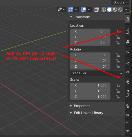
<h2>The Problem</h2> After installing even a small number of addons the Properties Panel becomes a crowded and unreadable mess. The text on each tab is cropped to just one or two characters or worse can disappear completely! This makes the whole panel unusable and is a total UX nightmare.
<h2>The Proposal</h2> Give users **the option** to choose whether these tabs are displayed horizontally or vertically. There should be a header at the top of each panel that allows it to be expanded or collapsed in a way that is consistent with the rest of the Blender UI. This was the actually default in the Properties Panel in Blender 2.7 and it was a MUCH better user experience.
Failing that a second option could be to allow the vertical tabs to dynamically overflow into more than one column when needed, as suggested here - blender.community/api/storage/file/59/59ee2b501de2fb001513f45c/42/42652358c4f14f48ba13697aee057bb2-l.jpg
21 Comments
this is just a bandaid solution to the real problem- the N panel is a dumping ground for everything , and that needs to be solved.
* @testure * It's mostly addons that dump everything in there. The addon developers can make actual editor panels/windows for their addons or add custom sections into the existing editors/panels instead of just shoving everything in the N panel.
* @thinsoldier * Sure but it's extra work. My opinion on this is the Python API and/or Blender should be changed so that ANY sidebar tab can be edited by the user at any time.
* @testure *, even if the sidebar has only three tabs, I want to be able to read them without turning my head -90 degrees or my computer 90 degrees.
I think there are two different problems. One of them being what you said, and another one being the fact that they are not readable in the first place.
* @zorro.weaver * are you actually not able to read text that is sideways, or is that hyperbole? i'm honestly curious, because I have never met someone who was not able to read text that was rotated.
* @testure * You're right but a lot of us would still like that bandaid whilst the core devs figure out what the solution is going to be long term. Also I wouldn't expect implementing these suggestions to be particularly challenging compared to a global UI/UX overhaul. But then again I only know some basic python and front end stuff, maybe it's more challenging in C.
* @testure * That was hyperbole. I still think it would make it nicer to read if the text was not sideways.
* @ad.morris * the problem I have with a proposal like this is that bandaid solutions all too often become perennial. Cramming everything into the N panel was the previous bandaid solution and here we are years after the decision was made complaining about it. The problem doesn't get solved until we stop trying to put bandaids on it and commit to doing the work necessary.
I'd rather not have tabs. A single <select> / dropdown menu with all the tab names that I can cycle through with the mouse wheel would be a huge improvement in my opinion.
Something I often do is make multiple 3d viewports, open the N panel, choose some specific tabs, and resize those viewports so the only thing I can see is the panel. I wish there was an addon that forced all sidebar tabs to just be a proper dedicated panel that I can put anywhere in my window.
* @thinsoldier * imo this is the correct solution. it's essentially what a program like Modo lets you do- the UI is infinitely customizable because every panel is just an XML file, and the schema is completely separated from the underlying code, so you can create a custom panel and dock it anywhere in the UI that you want. Tabs should be just a subclass of the panel layout, so you could put tabs on any panel you want (or avoid them like the plague if you like). It should definitely not be the built-in "bucket" for all addons to dump their panels like it is now.
rather than wasting valuable dev time with bandaid solutions like horizontal N panel tabs somebody should be wrapping their head around long term solutions like this one.
It is being discussed here : devtalk.blender.org/t/solution-to-the-sidebar-panel-design/3515
What about give a choice to user - tabs or square/round small icons? Each add-on creator would be obligated to provide one. No problem with reading, easy to find and recognizable (icon > text), take less space and finally there will be clear distinction over blender tabs if icons will be placed in N-panel.
Yes. These tabs are nasty and hard to read. Making them horizontal would be nice. It might take up a little bit of extra space, but I am willing to sacrifice this to make them readable.
* @zorro.weaver * Eaxctly. Having the tabs as headers wouldn't even take up that much more space either, since the width of N panel is there already for the contents of each tab anyway
The sceond option have sense.
The horizontal, maybe as list of tools in option panel, then any click on list can open panel.
In other issue I suggest to close panel by right clikc in menu "close", or maybe need hide to more comfy managment than in add-on manager.
This would be great and remove the need to scroll.
I would greatly appreciate the addition of an option to arrange tabs horizontally in Blender. Given the numerous addons often required for effective production use, the current vertical panel setup can be challenging to manage. Plus, with today's widescreen monitors, there is generally more horizontal room available, making a horizontal arrangement more practical.
This annoyance is finally about to come to an end. 😌
This patch (not reviewed, not merged yet) makes addons tabs in the sidebar (N panel) not shrink when there are too many of them: developer.blender.org/D15395
Consider awarding a ❤️ token to let #b3d developers know that you like the patch.
⚠️ Remember that this patch is NOT the place to discuss about your suggestions for sidebar UI redesign.
Several years on from the 2.8 overhaul and this is still utterly terrible. If any of the core devs see this. Please just add multi-column overflow if these tabs must be vertical. Even with vanilla Blender, the text on them disappears when the viewport is only taking up a small area of your screen. There really aren't any logical arguments against fixing this. An implementation just needs to be decided on and executed.
From my perspective it would be better to customize the Npanels tabs and select by user, which addons together can be in tabs. Lot of addons have just few options, but occupy one tab slot.
Wouldn't it be better to use the footer menu to display all the tools (properties)?