
More user-friendly closing, splitting and merging of windows in Blender UI
Hi guys,
what do you think about a new window control for the Blender User Interface?
Current situation:
There is no visible contact point in the User Interface for simply closing a window and there is no contact point for splitting or merging a window.
My proposal:
Each window gets these two small buttons at the top edge. An (x) button to close a window and a (lasso) button to merge or split windows vertically/horizontally.

Here is an example from me how this tool could work.

Okay, once again, step by step:
- You can close a window simply by pressing the new (x) button.
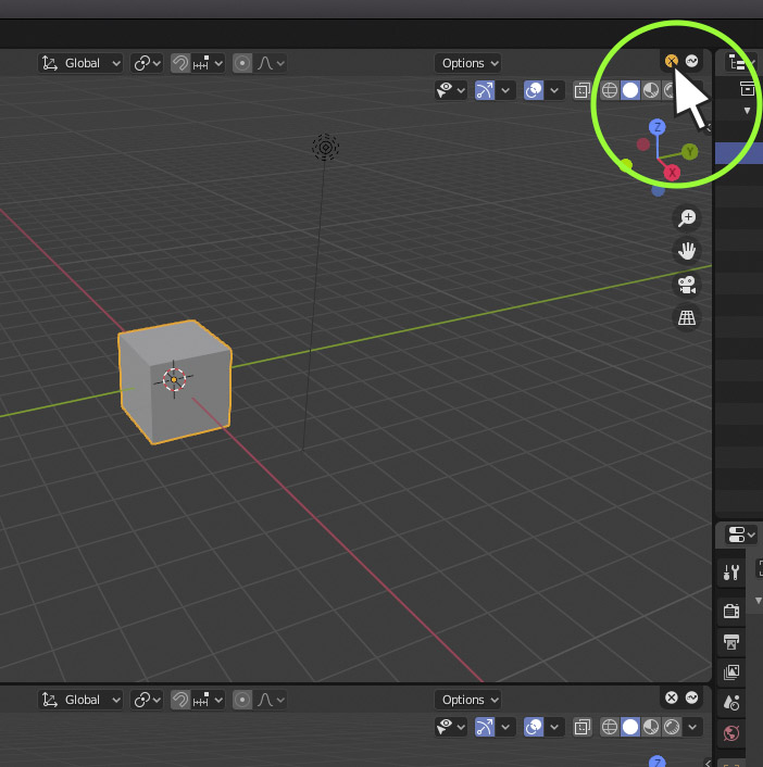 2. A window will be merged by clicking on the lasso and simply dragging it to another window.
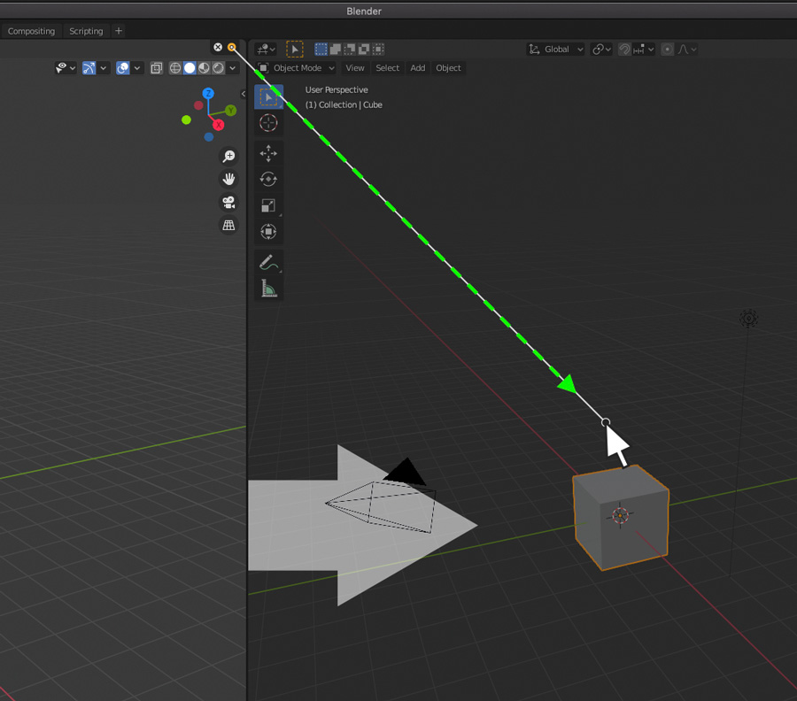 3. A window will be divided vertically by clicking on the lasso while holding down shift.
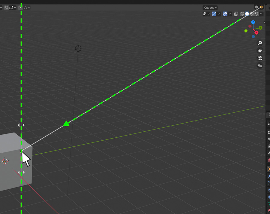 4. A window will be split horizontally by clicking on the lasso while holding down shift + alt.
I can imagine that a window control like this for closing, splitting and merging will feel pretty good in the UI and especially newbies will feel faster comfortable in the Blender interface.
Just by the way. Unfortunately I am not a coder, otherwise I would try to realize this by myself. :)
OK guys, if you like my proposal, vote it up! :))
Have a great day!!!
Henry

7 Comments
Looks like someone's doing better IMHO:
devtalk.blender.org/t/proposal-resize-join-area-operators/12695
* @-L0Lock- * It works better than the initial interface editing, but it's less user-friendly. What Henry Neumann here was suggesting was to add icons to say to beginners: "Hey! We're here! We can help you optimize the interface!"
So, both ideas are different, but both are excellent in my point of view.
* @-L0Lock- * Thanks for sharing that link. It looks like a super great improvement. But as Ak MC correctly pointed out, one of my main concern was to make it easier to get started using Blender. In my opinion, a solution behind walls is not a good starting point for an interface function that is so fundamental.
The idea of Ak MC to make the icon variant optional would be ideal for beginners and professional users.
And I'm sure that a few other professional users, including myself, would like to see a graphical solution in the user interface as well.
Once you're used to manipulate the User Interface, these icons are not necessary. But for sure, this would be really helpful for beginners in Blender.
Let's vote it up. =)
(Would be great though to have the ability to hide these icons in the user preferences as well so advanced users can have less icons on their interface)
Full mode screen?
* @krimegxen * Sorry, I'm not quite sure what your question is about. Do you want to know if the icon variant would also work in full screen mode?
I love the idea.