
Improve the display of nodes.
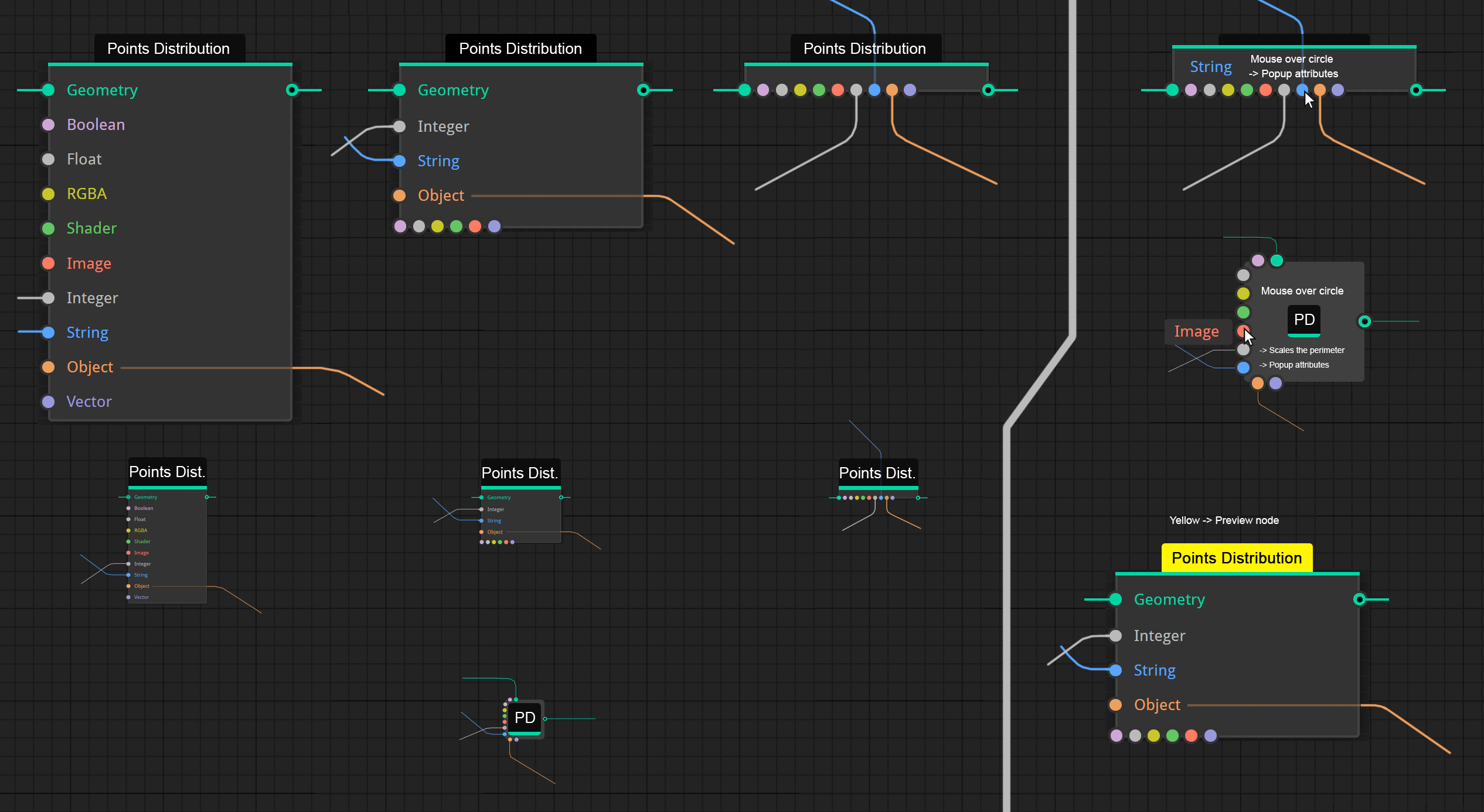
Now that Geometry Nodes is introduced I think it is a good time to rethink how nodes are displayed in the node editors. From some mock-ups by Pablo, I have made a few modifications to improve them, in my opinion. ui.pablovazquez.art/
Improvements:
- Color for attributes.
- Node name with constant font size.
- Tab for the name of the attribute, so the status of the node can be indicated. For example, it is being previewed, or it is not calculated ...
- Horizontal bar to indicate by color the type of data (green=geometry).
- Wiring with a horizontal or vertical slope at the connection point.
- Differentiate the outpus from the inputs with a point in the center of the output circle.
- Three modes to minimize how the data is shown. All attributes, only the connected attributes, or hide them completely, leaving only the circles. In compact visualizations the circles would be arranged horizontally, in this way the balloons that are currently generated are not necessary (ex: Principled shader), since they can expand in a straight line.
- When zooming out, the name of the node is compressed eliminating characters, the rest is scaled (attributes , the circles and the connection cables).
In compressed or small-scale modes, attributes are overlayed or scaled when cursor is over to show the attributes .
7 Comments
Great ...hope they improve the nod3 conecting without endless zooming in and out and the useability of the right tabe properties . Maybe hover over sockets scales them up and show the name so conecting is more easily when they nodes are tiny and partly colapsed and open up the whole node again and again is not needed ..so we can work with a greater overview without endless zoomIng and colapsing...wfg......p.s. tiny nodes could have a little bit bigger sockets overall and a scale option in the system probs.
Definitely some good ideas! Another option to consider would be node icons that can be used with collapsed nodes / nodes at a distance / as an alternative option for more visual workers. See Grasshopper for that style of node.
I think I'd like to see more emphasis on that accent bar at the top. I'm not sure how useful to navigating 1000+ node trees it would actually be. I'd assume we can still manually colour nodes in this method. Perhaps some nodes should have a default colour for the full body. Sverchok, for example, defaults viewer nodes to be fully orange (the whole node, not just the header) so you know at a glance what's doing what.
How are different values / sliders etc shown on the node? I am resolutely against hiding parameters on a separate panel as it is a severe barrier to intuitive working where seeing patterns is invaluable. I always feel seriously handicapped with other software that try to "streamline" nodes to the point that you need another window entirely to view the actual parameters.
I do like your presentation for minimised nodes and nodes beyond a certain zoom distance! Looking sleek!
* @Erindale Woodford * Putting icons would be ideal but it slows down development, it is currently happening in the Sculpt branch, in which some tools are not shown because the icon is simply missing. I think you have to have an alternative before incorporating them.
As I have arranged, the tab indicates the activity (selection, preview, ignore ...) and the thick horizontal line indicates the function of the node. I think there is room to color the background of the attributes or to outline them with fine lines. The tab with the name of the node, which is generally dark, can also include a contour line, apart from modifying the color to indicate more than one state.
To the right of the image, although very schematically it is shown how the attributes would be superimposed in the compressed or distant modes. You can temporarily scale a node or overlap attributes without destroying the existing layout.
I am against of different colors for text. May be slightly saturated. A lot of mixing colors will make eyes tired faster.
* @ Vyacheslav * The background is dark gray, so I think the color can work, but it is true that it's necessary to do more tests adding the values of the attributes, the mixture can be strange. I do not see the desaturated option, I would prefer an option for the attributes to inherit or not the color of the inputs and outputs.
* @ wevon * perhaps not just option, but slider «multiply with socket color». So everyone will tune it to his taste, more or less saturated.
While I'm not saying the nodes can't be improved, this proposal just looks like a confusing mess.