
Icon Layout for Overlays Popup
I suggest a redesign of the Popup for Overlays to make easy to use and find the options with a compact menu done with icons.
The buttons will have individual ToolTip description for new users.
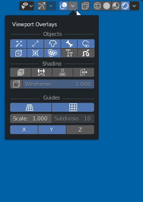

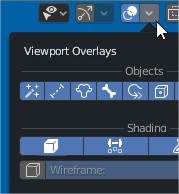
I suggest a redesign of the Popup for Overlays to make easy to use and find the options with a compact menu done with icons.
The buttons will have individual ToolTip description for new users.
4 Comments
isn't this too much icons in one place? also that means other popovers have to adhere to this design change and they are context sensitive , i would ask for trying a color coded version but then we'll have a rainbow forest, especially with the flat icons, this needs testing and iteration to make it work.
its context sensitive, but in that situation blender needs 40 controls.... but also in that situation works better than actual solution and it easy to find what you want and to train muscle memory
also it's and example of possible solution, with less width the solution could be better and easy to read * @PK_GO *
So much easier to associate with icons than words. Although a combination of the two would be optimal so as not too rely too much on tooltips, this looks really damn nice. +1.
Great idea but maybe It would be better to have a
Some people like me find it faster to look on text than two crowded rows of icons with low contrast. :) icons + text would be great :D