
Small Shading Pop over
I made a small mockup to the shading menu , active matcap icon is too big and covering space a lot i think we don’t need that much big.
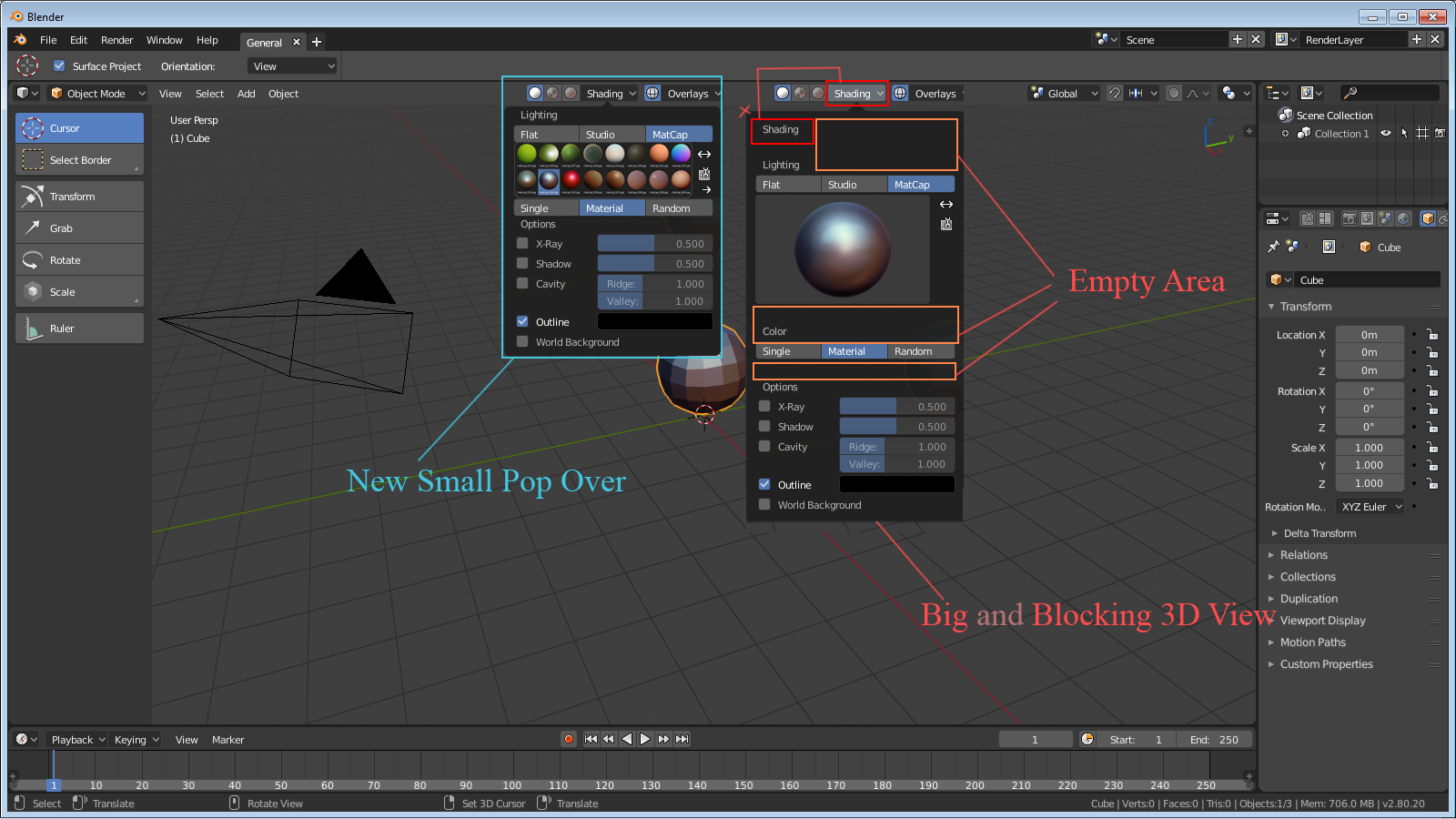
I made a small mockup to the shading menu , active matcap icon is too big and covering space a lot i think we don’t need that much big.
7 Comments
More efficient workspace usingis always good. It would be nice to have big version when pointing small miniature.
redefined UI
i like it but think the matcaps could be a bit bigger
Yes , we can have an option to resize matcap viewer like Ctrl+Alt Click and Drag , we have this option every where in the T Panel , N Panel , Properties tab and i think it should be there also.
I don't really see a reason for it to be smaller - you can't use any part of Blender while it is open anyways. You should also reset your theme, with the default theme transparency is enabled and you can see what's behind the popover
@benthillerkus: one reason would be to see a bit more of what is changing in the viewport, the current center position covers the thing one needs to see when changing the options. also when on small screen it might be preferable because the whole menu will become scrollable when the screen height is reduced too much. and no transparency is not a valid solution for this, just a not so good workaround.
In the latest build they changed shading pop over a bit removed Shading name on the pop over and empty area.