
X, Y, Z values buttons in color gizmo (as option)
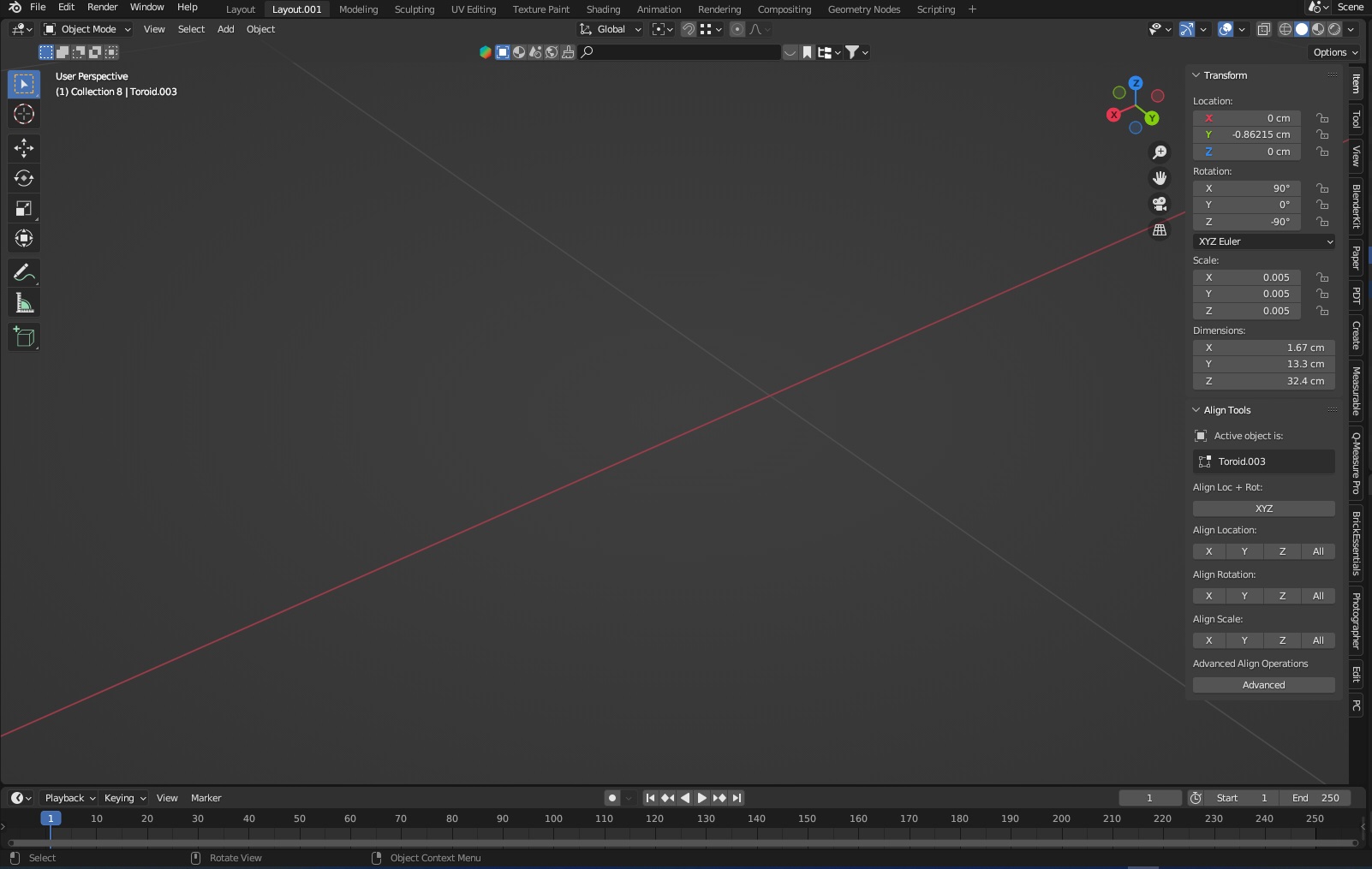
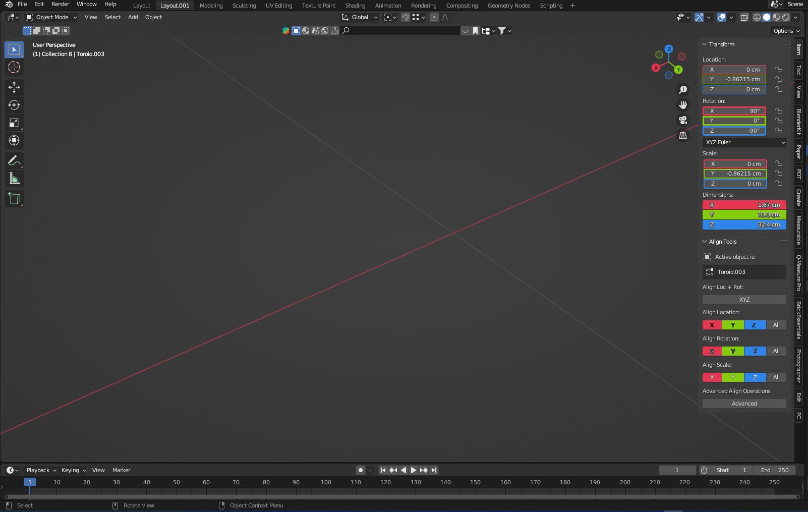
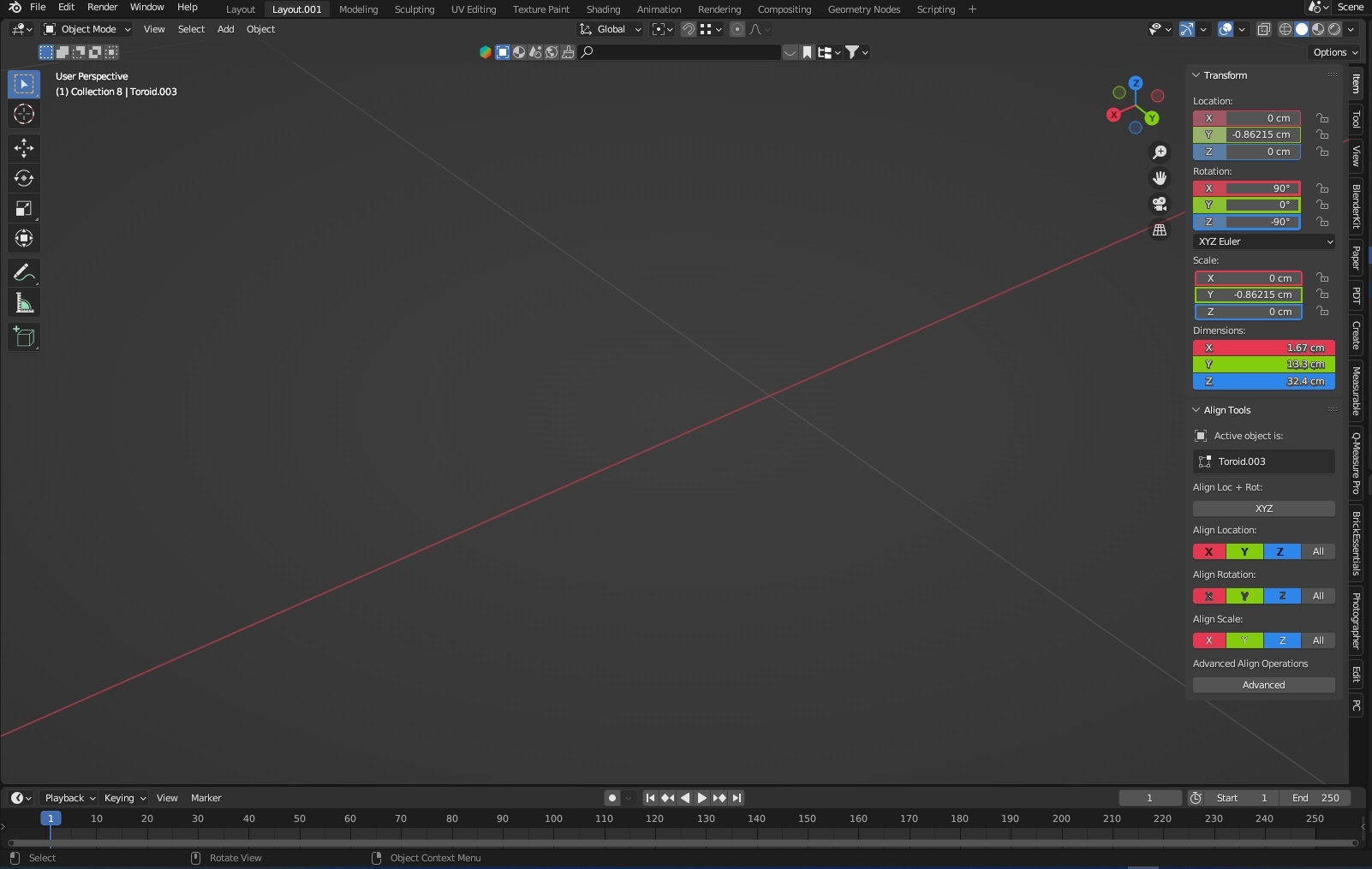
Want propose new option as more intuitive operation with objects settings by X, Y, Z values buttons or inputs in color gizmo (as option for more intuitive recognize a related value in axis x,y,z on viewport and gizmo).
When user operating viewport, then often is cognitive computing in mind as find right axes that should be selected, eg. align, mirror (also this same in menus), etc. that always can be different due natural process. The idea is to optimize this thinking by quick look and recognize more unconsciously right X, Y, Z values inputs or buttons.
This can be frame board for this values inputs or buttons or whole button.
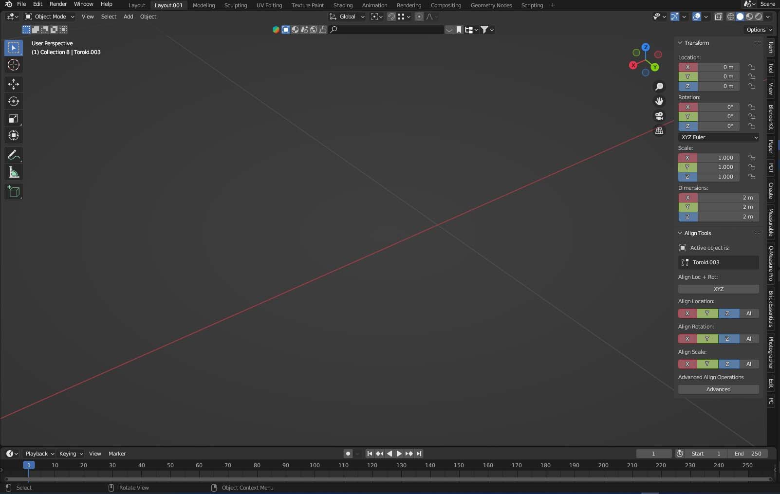
I created some visualization of possible solution. Maybe not perfect, but maybe some gradients? Or other idea how to optimize this more recognizable and related?
8 Comments
One thing to consider: those boxes already are reserved for color assignment, when keyframed... so you'd have a conflict happening here.
I know, that why suggested gradient maybe or after assigned to animation color can be different as overridden or when this function other flag, eg. cricle around x,y,z. In fact also hard recognize right drivers if are different and this limiting around some semaphore working for drivers.
What You think the last proposal now?
Honestly, I don't think it's necessary. One quickly learns the axes colors; one can read XYZ, i don't see that it needs to have a color coordination.
And in Blender, colorization of a label/value generally offers info that something is happening with that value. The eye is drawn to it, because it IS colored. Having a rainbow in the sidebar will lower one noticing things that matter a bit more.
I like the idea, but only if it is something that can be toggled on/off, in the theme section perhaps... Someone might find it more distracting than helpful ^^
and like Softyoda, I like the first option more! The one with the colored letters :3
While I agree with you, some color lack since the 2.8, I think the second mockup is too flashy in my opinion.
But it serves the purpose of this proposal, we understand.
It need more experiments probably, eg. circles around letters x,y,z maybe.
I added new concept for this - last image, eg. just partial btn color to separate from key frame colors