
more esthetically harmonious property panels
why having to have different aesthetic compositions with a lot of space that is badly managed? it would be useful if the panels were more aesthetically harmonious with each other ... I think that they should all be similar to how the panels of the nodes are built
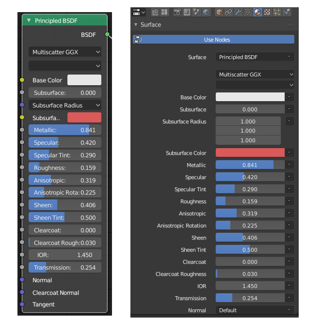
2 Comments
Perhaps if the functionality was width-sensitive, moving the field titles on top of the fields when the properties pane gets too narrow?
What about Text-Entry fields though?
Maybe it can be a configurable option in the future for users who like what you propose.