
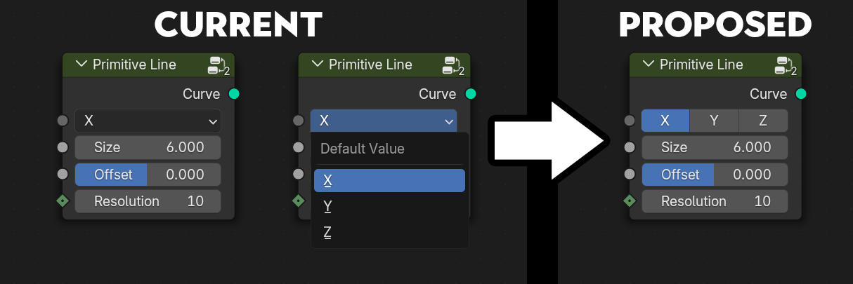
Option for Menu Sockets to be displayed as buttons instead of menus
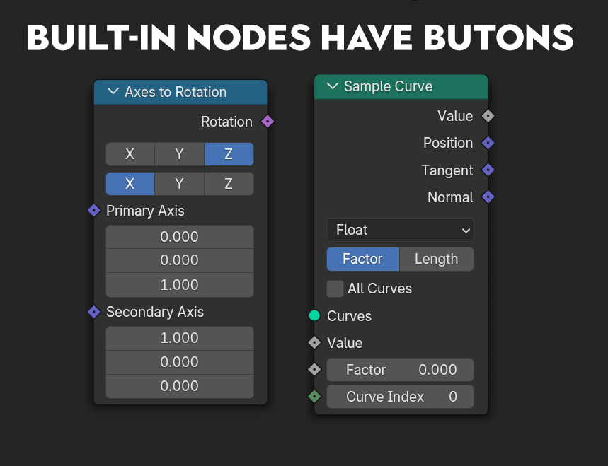
Sometimes you just want a few buttons instead of a whole menu. Built-in nodes do it, so I think users should be able to do it to. It would save clicks and make the UI more readable.
It's the equivalent of adding
expand=True
to an enum prop in python.
The option for this would be in the same place where you pick a subtype for certain socket types.
Just to clarify: this is a proposal for user-made node groups, not for existing nodes.
4 Comments
I'm going to disagree that it makes the UI more readable. In the Current screenshot, I only see X - only one thing I have to read. In your Mockup, now there's XYZ that needs to be also read.
And once you consider a switch node (13 buttons), or vector math node - 27 buttons?
Saving clicks... come on... it's one menu click.
I'm not saying that every menu should be displayed like that, I just want an option. I certainly don't want it for math nodes! It makes sense for shorter menus with 2-3 items that can fit in one line, like the built-in nodes in the image.
In my opinion it is more readable, the blue highlight stands out more than the menu. Imagine the
Axes to Rotationsnode with two dropdowns.If you waste too much time reading XYZ instead of X, then how much time do you waste having one less click to change a narrow enum property (which you might change multiple times too)?
Arguably, you can always use ⎈ Ctrl Wheel 🖱️ to cycle through all options one by one, but I find that limited for shuffling through the list while staring at the actual result or if you know where your intended choice is.
No, I think it would be a nice addition, as an option. Much like floats have three widgets available (slider and box with or without arrows), or eight if you also count the ways the values are displayed:
Yes please ! In the modifier panel especially