
Column layout with left-aligned text
Hi
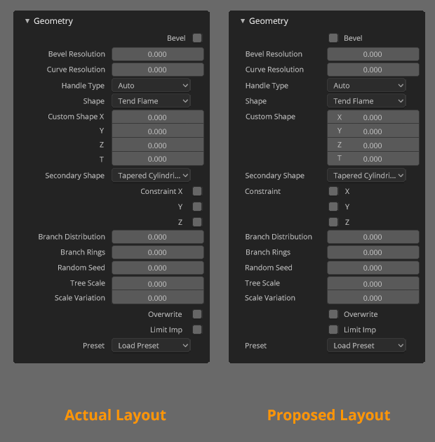
After many debates about the new unique column of Blender2.8 I would like to propose this version with a few small changes in the alignment of the elements that would greatly help the readability of the panels of the program.

The proposal is quite clear, align all the labels of the panels on the left, including the checkboxes. Making it much more user-friendly to read the values by users.
For the example has been used a panel quite complex and with all kinds of different elements that put in difficulties to the rest of proposed layouts, such as the temp-ui-layout branch, which needed a dynamic layout depending on the width to adapt to the wide column. In addition the layout has been tested in the configuration of 2 and 3 columns to check that it was not a reading problem.


Other proposal is a dynamic system, like this that I explain in the commentaries

21 Comments
The way it resizes need to be revisited too. Check the world properties and how the HDRI name gets hidden when you have like 50% of the window empty on the left side. You got much more control if all sliders fill up the empty space as much as they can. Why do we need empty space when you can use it to increase the sliders accuracy and show full names.
@luisburdallo: The problem is similar to the one I was telling amonpaike about. Blender2.8 is designed from an aesthetic rather than a pragmatic point of view. So that type of panel that looks great when you look at it as a whole contains a number of very serious problems such as text aligned to the right, boxes without space for relevant information ...
@alberto3d.1984: I didn't read the entire thread. I guess we agree then.
This would be nice
Surely your proposal is much cleaner and so I support it. But I hope with a more compact version with the labels included in the parameters, so that I can keep the panels tight.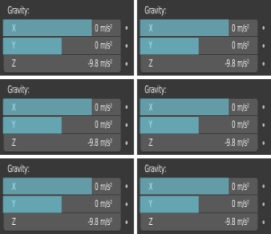
@amonpaike: Yeah, the problem with that is that layout doesn't work in wide panel, appears to be really important an aesthetical solution for that type of panel.
To make that possible an option is make a "dynamic" system like this that I designed.
The layout change the solution if the panel is enough wide, and when you have two or more columns you go back to narrow layout. And it's a great solution for al situations, but like it needs a dynamic system that change the layout depending of the width of panel I don't want to propose it. The important part is to have a left aligned panels.
@alberto3d.1984: The problem with the actual implemented layout is that it only works correctly in the properties editor, and doesn't work in any other panel, user preferences, sidebar, popups,.... Making inconsistent all the interface. Also probably made more hard to implemente anything. Because instead of implement only a control and make all automatic the developers must to implement the layout in each panel, with a lot of rules.
@alberto3d.1984:
One and Two columns Narrow Layout, Just my Wish.
I have nothing else to say.
Looks very good in my opinion. Clean. I think having sub-labels inside sliders is definitely the way to go. Right-aligned text could maybe remain as an option if someone prefers that.
I really hope this issue gets adressed. I'm pretty sure there's more people who find the current layout to be not so good.
easier and faster to read and remember , this can improve our workflow too.
I will have to disagree on this one. The existent layout is much more clearer for me and conveys relations much faster.
My point of sight travels in two vertical lines in your proposal, of which left one does constant zig-zags, while the existent one constrains the eye movement in one line between the name and the value field.
I agree. For comparison, here is an example of a properties panel from UE4 Editor: imagebin.ca/v/4LNv66kUVleh
agreed. everything cool but the not-centred values👍
This should be marked as done
This is being addressed in 2.90, I think you should update the status of the post
* @marcellofonda * I keep an eye in the development and I didn't see any change about this, only a change in the checkers text position
* @Alberto * What about this: youtu.be/0LNiGdgccVI It looks like it's more than just textboxes. Your proposal actually looks better and more detailed than what Pablo presents there (that's why I still upvoted yours), but they actually already took that direction :-)
I like the new layaout proposal!
This is definitely worse! Readability suffers alot with flipping text over to the right side. The only good thing about this proposal is that the tick boxes are aligned to the middle. Leaving the text on the left side plus alignment on the center line and we have something nice!
I am not sure you guys are testing this proposal properly. Try to read quickly the contents of the existing and proposed layout.
For example, in the last picture, look at the distance the eye has to travel from the name 'Shape' to the value 'Tend flame' in existing and proposed layout.
Are you sure you are not looking only at overall 'look' of the panel (which in my opinion is also degraded in the proposal)? The old layout not only conveys information faster but also has somewhat better aesthetics to it.
@Okavango: It would be awesome if there was an option to chose align left/ right like there is for rmb