
Introducing "Modes" to the Properties Editor (e.g Render Pipeline)
Observation
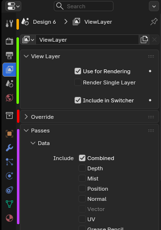
The Properties Editor has a very large number of unrelated settings into a single vertical strip of tabs. While separators exist, the overall structure feels inconsistent and visually heavy. More importantly, these tabs don’t all behave the same way:
-
Tools (yellow) : Content changes based on the active tool. This overlaps heavily with the N-panel and mostly targets sculpting workflows. It arguably doesn’t belong in the same space as object or scene properties.
-
Scene / Render / World (green) : These settings are global. Their content never depends on the selected object and applies to the scene as a whole.
-
Object / Data / Modifiers (purple) : These tabs are contextual and depend entirely on the selected object type.
-
Collections (red) : This tab feels isolated and doesn’t clearly belong to either the “scene” or “object” logic.
Suggested Solution
Introduce modes in the Properties Editor, similar to the Outliner’s Scenes / View Layer / Blender File modes. Beyond simple filtering, these modes would allow workflow-specific panel layouts, with simplified UIs and fewer nested, collapsible sections. Here is a non-exhaustive list:
| Properties Editor Mode | Typical workflow | Default workspace |
|---|---|---|
| All Properties (current) | General use | Layout |
| Object Properties | Mesh editing | Modeling |
| Tool Properties | Sculpting | Sculpting |
| UV Editing | Object and scene shading | UV Editing, Texture Paint, Shading... |
| Render Pipeline (see below) | Compositing and rendering | Compositing, Rendering |
Example with Properties Editor → Render Pipeline
Here is a proof of concept of a Scene-focused mode , renamed “Render Pipeline” .
This mode would present a condensed, curated view of all render-related settings currently spread across multiple tabs (Render, Output, World, View Layer, etc.).
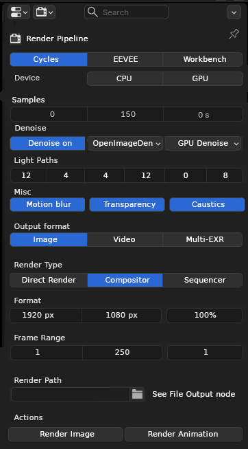
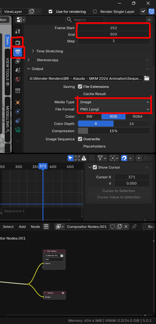
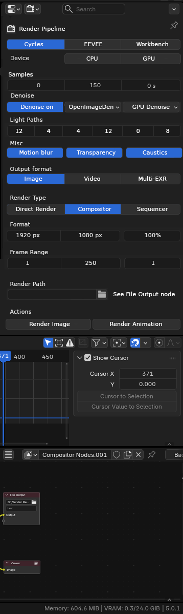
Here is comparison for a concrete scenario, when working from the compositor and doing some test renders with different settings.
| Current (red are the different clicks needed to reach render-related functions) | Render mode (render-focused UI) |
|---|---|
|
|
The key challenge for these (non-exhaustive) modes is deciding what settings deserve inclusion, and how much control they should expose, since All Properties would remain fully comprehensive.
6 Comments
I think the current properties menu works fine. Also I think your observation is not completly right.
Collection Properties are isolated because they "live" in a different abstraction level. See that like layers. As you describe Purple is the "object level" (Deeper layer), so all property related to object are packed. Then you have the "viewlayer level", collection live in the viewlayer, that the reason why you can for example exclude collections from viewlayer but not objet. And object live in the "collection layer" which live in the "viewlayer layer". Finally you have the "scene level" (Highest level). All property menu packed in your green mark depend of the scene.
So to me, it make sense to pack them and by "categories". Could it be better ? Yes I think so. Is you proposal make sense and can improve or be better ? I don't think so
Thanks for your feedback. I understand that Blender’s hierarchical data structure can be tricky, but I don’t necessarily see the logic of the Properties Editor as incompatible with my idea.
Take the Outliner as an example: in a way, it already does something similar by exposing different data types and filtering available operators accordingly. Following your logic, it shouldn’t have both a “Blender File” and a “Scenes” mode, since a Blender file is logically above a scene..yet this works perfectly in practice: Need to link a collection to another scene → Use Scene mode. Need to relink a linked asset from another file → Use Blender File mode. Each mode is tailored to a different workflow.
That said, I’ll admit that the idea originally came from the need for a more render-friendly Properties Editor. The other concepts came along as a bonus. I still think the "render" workflow deserves more love.
In advance, sorry for the wall of text (again) 🥲 One day I will learn to be synthetic.
I think modes work well in the outliner because the vast majority of usage is in view layer mode, while the others are either niche or rare occasions. Unless you do some development or heavily use multiple scenes in files and constantly handle data accross them, you can literally go months with multiple projects without needing to go into any other modes. I frequently find people that don't even know they exist after years of blendering, that tells something :')
(And IMHO some of those modes could be merged into one, like scene vs view layer: just have a "current scene only" checkbox in the filter menu).
You can't say the same for the properties editor, you constantly use most tabs all the time. And I think the tabs do a better job at offering a consistent GUI that's easy to switch in a single click than modes in a popover menu or keyboard shortcut would.
And while all these tabs are not exactly behaving the same because of their context, the editor as a whole is consistent: it's the properties of anything, and it's sensitive to the selection. Plus it's similar to other 3DCCs, which is always good to take.
I don't really see what you would gain from isolating tabs into modes you'd have to toggle or choose, compared to what we can already do have or what we could push further without being disruptive.
For example, with the introduction of the visible tabs popover menu, you can already have different sets of tabs on each workspace if you want:
From there, I think what we miss from your proposal is a way to make "condensed curated views". And your example isn't just a "currated" view, it's basically an entirely new GUI, some options are using different widgets entirely. It makes me wonder what the GUI to create such view would look like, and how stable it would be. And yet I see the appeal, and I do like it, but only for a power user.
It's similar to the extreme customizability on Linux: some people will like being able to do their own jam, and some of those people will go crazy about it. But for the average user, it's a pitfall for breakage and instability; they just need something that works and is easy to learn and safeguards the rest for the power users.
And even for power users, truth is, at the end of the day they need to work with the tool and not work at the tool: do your job with the tool instead of customizing (and possibly breaking) it, and spending time learning a new layout they just made only to change it even further the next day because it's "not quite there yet" (I'm on Linux, I know the temptation 😅).
It reminds me there were proposals on RCS for forms of "let me drag any widget anywhere" like on ZBrush. That theoretically would do the job, but at the cost of throwing all the neat context arrangements out the window, and how hard would that be to implement?
And that leads me back to:
Maybe the solution isn't a curated view feature, but instead finding ways to make the current properties editor's layout do a better job out of the box, exposing the right options in the right place and using the right widget.
All that to say, the properties editor's many-contents are not as big of a problem as it might seem, and solutions don't need to be as disruptive. But if it is decided to be worked on, I hope it is made wisely to avoid these pitfalls as much as possible.
Thanks for that,it’s making me rethink my idea. One simple approach could be a slightly reorganized tab system, perhaps adding a Misc/Performance tab to consolidate panels that are currently scattered across other tabs.
Alternatively, there could be a “User” tab that functions like a custom shelf, where the user can pin and organize panels from other tabs as they wish. For example, they could include only certain panels from the Render and Output tabs to tailor it to their rendering workflow.... Kinda similar to workspaces
I'll think about it, cheers
This is what I meant:
That sounds nicer to me!