
Differentiate Pinned Editors + "Sticky header" in Properties editor
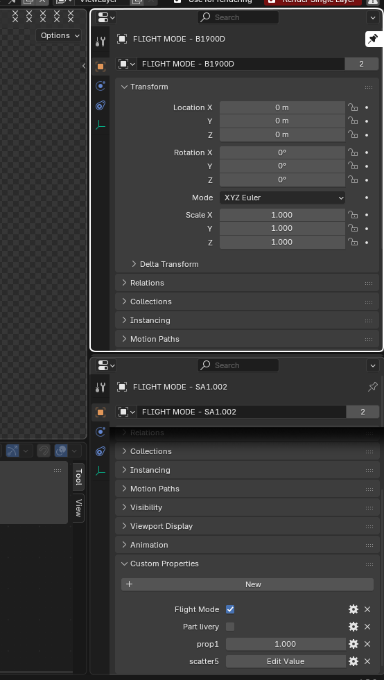
As far as I know, there’s no way to tell if we’re working in a Pinned Properties editor without scrolling all the way up to check the Pin icon. It would be helpful if pinned editors had a clear visual distinction from regular ones—for example, an accent color (user-defined in theme settings) and/or a “reversed” Pin icon.
Similarly, it would be very useful to have the object’s name (the header) remain sticky while scrolling, since it’s otherwise impossible to know which object you’re editing without going back to the top.
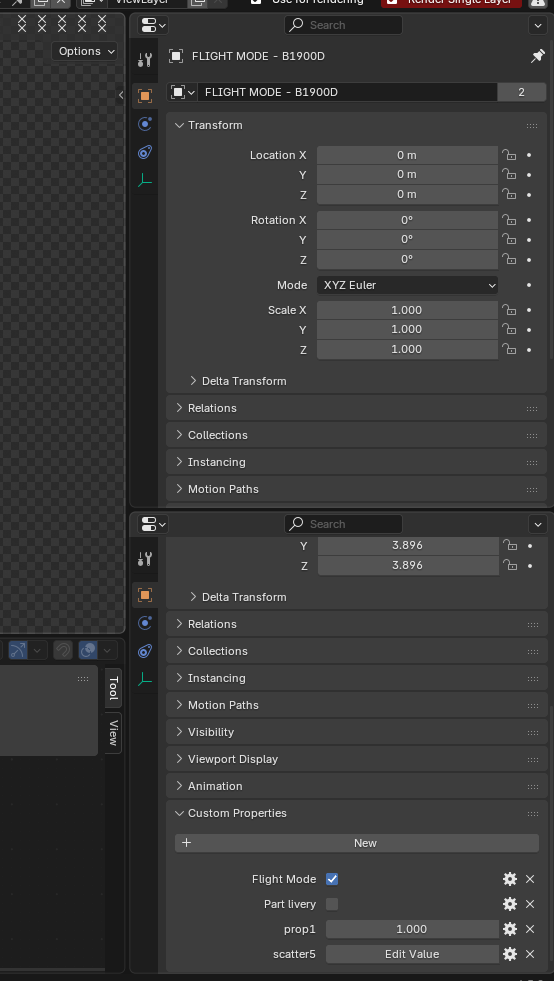
Before (example with 2 stacked Properties editor, one pinned and one scrolled to the bottom, thus hiding the Object's name)
After: (pinned Properties editor has different look, and a "drop shadow" effect appears as the user scrolls down in the properties editor)
1 Comment
This is something that we actually had before... when properties search was introduced in 2.91 the object name and the pinned icon, that were sticked to the header and therefore always visible, were moved down to make space to the search field. Not the best choice in my opinion, considering how pinning is much more common compared to search properties. A redesign bringing them back in the header would be good.