
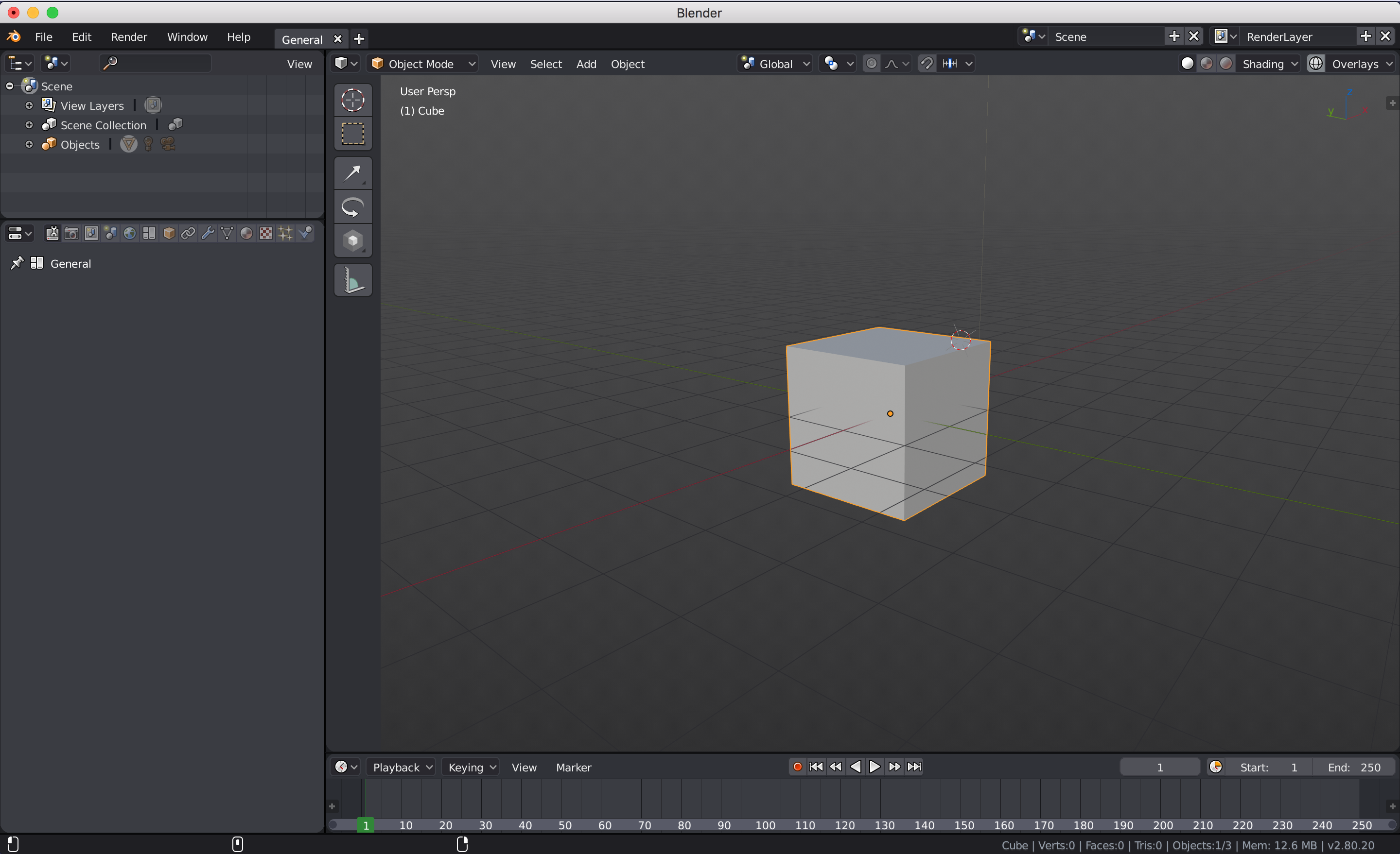
New Default Layout for 2.8
Considering the interface changes anticipated for 2.8 I think a new default layout could greatly improve usability for a number of key reasons:
- It would centralise key functions in one area so that users are not needing to constantly scan back and forth across the screen
- It would remove the need for the top bar which is in the current Blender builds. Instead, tool properties could be placed in a dedicated tab in the properties panel as they were in earlier mockup ideas (see blenderartists.org/uploads/default/original/4X/7/5/b/75bb1734b1fd24bfea3e67d19663d2cc7d2e07e4.jpg ). This would make tool properties much more accesaible than the original proposal which would have had them on the right of the screen.
- It looks cleaner with less information scattered across the screen
3 Comments
Definitely not a fan of having the Properties and Outliner on the left. Visual hierarchy puts the most important/most used elements on the left. People are going to interact with the 3D View way more than they're going to interact with the Outliner or Properties Editor.
im not going to vote up this yet, but it has a lot of sense, also need to move view layers and scene to the left, at least for the default view . Other thing that im not sure about its the tool bar, if we dont have the one in the spacebar, having the tool bar closer to the center of the screen for starters its cool (you forgot the navition gizmo, really important for a default theme) but with the toolbar there and in the space bar we have a redundancy that i hope has some other plans to extend that.
why?!