
Properties icons appearance
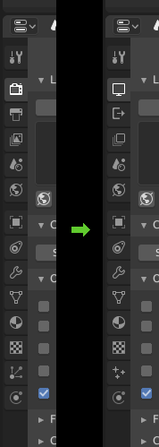
Just wondering if it would be worth changing some of the icons as shown here:

Rather than a DSLR camera, have a computer monitor for Render settings. Instead of a printer icon for Output have an arrow pointing out of a container. Simplify View Layer and remove the image within the square. Lastly change Particles to some floating particles rather than kinetic lines as currently it looks like an XY line graph.
6 Comments
Big fan of the new particle icon - the current one looks like an axes symbol. The others are a bit better too.
The particle icon is perfect!
Particle icon is great. Also, that "Share" icon is becoming a standard (well at least variations on it), well worth considering.
holy shiiiiiiet
Have you posted it there ? This is where it might get a hit.
@-L0Lock-: Thanks I've added it there for approval.