
Improve modifier's headers
There is a few things that declutter the UI and improve the experience :
-
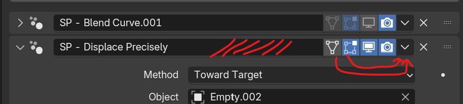
The name being constantly editable is useless, inconsistent and the space could be better used to widen where we click to expand/collapse. --> Instead just use F2 to rename like everywhere else and put a rename option in the dropdown.
-
May be more of a personal opinion but Edit mode and On Cage buttons are useful really not useful enough to have them exposed on every single modifier at all time like that. Just put them in the menu too.
7 Comments
When working with characters, i click those 2 on a constant basis - some on, some off, some always on. Hiding in a menu would be very unwelcome.
anytime i do any modeling i switch these all the time across the process.
They could have a shotcut... Personally I lose a lot of time because I can't see the name of the modifiers. So there is a compromise here and these buttons are extremely exposed compared to some just as important features
Why can't you see the name of the modifiers? What screen resolution are you using?
Quick tip: Press
Ato expand/collapse modifiers (or any panel).Thanks but this not really the point
I guess I will reformulate because I am very surprised by the reactions. Like I did not explicited the issue with current UI since I thought it was obvious.