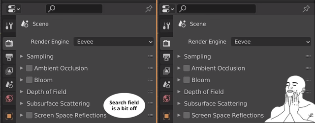
Let's try to align the new search and context selector a bit better.
89.5%
Development Status:
Open
Upvote17Downvote2
R
Rockbard
16 Sep 2020
3 Comments
S
Shimoon
Its actually properly aligned with the outliner one
{attachment search_barJPG}
2
s
sulyok.zs
*
@Shimoon
* Looks like shit though... :( The proposed one is better, since there are no sound logic for the empty spaces. Further more the spaces are not the same size... that causes further confusion. The best would be full width search-bar. at least from UX point of view.
2
a
adamsanim8
To me it looks like clutter, a better design would be to only show the mangifier Icons & when clicked then takes you to the field.
I managed to tweak the theme but when the mouse is over an editor for highlighting the field appears, couldn't find the theme setting for that,
And i agree with the alignement, both the outliner & properties should be on far left & the display mode icon in the outlliner could be moved next to the filters

3 Comments
Its actually properly aligned with the outliner one {attachment search_barJPG}
* @Shimoon * Looks like shit though... :( The proposed one is better, since there are no sound logic for the empty spaces. Further more the spaces are not the same size... that causes further confusion. The best would be full width search-bar. at least from UX point of view.
To me it looks like clutter, a better design would be to only show the mangifier Icons & when clicked then takes you to the field. I managed to tweak the theme but when the mouse is over an editor for highlighting the field appears, couldn't find the theme setting for that,
And i agree with the alignement, both the outliner & properties should be on far left & the display mode icon in the outlliner could be moved next to the filters