
Wasted UI Space in Blender 2.90
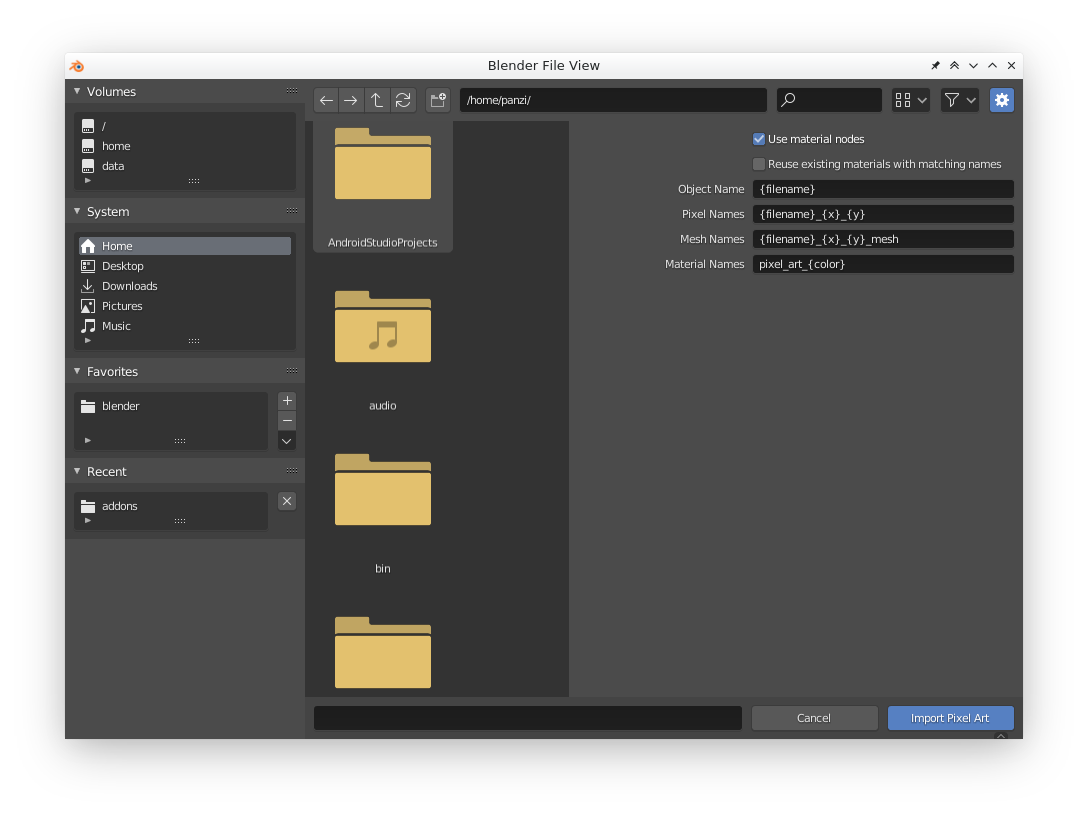
Just wanted to note: In Blender 2.90 the new layout causes a lot of wasted space when you try to resize a sidebar so that a longer label is fully visible. So that is more wasteful than it was in 2.8x.
Demonstration video: youtube.com/watch
6 Comments
Not sure what you expect if you resize a window bigger than its content...
* @-L0Lock- * If I make the panel any smaller it cuts of the input elements for no reason while still keeping some of the wasted space. Hence wasted space. It would be ideal if it would fill the panel with the input elements and only starts to display empty space when the elements are fully shown. Look at the demonstration video.
yes, that's ridiculous. For that matter, why not put the text ON the icons?
* @jeric_synergy * What icons?
* @grosser.meister.morti * The 'folder' icons.
* @jeric_synergy * That's not what I'm talking about at all. The icons are good for image thumb nails and you can choose list view anyway. I'm talking about the import options panel.