
New N -Panel
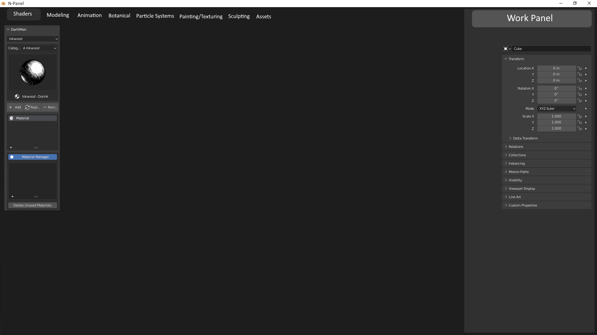
The N-Panel is a great idea that I don't think was very well thought out. If you have a few addons, then it works fine, but if you have a lot --then the N-Panel leaves a lot to be desired. As a user, it would make more sense for the N-Panel to be a window, with tabs that the user can organize, as well as having the relevant connections to the work panel right there for someone to be able to use. Give the users the ability to organize their addons by creating tabs and being able to drag and drop addons to the proper tab. I created a mockup of what I'm talking about. Hopefully it makes sense.
9 Comments
I remember discussion about it some time ago. It seems that creators of add-ons are more guilty here. They should create own menus (like some do). Others just add new tab to side panel. Although grouping tabs could be useful.
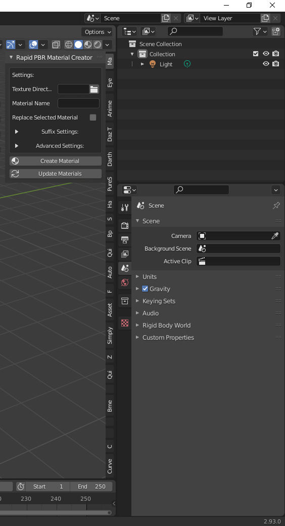
It would be a lot easier if they had the tabs on the N-panel read sideways instead of up and down. I posted a picture of my 2.93 and as you can see, some of the tabs you can't even read on the N-Panel. The only way to fix it at the moment is to go and disable addons until you can read all the tabs.
I assume it will not solve all problems but...
Simple Tabs add-on: chippwalters.gumroad.com/l/simpletabs
This more the addon maker's fault in my opinion.
For example Bool Tool and copy/paste UV chose to add their controls to the existing Edit tab instead of making 2 new tabs.
If many/most addon makers would choose to add their controls to a single tab named add-ons it would fix 75% of the issue.
The other 25% is that the controls for some addons should not be in the sidebar at all. They should be elsewhere in another editor or should create their own editor like Animation Nodes did.
I don't think it's the addon devs fault. It's a mix between addons mishaps, Blender's design faults and BF's Human Interface Guidelines inducing a lot of issues.
Solution 1 : Put everything in an "addons" tab
Issue: Instead of a forest of tabs, you have a forest of panels, and your addons can't really profit of having multiple panels anymore.
Solution 2 : Regroup addons in a few tabs
Issue: same as previous but lesser. The BF actually recommends addon devs to create as few tabs as possible, and prefer to make task-oriented tabs. But the tabs existing out of the box don't really follow that logic in the first place, and "tasks" are free of interpretation. And at the end of the day, when your addon has a lot of elements to show, you can't just mix it with others without making a mess.
Solution 3 : Let the user chose the tab used by each addon
Issue: The API doesn't make it automatic for any tab created, the addon dev has to make its own solution for it. Which requires more time, effort and skills to do so. For EACH tab in EACH addon.
Solution 4 : change the API
The BF could change the API to make the UI more customizable without the need for addons devs to do (much) extra work.
Issue: It's a lot of work on a slow moving ship. If it ever happens, it will not be overnight.
Solution 5 : Self-restrain and alternatives
Addon devs could stop adding that many things in the sidebar in the first place and find other places to put their GUI.
Issue: the addons guidelines don't give much more room. And it's complicated to create new space without c/c++ programming, which is quite a different challenge for addon devs.
Solution 6 : allow popup windows.
That itself could reduce a huge amount of clutter easily. Many addons could be changed into a single button somewhere in a common tab, that opens a temporary window for the time we need that addon's tools. Many softwares do this with flagrant success.
Issue: BF disallows it .
TL;DR:
This issue has been discussed many times, many proposals have been done for that. But to me, the bottom line is that the most efficient and time-proof solution is to have the BF change the API and Guidelines to give addons devs more flexibility and access to UI, and also let the user have the final word by customization.
This annoyance is finally about to come to an end. 😌
This patch (not reviewed, not merged yet) makes addons tabs in the sidebar (N panel) not shrink when there are too many of them: developer.blender.org/D15395
Consider awarding a ❤️ token to let #b3d developers know that you like the patch.
⚠️ Remember that this patch is NOT the place to discuss about your suggestions for sidebar UI redesign.
For the clutter in the N Panel I designed the N Panel Manager. While it doesn't manage the N Panel directly, it solves the clutter problem by making use of workspace filtering. The N Panel Manager provides quite some filtering options, and a UI to manage your setup. See: blendermarket.com/products/n-panel-manager
Well... If you do that, you absolutely lose the entire point of the sidebar (that's its actual name): an easy access toolbox from the viewport.
I beg to differ. I added a picture of my "easy access" N-panel so you can see my perspective above. I don't find anything easy about it. My entire point wasn't meant for those with one or two addons, but the more you add, the less "easy access" it becomes. I find myself having to constantly enable and disable addons just so the N-Panel is useable. There is no customization of the N-Panel so you're stuck like this. Even making the N-Panel Tabs list horizontally would help alleviate some of my frustrations, but you can't --which makes no sense. Being able to categorize and organize your N-Panel the way you want it to work should be a no brainer. For all the other intuitive functions of Blender, it mystifies me that the Blender team could miss the ball when it comes to this part of the user interface. How do you not see this coming when you design your system to be addon friendly?