
New Properties Panel icons and more icons in 2.8 - Too Indistinct?
Hello guys,
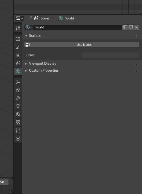
I'd like to begin my comment saying that I'm really surprised with the new looks of the Properties Panel. I think the vertical tabs are superb! Now we can use a less wide "toolbar"(?) without losing some of the tabs - no clipping, no need to scroll through those little icons - something that happened when they were layed horizontally. However, I've been noticing that the new style of the icons is not very distinct, specially when they are small. I think having all icons with very simple 1pixel lines is fine, but when I look at the Properties panel now and at some other toolbars I just can't tell what's what fast enough. I came with the idea of, perhaps, having the icons change to a colored version when you hover over them or when they are active. What do you think?
5 Comments
It helps a lot to see pictures in proposals.
My favorite so far is the one with a vertical colored line on the side of the tab.
@Pablo Vazquez: True! I've updated my post with a mockup of what I'm suggesting. It's rather subtle I think. Anyways, I'm thrilled to have had your feedback Pablo, thank you!
You should follow the discussions on the forums, where the issue is widely debated. You might also propose your coloured version
@: Thank you! Could you please provide me with a link to that post? I'm new to these forums.
@Pedro Rubini: blenderartists.org/t/new-icons-for-blender-2-8/
beware: it's a loooong discussion