
UI Design Consistency in the N-Panel
The current N-panel design is a bit inconsistent. The issues are :
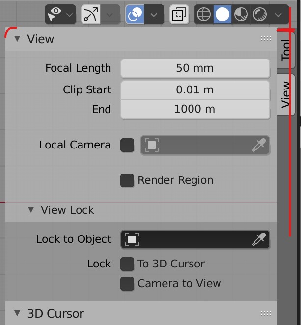
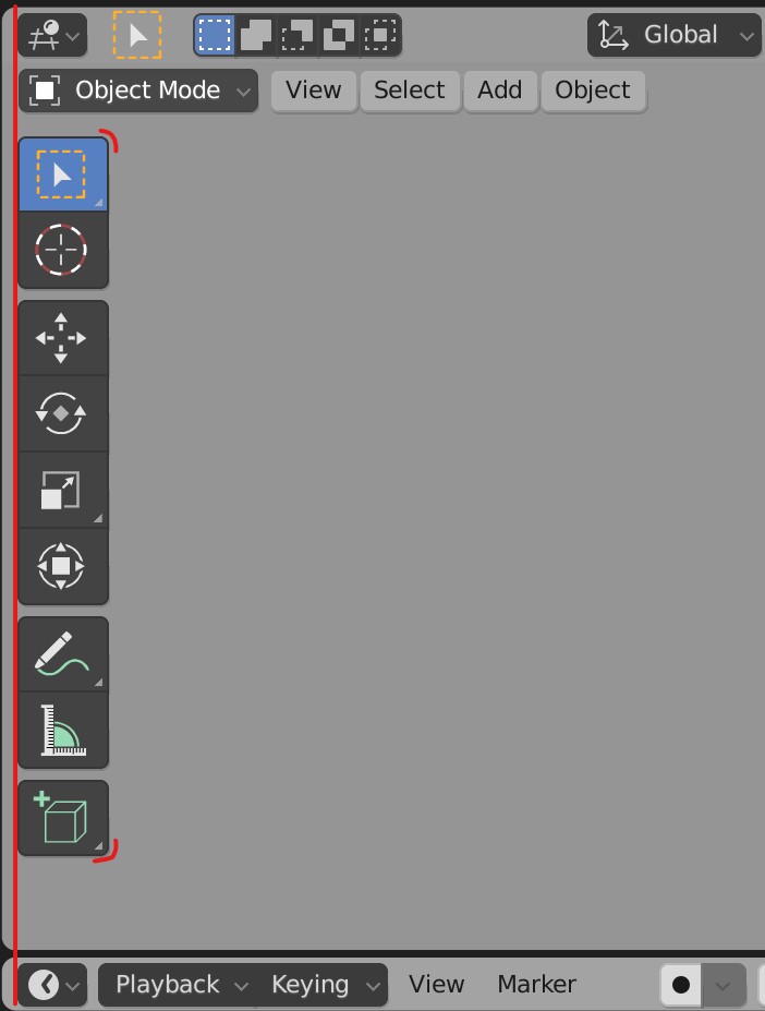
- It doesn't have rounded corners like the rest of Blender's UI. The T-panel icons have rounded corners too.
- The right side of N-panel where names of tools exist is offsetted to far right, completely ignoring the boundary of the upper Shading Icons. I understand this might have been made this way so the side panels don't take much space. But it is a quite insignificant to sacrifice for a consistent design.
- There is a small gap in the upper section of the Tool Button(marked with horizontal red lines in this picture). Here the properties panel should be expanded to the upper area of the Tool Button. No gap should exist.
The N-panel
 The Tools Panel
2 Comments
There is a developer who specializes in these tiny alignment tweaks. I don't know their name but if you can find them and post this on devtalk they'll probably consider making the change.
Ok . i understand. But i don't know how that that site (DevTalk) works. I have only visited it once.