
Dynamic navigation widget ( UX Prototype )
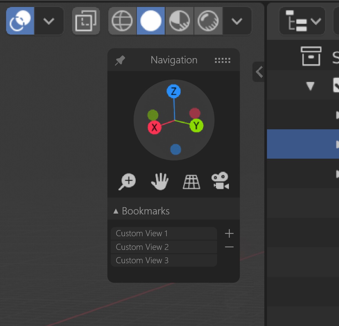
Hello there, I have some thoughts about the recently redesigned navigation widget at the upper right corner of the 3D view. I have several problems with it:
- it gets in the way most of the time
- it makes the right side of the 3D view overcrowded when I use the "N" Panel
- however you move the 4 little icons it always looks awkwardly arranged
- view-port navigation has so much more potential to be useful, but the current design covers the bare basics (I understand 2.8 is still young and most of the new functions are placeholders for the future implementation)
- you cannot move it to other place to make it more comfortable. let's say you have a cintique tablet and you like it close to the part of screen you are working on. (or you are just left-handed for example )
I know there are plans to make the tool properties window (currently stuck to lower left) freely movable, so I am using the same concept. I couldn't show it in the prototype, but imagine you could gram the title bar and place the widget where you wish.
Also, the widget works with clicks in the prototype, but I propose the widget unfolds on mouse over.
I propose the following functionality:
- the widget can be freely moved in the 3D view
- the widget can be minimized to save space when it is not needed
- the widget stays unfolded when the pin icon is activated
- you can add and remove custom view bookmarks to store viewport orientation and zoom
- you can switch between bookmarks by selecting them from the list
I took some time to put together a dynamic UX prototype (click on navigate widget) or use the embedded version ontop
6 Comments
Not personally a fan of yet another panel to cover up the viewport with a rearrangement of the things that already exist. the proposal states some problems that it's trying to solve, but I don't think it solves any of those problems other than it being movable.
it gets in the way most of the timeThe existing widgets can easily be turned off in the options. If you need to turn it on and off frequently you can even map a hotkey to the option to toggle it with a key or pie menu. The best part is that when it's "on" it's not a huge opaque box with a bunch of buttons, it's neatly integrated into the viewport HUD to be as minimally intrusive as possible.
it makes the right side of the 3D view overcrowded when I use the "N" PanelYour mockup looks MORE cluttered to me, given that it's an opaque panel and adds view bookmarks.
view-port navigation has so much more potential to be usefulFair enough, but I fail to see how your proposal solves this problem, other than adding bookmarks which has already been done several times over via addons.
you cannot move it to other place to make it more comfortableAlso true, but I don't necessarily agree that having a floating panel that can be dragged wherever is the solution. Having some presets for which corner it should be put in seems like a cleaner solution to me, and doable with the existing panel-less design.
You also mentioned mouseover expansion, which I've seen in other apps and can't say that I enjoy. It makes for an 'unfocused' experience as you move through the UI and have numerous panels flying out each time the mouse crosses over them. In this one situation it might be fine, but once you add the functionality for this type of UI behavior it will start showing up everywhere .
* @testure * So your position is “ it is perfect as it is “ . There are things I couldn’t show in the current prototype like semitransparent effect on mouse out and animations, but I didn’t have time to put together an animation. I also didn’t want to add too much features I’ve noticed too much scope berries a project. It is better to keep things simple. We can add stuff like rotation axis lock to mimic 2d rotation for grease pencil drawing. There is need for 2D pan and a checkbox for lock camera to view
I agree the design is somewhat cumbersome. It is this way because I try to follow the current design language for the viewport widgets eg tools properties. Ideas are welcome. How would you suggest it should be.
My main goal was to start a productive discussion about viewport widgets
* @george.mitev * Nothing is ever 'perfect as is', my feedback is more to avoid making something worse . Just because your car makes a funny noise doesn't mean you should set it on fire :)
I love it!
I usually add a camera for each ‘bookmarked’ view. Obviously, these bookmarks would go into a special collection with 2.8. Spawn another outliner editor and limit the editor to show only that collection... presto!
I now realise I drew it a little bit small. The basic idea holds though