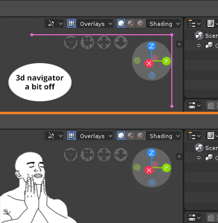
A lot of things seem to be off. Not entirely sure if they have it planned but every text, icon seems to be like shift down a few pixels.
1
R
RockbardAuthor
@luisburdallo:
It seems like the developers don't listen to designers. Probably the design team is much smaller then coders :)
R
RockbardAuthor
@luisburdallo:
And yeah you absolutely right about centering the text. I think the developers just busy with the big features and don't have time for miscellanies stuff. I wish they read this site more often.
L
Luis.Burdallo
@Buster Friendly:
I am sure they do and those things are left for the day before the Beta release. :D
R
RockbardAuthor
Developers did the changes! :)
But im afraid now the manipulators is too close. we need more space
m
manuelgrad.at
@Buster Friendly:
oh man, i hope they fix that ...
R
RockbardAuthor
@Manuel Grad:
I feeling like doing another request for this is almost dangerous :)

10 Comments
@forestgumpovu4: Flawless victory :)
A lot of things seem to be off. Not entirely sure if they have it planned but every text, icon seems to be like shift down a few pixels.
@luisburdallo: It seems like the developers don't listen to designers. Probably the design team is much smaller then coders :)
@luisburdallo: And yeah you absolutely right about centering the text. I think the developers just busy with the big features and don't have time for miscellanies stuff. I wish they read this site more often.
@Buster Friendly: I am sure they do and those things are left for the day before the Beta release. :D
Developers did the changes! :) But im afraid now the manipulators is too close. we need more space
@Buster Friendly: oh man, i hope they fix that ...
@Manuel Grad: I feeling like doing another request for this is almost dangerous :)
@Buster Friendly: Ah, still not fixed...