
Minor UI improvments and fixes for 2.8
Just some quick notes that I took after trying to teach blender 2.8 to a couple of friends who are looking to make the switch.
Overall having new visual icons for modeling is awesome. It's missing a couple that I feel really could help intermediate/new blender users.
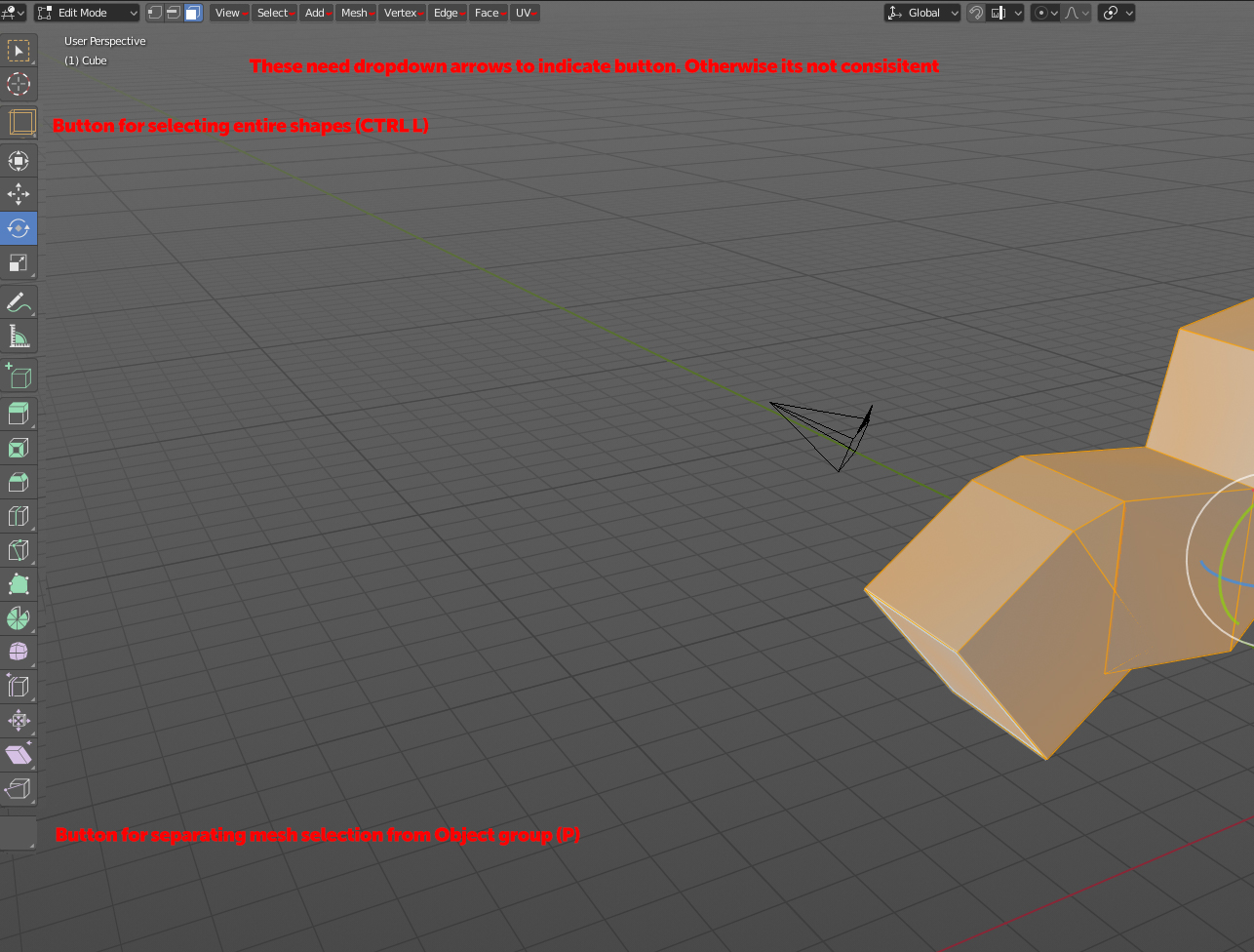
Button on how you split your mesh would be immensly helpful since its not clear to a beginner/intermediate on this is done.
the CTRL L function would also be super helpful (or maybe it can sit as an extension from the old "B" selection icon?)
Also the view/select/add/mesh etc needs arrows. People are programed from web/apps to read that as breadcrumbs/labels (especially seing how everything else have a dropdown arrow=
2 Comments
just some pedantic feedback on your proposal- fully saturated red on a middle-grey background is VERY hard to read and painful on the eyes.
It would be best to separate these into separate proposals so they can be addressed and discussed individually.