
Application Template: A Mockup for Blender Touch
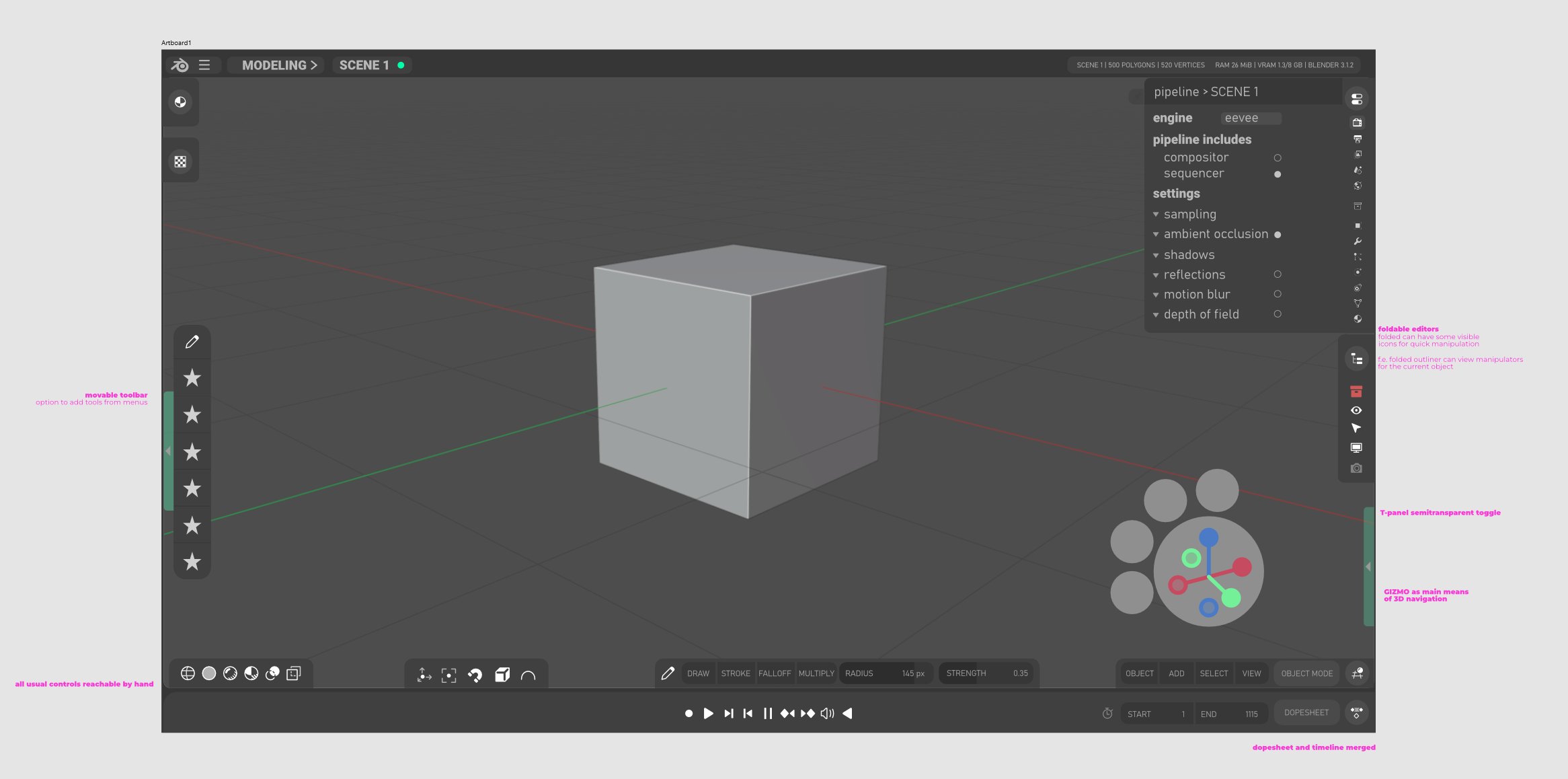
I made this little rough mockup for small screens and touch devices.
I think Blender would benefit from updating its UI at some point and a step towards touch screens would IMO be the right way to go.
The feature list:
- Foldable editors - the user can fold editors into little icons on the sides
- Workspaces merged into a single button just like Scenes in the corner
- Touch friendly Gizmo moved to the bottom
- T-panel and N-panel have a foldable icon
- Header Icons in 3D viewport moved to the bottom for easy editing
- Quick Tool panel merged with header panel to save up space
- Version info moved to the top as it is mostly not interacted with and merged with the Main Header
- Foldable editors can have quick shortcuts when folded, shown with Outliner (that would show the options to hide the Active object)
Let me know what you think!
Do you think this would be a cool idea?
12 Comments
The title is misleading, I think this proposal should be called "Mockup for Blender Touch UI" instead. Portable has other meanings, and not all mobile devices are touch, nor all touch devices are mobile.
You are right! I am changing the title. Any ideas on the mockup itself or where the UI could go in the future?
youtube.com/watch It seems Blender is finally going Touch!
And the current mockups are very much to what I thought about - foldable windows, minimal UI, its lovely, thanks Blender!
Term
Portablein the context of software does not mean what you think it means. Blender already is portable - aka - it does not need an installer. What you want is Blender on mobile.You are absolutely right
I think the idea of a space-optimised UI layout makes sense, and also a touch-optimised layout, although I'm not sure they'll have 100% overlap so it might make more sense to make them two separate ideas.
Regarding the specific suggestions: -I like the idea of being able to fold editors down (as an alternative to joining them), but not certain on the specific UI for the mockup. It feels like it would work well for the properties editor and OK for the outliner, but not for most of the other editors without a complete redesign. Maybe it should be limited to temporarily folding down a horizontal/vertical split? -Based on the mockup, folding down workspaces doesn't really seem to save any space so maybe it helps with touch optimisation only? -Technically the sidebar already has a foldable button but it is very small so maybe a larger icon? -I feel like a foldable icon for the tool bar makes sense if you're space-limited but feels counter-productive to a touch workflow. This might be one of the things where the UI options need to split into two sets of proposals. -I'm not sure of the logic behind having the navigation gizmos at the bottom - it feels like it would be accidentally touched a lot down there if you were using a touch surface. Were you imagining thumb-operating a phone/small tablet or similar? Arranging the other navigation buttons around also feels like it's taking up more space than the current layout - again, probably something where there's a clash between the requirements of a small screen and the requirements of a touch workflow.
Thanks for the comment!
Maybe a comparison to the current UI would be useful to see how much the UI is uncluttered in the mocap (while missing some features, of course).
I think the BF is not big enough to support extra hardware, and especially so if it requires to basically have a second Blender to carry on.
On the mockup itself: it looks more like you are making a new software reusing some UI from Blender. IMHO a touchscreen version of a software should remain the same as much as possible. It's hard enough to learn one Blender. And people will expect things to work and feel mostly the same but with fingers/styluses.
I agree! I wish for an Android build in the future but definitely not a priority. However! Touch UI might be the next step in the UI evolution for professional 3D software in general.
I think there will soon be a need for evolution of the UI just like 2.79 -> 2.80 was. The mockup definitely suggests more touch elements but all the basic structure of Blender is there. What is the most jarring thing for you?
I know long posts with lots of critics can easily be read as a massive rant, but it's not. I'm just trying to explain my thoughts, and I really suck at being short and synthetic.
As a graphics tablet and pen display user myself, I do have some wishes for some UI options for Blender. But not at the cost of having two different UIs to learn switch back and forth all the time. Like an option for the right-sided scrollbars to be on the left so that left-handed me can still see where I am scrolling. Also take inspiration from akeytsu's gizmo system and in-viewport animation curves. But that's another subject.
IMHO if the BF had to make a touchscreen UI, I hope they wouldn't do it on a different Blender build, instead they would adapt the current UI for everyone , with maybe a few things optional. Much like we can already enable menus opening on hover, we could have a few options that accommodate tablet users and touch screens.
I am not a graphic designer, my words are mere opinions bases on my own and my peers' experience and my observations on UI changes on multiple softwares.
When it comes to heavy UI changes, I think it shouldn't come at the cost of the current UI. And IMHO it just should not change in a major way if it isn't needed, like if that part works and is already simple enough to use. Everyone benefics from some UI simplification, but only if it doesn't multiply clics and screen-traveling and doesn't cause people to feel lost every ten seconds. Also, after 20 years old, it gets harder and harder to learn new UIs and you are proposing some big changes here x)
A good example of that is how you basically flipped Blender both vertically and horizontally:
These things listed one by one sound like nothing. But the issue is that it's a lot of little things, little changes that completely change the user experience both when switching to a new UI and when using it in the long run.
Now to be positive, the toolbar looks nice, the compact format of the application menu and workspaces works for a small screen and looks tidy.
But then, there are more global issues:
Blender is a Swiss army knife with lots of tools, functionalities and user customization. Your mockup doesn't look the same way.
In your mockup, it seems to be viewport centric (which Blender is not), other editors feel gone, in the background.
I didn't need you to tell me what kind of softwares you got inspired from, because your mockup is absolutely just that: a viewport-centric modeling tool.
In fact I got surprised you even mentioned "tools mostly for sculptors, storyboarders, animation etc ". Because your mockup doesn't show that. And even if it was, then you are confirming that this mockup is about reducing Blender, not enhancing it.
There are many more user cases for Blender. CAD users, shading / texture artists, crowds, procedural modelers, vfx, video editors, compositing, scripting, ... so many areas you left in the blind.
Blender makes it work by having a default workspace that fits most viewport based usage, can fit even more with very little tweaking, can be easily customized to an extreme extent, and you even have workspaces to have multiple pre-configurations.
Your mockup, I don't know, it doesn't feel comfortable from the get go, it feels like I'm on a tiny screen and I am expected to just have only three buttons and one panel at all times.
I guess that you hope that people would just switch workspaces and figure it out.
But you basically leave that up to imagination, so we can all imagine different things and that's useless to debate about.
How would the video editing workspace look like?
I'm a character animator for movies and series, so I need a dope sheet, a graph, a free perspective viewport, a shot camera viewport and a side viewport. All at the same time. How does it look, and how is the user experience to set it up?
You say in an above comment:
Then that means you deal with UI scale that are within the same ranges of desktop computers, and thus, UI scale should remain about the same. Why upscale everything like we are on a tiny smartphone screen? Aside from 13 inches displays (where the current Blender ui scale is enough), there's no need to make buttons the size of my fingers.
Many times in your comments you indicate that you did something because you like it more, but that's up to user preferences.
I think that's actually interesting: you therefore made a mockup for you, not for Blender users.
If you want to make a mockup for everyone, first you have to wonder who that "everyone" is. You have to think about what is the default experience. How to make people understand how the UI works. How to not leave part of the people behind.
You can't just make your Christmas wishlist UI and fill all the gaps by "it's optional". It would work in an ideal world, but the reality is that it's a hell to even develop such a software, and the default experience matters the most.
TLDR:
- My mockup was supposed to introduce 3 simplified concepts:
- And small Utilities for Touch UI which are:
NOW! I would like to take this mocap further and fix the issues
Hi! I am super thankful for these criticisms, however harsh they may be :)
This is exactly the neccesary discussion I hoped for, for the sake of Blender. If somebody is to redesign the UI in the future, they might stumble upon this conversation and learn from the mistakes I made in the mockup.
Now I will try to reply to your points:
My User Preferences ≠ Blender Community Preferences
Menus are flipped
This would need to be a separate Blender Build
I use Blender differently
EDIT: I reevaluated this and renamed the proposal as a potential Application Template , which should be coming to Blender this year. I