
Improve Weight Painting in 2.9+ like it was in 2.79
Credit to "Jilur Rahman" for the images
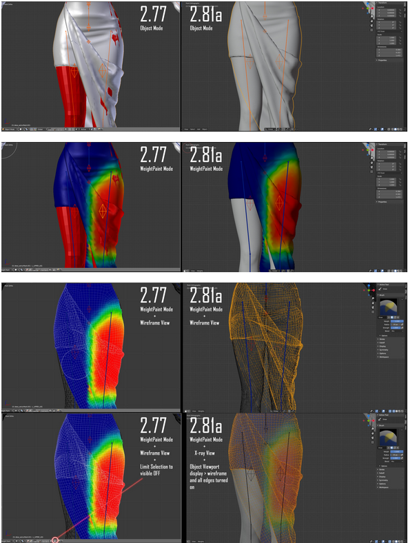
The old weight painting was easier to access and use , had better visibility please , make it more intuitive and faster by having a weightpaint mode automatically go to flat shaded mode like in 2.79 with the frames visible without having to click too many things
All the new people I see only weight paint using the Vertex Groups not by using the Flat Display and Non-Beginners simply use the bad shaded dark Weightpainting view , which is hard to understand what you are painting
I hope my point is clear about Visibility
Image Source: blender.stackexchange.com/questions/162837/weight-painting-is-terrible-in-blender-2-81a
4 Comments
It gets even worse if your object is dense, for example i have Suzanne here with 2 subdivisions and it looks very messy, the lines become very thick the more you zoom out. {attachment wp-1jpg}
Isn't this exactly what workspaces are supposed to be for? I.e. if you're using weight painting so much, you can create your own workspace that has flat colored viewport and automatically switches you to weight paint mode.
* @Stanislav Blinov * While, yes it could be done by the user that way, most importantly it should already be this way out of the box. Because that's not a per-user taste but a pure visibility matter that ANYBODY needs in weight painting.
Though in 2.90 it's already nicer, at least in wireframe:
Solid shading remains a bit dark sadly:
* @-L0Lock- * Thank you very clear and cool explanation 💪