some small things that i think may improve blender UI
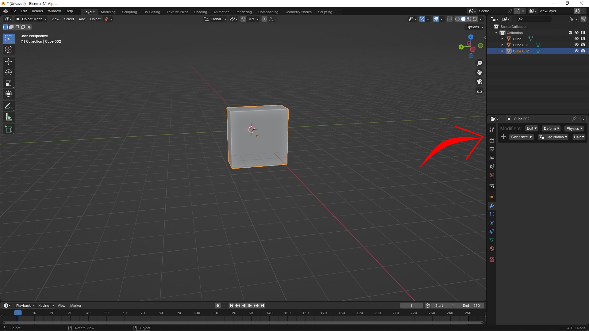
Modifier window
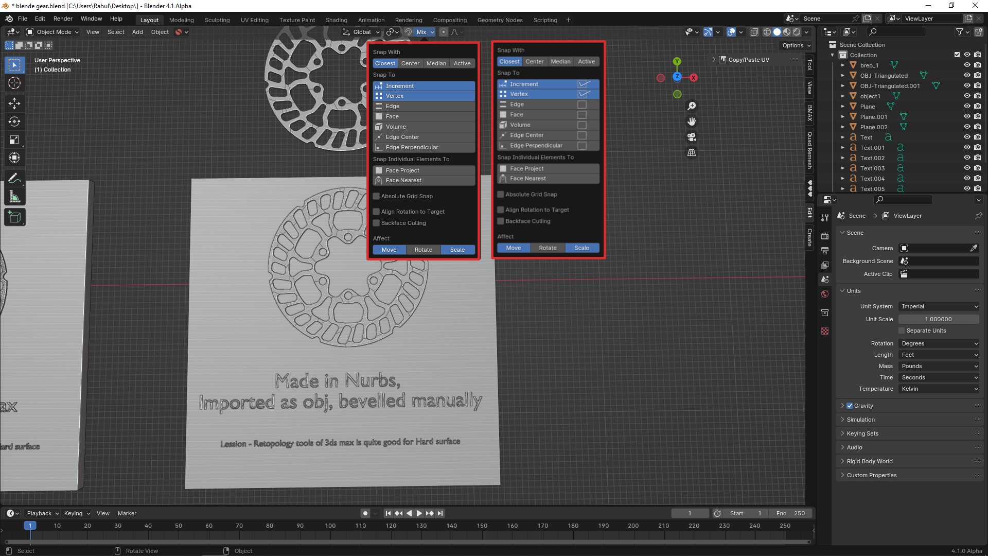
Snap options
0%
Development Status:
Open
Upvote0Downvote0
m
mrajendra2150
18 Oct 2023
3 Comments
L
Lauloque
Checkboxes in push buttons is redundant and adds clutter, not a big fan.
Categories buttons in modifiers, while it removes the need of first selecting a sub-menu as per 4.0's modifier menu, it really looks cluttered and hard to read.
If there is a need to remove 4.0's submenu system, I would rather just keep using the current menu and maybe have a different menu for geonodes when you have some, but still with the same formatting:
v
vridiot
I think there is reason to remove 4.0's submenu system, as it enforces a specific order of thought to get to the modifier menu item you need. It also makes discoverability of modifiers harder by hiding them away in submenus.
L
Lauloque
Debatable IMHO, with the arrival of geonodes modifiers populating the modifiers' menu, and potentially more "real" modifiers in the future, the wall of items we already have is doomed to be even bigger, cluttered and take ridiculous amounts of screen space. It will not help discoverability. In that context, dividing things in logical categories will help. Much like it helps for nodes.

3 Comments
Checkboxes in push buttons is redundant and adds clutter, not a big fan.
Categories buttons in modifiers, while it removes the need of first selecting a sub-menu as per 4.0's modifier menu, it really looks cluttered and hard to read.
If there is a need to remove 4.0's submenu system, I would rather just keep using the current menu and maybe have a different menu for geonodes when you have some, but still with the same formatting:
I think there is reason to remove 4.0's submenu system, as it enforces a specific order of thought to get to the modifier menu item you need. It also makes discoverability of modifiers harder by hiding them away in submenus.
Debatable IMHO, with the arrival of geonodes modifiers populating the modifiers' menu, and potentially more "real" modifiers in the future, the wall of items we already have is doomed to be even bigger, cluttered and take ridiculous amounts of screen space. It will not help discoverability. In that context, dividing things in logical categories will help. Much like it helps for nodes.