
Simplify Transform Options Menu
I think it would be great to replace the relatively new Transform Options Menu in the top right corner with three toggle Icons. So you don't need to get into the options menu (saves one click everytime) and you can see it's status anytime. --> less clicks, more overview!
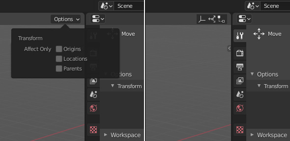
18 Comments
It would be great. Yeah. But I think this would be hard for the beginners to understand what each button means, as they look nearly identical to each other.
* @samanwayadatta * Text is usually more intuitive to understand.
* @samanwayadatta * if beginners has a hard time understanding those three buttons wait till they see the remaining 99.9%of the ui. Icons is at all times better than text. Tool tips will aid the understanding.
* @andreasng * "Icons is at all times better than text." ... HELL. NO.
The absolute best thing about Blender is the limited number of icons. The overdose of icons in Maya is the hardest thing about teaching it to someone who isn't already comfortable with several other icon heavy programs.
* @samanwayadatta * Those icons look quite different to me. If the icons have tool tips with their names then they are no harder to understand than any other icon Blender currently has.
* @thinsoldier * but. Blender is 90% icons. I don't follow.
* @andreasng * what about the other modes, edit, sculpt...? they hold a huge list of options in that menu so the solution should be unified across all modes otherwise it's pointless to the devs to modify one mode & leave the others the same.
* @andreasng * Look at a screenshot of Maya. Look at a screenshot of 3DS Max. Look at Cinema 4D. Now look at a screenshot of Blender and Lightwave and Modo. Some have signficantly more icons than others.
Yes, with a label "Affect only"
Your thinking is limited to object mode, what about the other modes, edit, sculpt...? they hold a huge list of options in that menu so the solution should be unified across all modes otherwise it's pointless to the devs to modify one mode & leave the others the same.
PLEASE
You have my vote! :)
I'm super into this!
I'm behind this 100%!
Nobody likes that menu lol... devtalk.blender.org/t/not-so-good-design/9581
i saw that answer quite a few times here. my question is: is blender supposed to be the illusion of a simple software, or are people actually confronted with learning stuff? i mean besides that, there are tooltips... also, when i saw that menu for the first time i thought, cool: options. that says something :-)
* @j.dubied * Without custom UIs to choose from, people will never agree on UI decisions.
i still hardly see why you can argue against this. if you want text to explain a button, just hover over and read the tooltips. as it indeed is in context with object mode only, why not switch those three buttons to that options menu in edit mode. (also in edit mode: the content of that options menu seems questionable)