
Inconsistent UI elements that confuses new users in 2.8 (and old ones)
As an ex UI designer with 13 years of experience under my belt what was always a cornerstone is consistency in the UI and adhering to standards, not to confuse users.
Which brings me to my pet peeve in 2.8 so far.
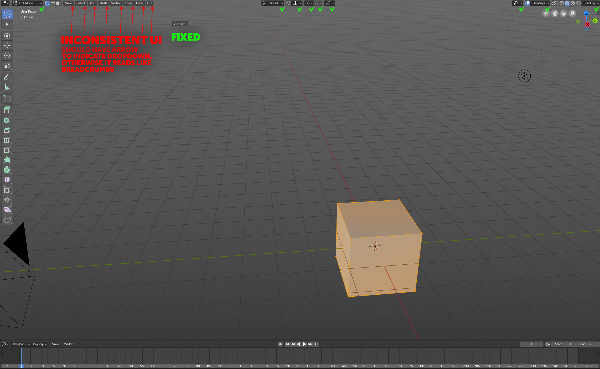
Atm the top left "3D space" menu reads like tags/breadcrumbs/labels and not buttons. Everywhere else in the UI when you have expanding menus its indicated by both color and arrow.
But not for these, they just sit there, not telling the user that they have any deeper function. It would be a quick fix I think and would make sure the UI doesnt deviate on arbitary things like this.
9 Comments
Hmm, it ads ~10px for every item. *8 that is 80px. In that space you could fit two extra menu items...
Very good point. You should create a papercut for this on devtalk.blender.org/t/blender-ui-paper-cuts/2596/399 .
will do!
+++++++++++++++++
Just thinking.... if you have time and freedom I think it would be really useful if people with skills like you could join the development team. Even if you did it on a voluntary basis it would be so helpful. You would then be in the pack and have more direct access.
Good idea!!
In the context of Blender there is no confusion with breadcrumbs because it is not a browser and the user has not navigated through each of those elements. And on the left you have menus and in the center you have radio buttons. So it's really consistent. They would also occupy a little more space.
everything that has a dropdown function has an arrow.
The UI consists of 2 main graphical approaches.
Icon button. Users are conditioned that theses are clickable and do not expect anything else.
Regular buttons That are darker and have an arrow. Once again. telling the user that these are clickable
And this third deviation that for all purposes have no apparent reason for existing like they do.
good point