
Settings for text, numbers in the viewport (color, size, distance)
Settings for text, numbers, color, distance in the viewport.
Hello community!
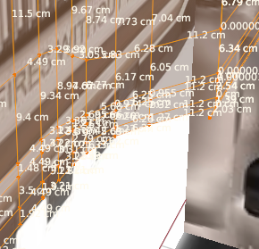
There is a very unpleasant problem, namely the problem with displaying text (numbers) in the viewport.
The problem is that due to some arrangement of the faces, the dimensions merge or are not visible at all, they are very difficult to disassemble.
The settings allow you to make some correction, but this affects the entire UI text in the program.
I would like to differentiate these settings into separate ones, for the text of the viewport and the text of the interface.
What do you need:
- Color change
- Distance from the line
- Movement along the line ( right, left)
- Text size
- Location (along, parallel, perpendicular)
- Font (Optional! )
One of the options is to overlay the center of the line with the direction along it, applying a shadow, so that the color of the line is not displayed through the displayed text - this way the text will not overlap with several colors or stripes at the same time. (Optional)
6 Comments
I was wondweing if it was possible to have a "meta" color settings that show the invert color of the underlying pixels.
Like the "inverted" mouse cursor option on Windows:
For things like this, it can really help readability without adding more stuff to display. Though admittedly, when you have many overlaid texts like here, i don't think it would work well.
Can we also get outlines or shadows for the text so that we can read it if it's over the same color?
I'm not sure that this will help much, besides, it will load the system.
It seems to me that it would be enough to choose the direction of the text, for example, along the face, parallel, or perpendicular.
It would be more convenient to have an adaptive text to the distance, i.e. the more often the grid (a lot of selected elements) the smaller the text. I think that would be enough. But this function is really lacking...
I'm talking about more general viewport text, not just for your example of text along geometry. For example, if I have bone naming on, it can be hard to read the names if they are rendered over a background that is a similar color. For example: This is just what I'm working on at the current moment, but I've also had times where I was working on something white and couldn't see viewport text at all unless I went to wireframe view mode. If the text had a black outline or shadow, it would be much easier to read it. And changing the color of the text wouldn't help because if I make the text black then I won't be able to see it against a black background.
What do you mean by "it will load the system"? You mean overload? As in, it will be too graphically intense and make rendering slow? If that's the case, people could just disable the setting if their hardware isn't up to the task...
Yes, I agree, it would be nice to do it in the opposite background color under the numbers.
Yes, I added your request to the description.
Yes, I meant performance while working.
I would like to see a universal option. it seems to me an adaptive shadow, with the effect of "Divide", "Opposite", could be suitable in any situation.
But this is really a problem, it is not solved.