
Reorganize the Side panel's tabs as drop down menu (or at least offer the possibility to do so)
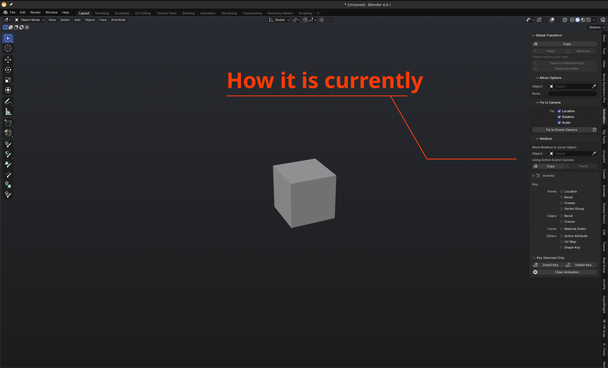
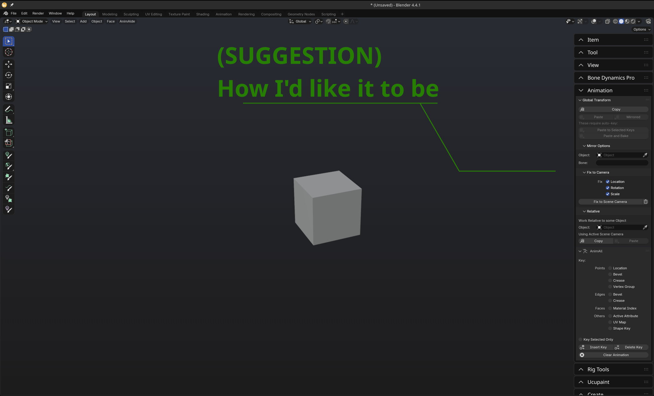
Honestly, I understand the idea behind those vertical tabs, on the side panel. It can seem more convenient, better to organize and more importantly, it optimizes the interface.
Unfortunately, by experience, I learnt, or at least felt, that it's not as useful as it should be. When you have a lot of extensions, it becomes quickly an organization of chaos, where you need to scroll the thin line of tabs to find what you need, and if you need to do it, you have to break your neck to read the tabs title.
So, here's my suggestion: being able to organize the tabs of the Side panel as we organize the options inside the tabs: by having arrows to open / close a tab, and another button to move the tab above or below others. And as you can see in the example pictures above, with a good theme, it can even look really fancier and ergonomical. Or at least, that's my feeling.
If it was possible to do that, I really think it would be a formidable improvement.
13 Comments
also the nesting of multiple items in one tab. Maybe some category system like modelling, texturing, node, scatter addons. that user can customise.
I like this
I like the ideas; please let me build on top of it: Why not employ, instead of current Text Tabs in the 3D Viewport Editor's Sidebar Region, Icon Tabs just like what happens in the Properties Editor at its left side?
In that way, we would be able to stack way more of them (and, in principle, be able to Scroll them Vertically as in the Properties Editor); the 3D Viewport Sidebar Region Tabs they wouldn't be Vertical Text anymore, but we may still have that idea of yours for the Tab's Name as Horizontal Text as that 'higher hierarchy Panel' you guys are talking about. So that we may have new Icon Tabs + (Horizontal) Text 'Super-Panel', alongside their Re-Ordering manipulator system as well, besides Vertical Scrolling system (for the Icon Tabs).
Naturally, fresh new Icons would have to figured out as a substitute for the original Vertical Text Tabs... but I undestand such UI change would pose a lot of trouble for Addons.
It is clear to me though that the current Vertical Tab system, although it may look elegant (especially if we are used to it), it's not currently very versatile nor optimal UI solution.
Here is a sample of what I mean; sorry about the inconsistencies (I've just reused randomly some of the Icon Tabs in the Properties Editor), but it's for the big picture: i.ibb.co/B5tBpCGY/Tabs.png
I have to admit this could be another solution... but as you pointed it out, for addons / extensions, it may pose another problem. It would require that we request for all extensions makers who need a tab in the side panel to create an understandable and recognizable icon, and... said this way, it may seem doable, but I don't see how you will really require such a thing.
I'm still convinced my suggestion would look more appropriate, personally.
Yes, it would be annoying to fix.
Though that Icon Viewer Extension/Addon provides a set of varied, preset Icons for Blender UI; in the worst case scenarios, a temporary preset Icon could be used for a while. extensions.blender.org/add-ons/icon-viewer/
But there is another inconvenience (in the Icon Tabs approach) that I know, from the small understanding I have of Python Coding in Blender: such adaptation might require the Class system to structurally accept Icons (if it doesn't yet) instead of Vertical Text; for example: from current <bl_category = 'Tool'> into <bl_category = 'CUBE'>, most certain that <Tool> is the String of the pre-existing Tool Tab, and <CUBE> is the String of the pre-existing CUBE Icon.
I also thought about being able to use, either Vertical Text Tab, or Icon Tab; but that could end up being EXTREMELY WEIRD, with UI unpredictable results.
Independently of everything that I've proposed, I suggest your proposition includes some visual identification for the indivual Tabs, whenever the Sidebar Region is Collapsed. This is fundamental I believe. The problem is that, I do only see, for the time being, that being done, either by the current Vertical Text Tab (which I believe we agree can be revamped somehow), or by the Icon Tab. I can't imagine anything else atm.
For me it would be good enough if there was the option to rotate tabs 90 degrees. I use Chipp Walters Simple Tabs now and can organize tabs the way i like it but it really annoys me that they are vertical.
i think there should be option to pin them in bottom of the screen with only icons visible. just like sculpt brushes.
The one issue with this that comes to mind is the same issue the "Modifier List" addon solved with the modifier stack: When you have multiple tabs open you have to either close them or do even more scrolling to go between them, whereas the vertical tabs are just a click away unless you have many addons...
...which you do, so perhaps it could all just be put in a single dropdown menu like the old modifier selection menu, which is 2 clicks to get to the menu you want (same amount as closing one horizontal tab and opening another like you suggest). Then you could right click and pin the select few you do want to keep as vertical tabs for quick access (maybe this suggestion crosses the "too many cooks" threshold XD).
I have a lot of addons, indeed, as I mentioned in the text I wrote to explain my idea.
However, I have to say that even without that many addons, I would prefer an additional drop down menu to replace those tabs. I don't count the number of times I have to switch from "items", to "view", or sometimes to "edit" or "animation", or to a specific addon's tab... even while I'm doing just a few successive actions.
Of course, I can "pin" what I need. I know that... But it would be definitely more helpful to be able to have multiple tabs open. And even without any addon, I know I would use that functionality a lot. Plus, let's note that with my system, like you can do with the other drop down menus, you could reorganize easily the tabs with a click and drop, so my "Edit" tab which is mysteriously so far from the basic and most used tabs could be moved higher and I won't have to search for it each time I need it.
( As for the modifiers list... I prefered the old one, I have to admit. I never found there was enough modifiers in the list to need a new classification. But I however don't find the new arrangement bothersome enough and I don't hate that change. )
So if I understand, you want to replace tabs by another layer of panels instead?
Indeed, that's the idea. But technically, tabs are ALREADY an additional layer. Just because it's not like the sub-layers doesn't mean it's better. And what I'm saying here is that I find that tabs are not better... at least, not if displayed and organized that way.
Theoretically you can already do this, but you need to do a lot of coding to get there. There already exists the ability to create a panel that is default closed and then allow it to open, but you would need to nest all of them in the same tab instead of in separate tabs.
Yes, probably, but I'm not a developper / coder... And if I suggest that idea, it's because I really think it would improve the interface and make it look better.
EDIT: Also, I already tried to code something so tabs look more like I want them to be, but there's really literally no way I can do this. Nothing worked.