
Frame label spacing and alignment
It would be nice if the frame would have an option to add some space between the label (if one is defined) and the nodes it contain to increase readability. Currently the label is too close to the nodes and it’s hard to read especially when not zoomed in close enough. This space could be either set to a default reasonable value, or allow the user to set it in the property panel.
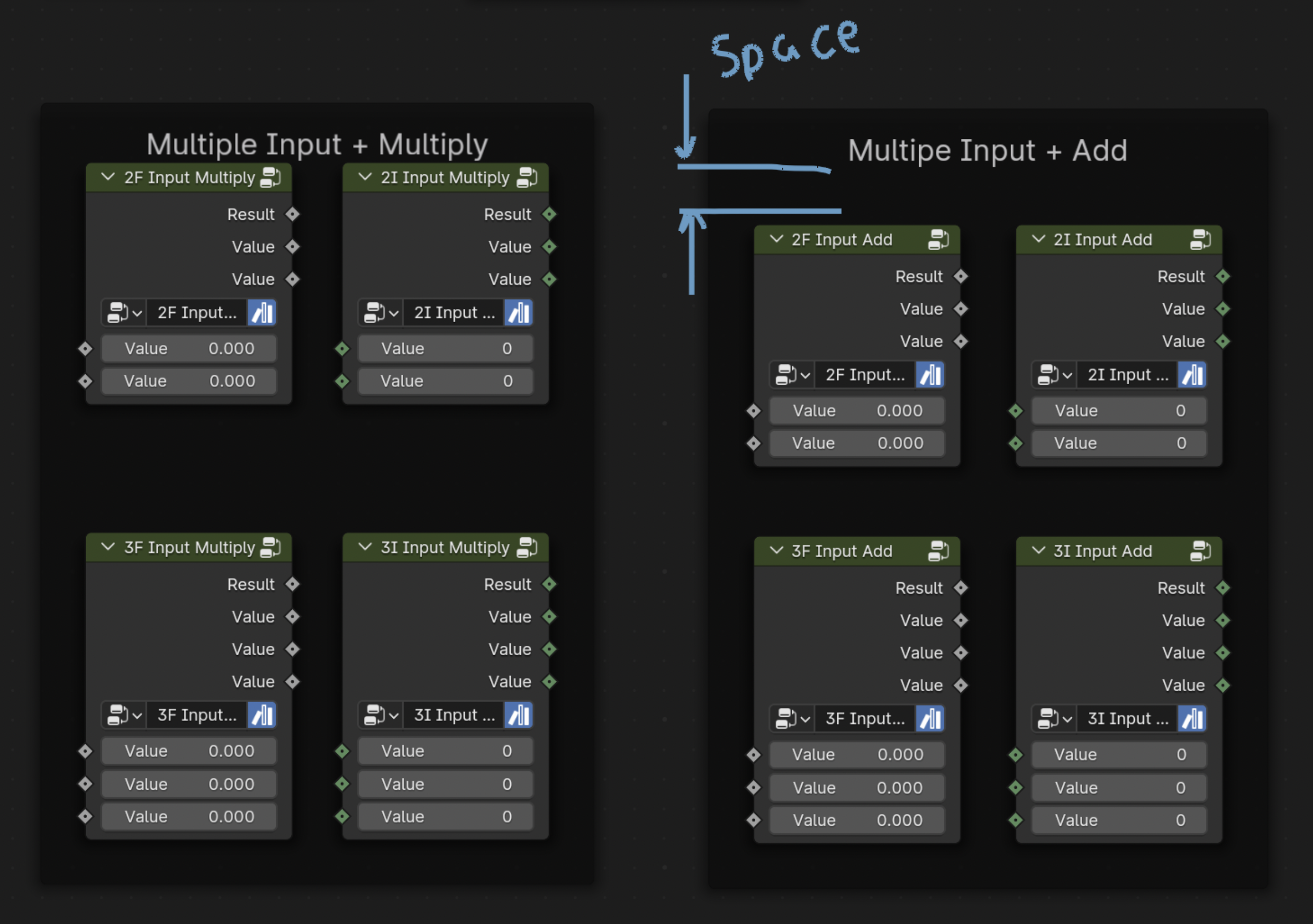
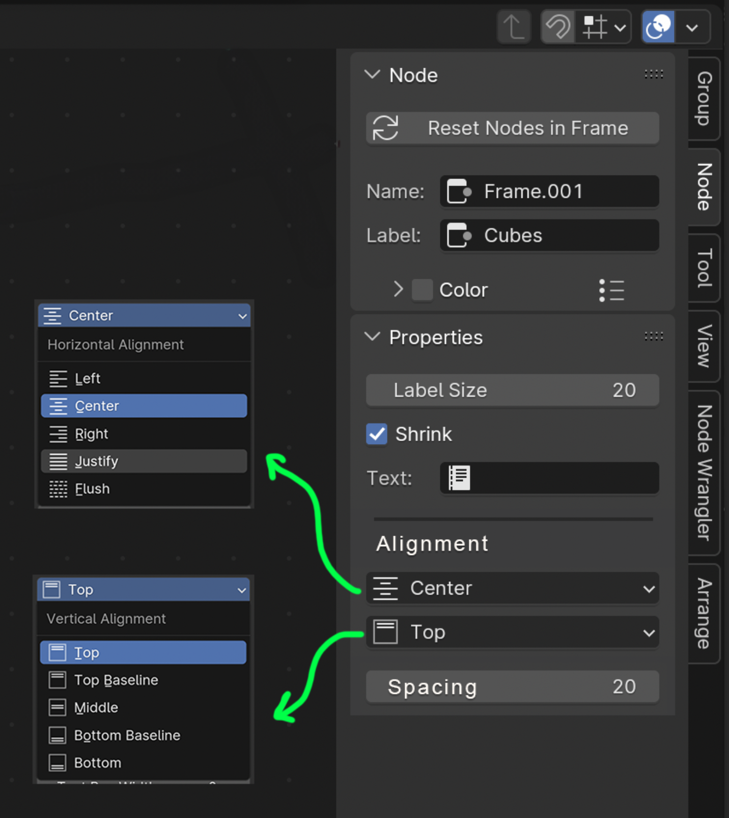
Also alignment and position of the label would be nice to have, so you can put the label either centered, at one of the corners, edges etc. The property panel could provide a setting/prop to let user select the label position within the frame. The default could be the current location top-center.
7 Comments
Upvote! I would love the labels to be more readable.
Upvote! This bugs me everytime I'm in GN.
This has bothered me for so long, yes please!!!
Could use a margin option too, either global, or per-side. Like in css:
Would love to have this support basic markdown too, but that's another thing x)
I often find myself in the same situation, where the label is too close to the nodes. Disabling Shrink and resizing manually is what did it for me. Now, I don't know how that padding will be added. I think the label can be even a text file which is written all over the frame, behind the nodes, so it should only be added to one line labels
Even better than just a space would be a line to delineate exactly where the label stops and the frame begins.
I've also wanted to have 'Close' and 'Minimize' buttons on Frame nodes for a long time. I think it would be a relatively intuitive setup to treat Frame nodes like mini 'windows' with a title bar and window decorations.
oh yes please!