
Get rid of the useless Windows title bar
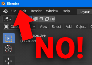
Blender currently has two top bars, the other one is useful, with buttons like "file", "edit" etc. The other one is useless, it has the blender logo (which already is on the other bar) and the three window management buttons used to close / minimize the window on the right side.
These window management buttons should be put into the lower bar, and the top bar should be removed, this would add 23 extra horizontal rows of pixels on a 1080p screen, for a total of 44,160 extra pixels of workspace.
Before (see blue top bar):

After:

The only downside of this would be that if you have a lot of custom workspace presets on the top bar, there would be no space to grab the blender window to drag it around. This could be solved simply by allowing the window to be dragged by grabbing the few extra pixels of space that is above the different workspace buttons, or by adding a dedicated grab area between the workspaces and the scene switcher:

(this is similar to how Google Chrome works if you have many tabs open at once)
12 Comments
hm.. i Don't know what to think about.. The softwares that doesn't have windows titleheader are little bit harder to move and i use a lot "windows snap" feature - i mean this youtu.be/uXAu2-nA8PE / docs.microsoft.com/en-us/windows/powertoys/fancyzones So this why i think that: if this feature will be implemented - then it should be optional feature. So i give thumb up but i wish it will be optional feature.
* @cosmical * Yeah, It's definitely better if it's optional. They should at least style the top bar to match blender's theme, currently it's really clashing.
In my opinion, the window Title Bar is not useless:
BTW, your screenshots are not representing real daily usage of Blender :) Also the workspace count may be greater than usual default ones seen here.
IMHO, the Chrome is not a good example in UI customizability. Firefox would be better, as it allows the Title Bar to be unhidden if the user wants (I do this, because it's the best place to see the page title).
Even more pixel rows (25 vs 23) can be gained for 3D viewport, if you hide Tool Settings by right clicking on area header ;)
P.S. BUT I agree, that such option has it's right to exist and if it could be turned on/off in preferences - why not :)
BTW, we have already talked about this recently , also here ...
you can go to "window>toggle window fullscreen"
Window - Toggle Window Fullscreen, not the option? you need bottom OS bar too?
* @Eugene D * Option but not the best. Why? Because it hide taskbar too. So it good only if you have 2 - 3 displays and your taskbar not on same with maximized Blender.
I like how Photoshop window look in this case.
* @IIIFGIII * I think the main reason to not get rid of title bar is file path. It can be very long in some cases. Personally for me, I like to see full path to my scene file. And how to implement it without title bar I don't know...
This is breathing space and it is needed in every program window. You cant fill every space with buttons and text.
* @mrajendra2150 * It isn't necessary in every program on windows. I have a apps downloaded. That handle it in their own unique way.
I'd argue that a row of empty space on the top of your screen doesn't make you any less anxious, like a breathing space would.
* @mrajendra2150 * The JetBrains ecosystem handles it well.
The Windows title bar is completely gone in their apps.
Repeated often blender.community/c/rightclickselect/7dhbbc/ blender.community/c/rightclickselect/pddbbc/