
Blender2.8 Interface Structure Proposal
Edit: This idea was really big and some ideas have been pick, other not, so I think that it's outdated righnow.
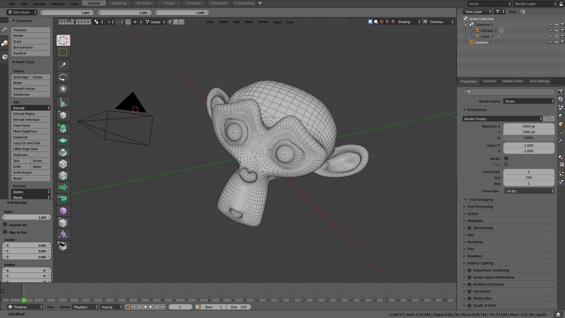
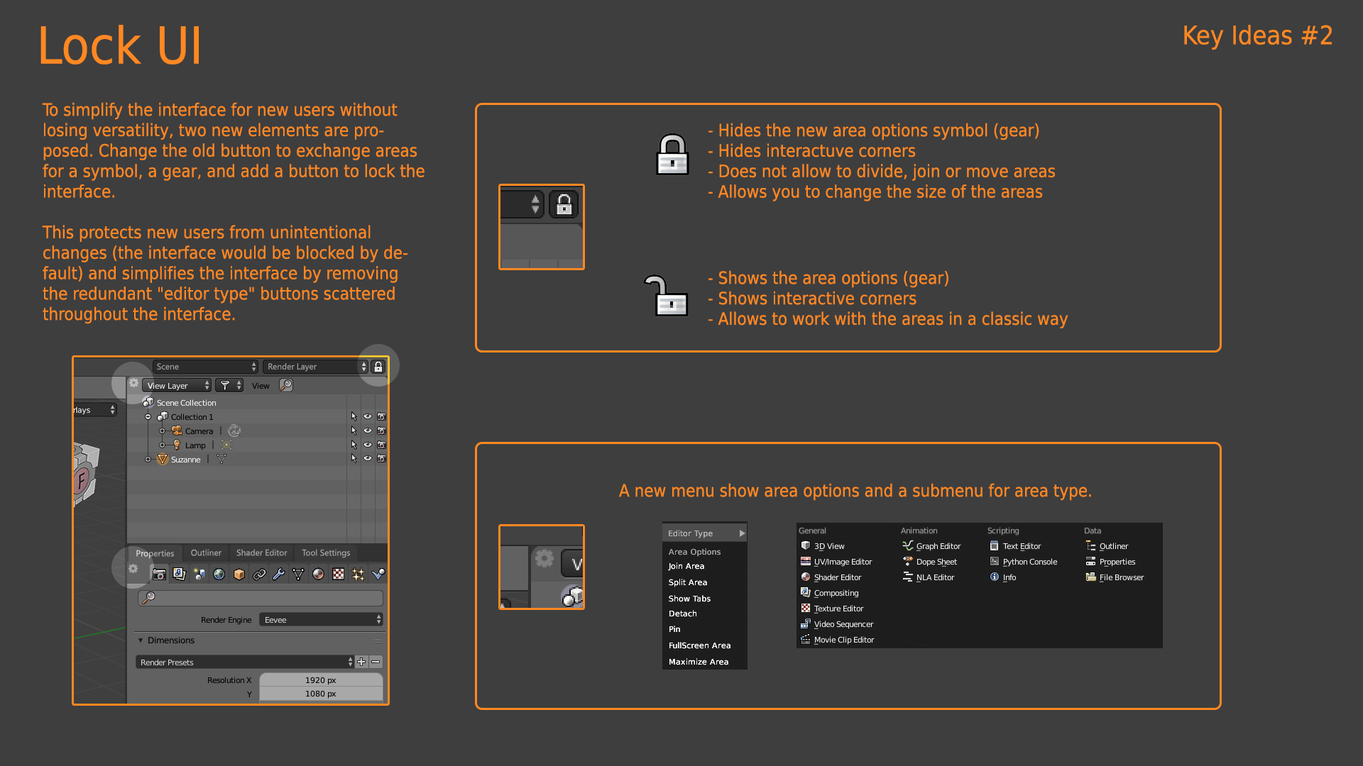
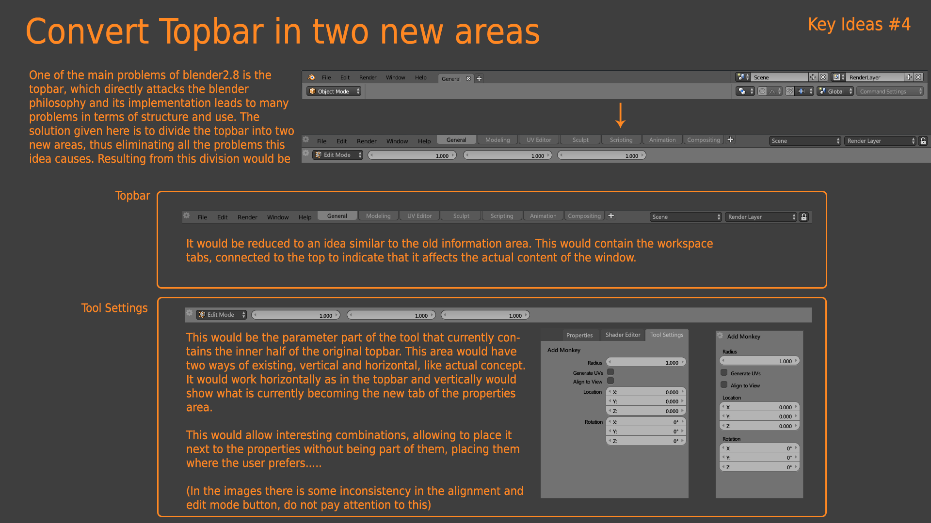
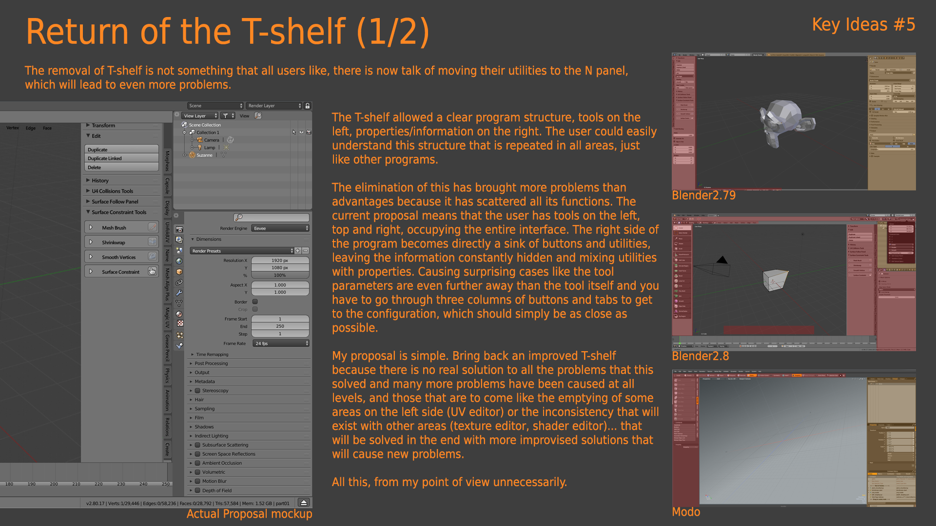
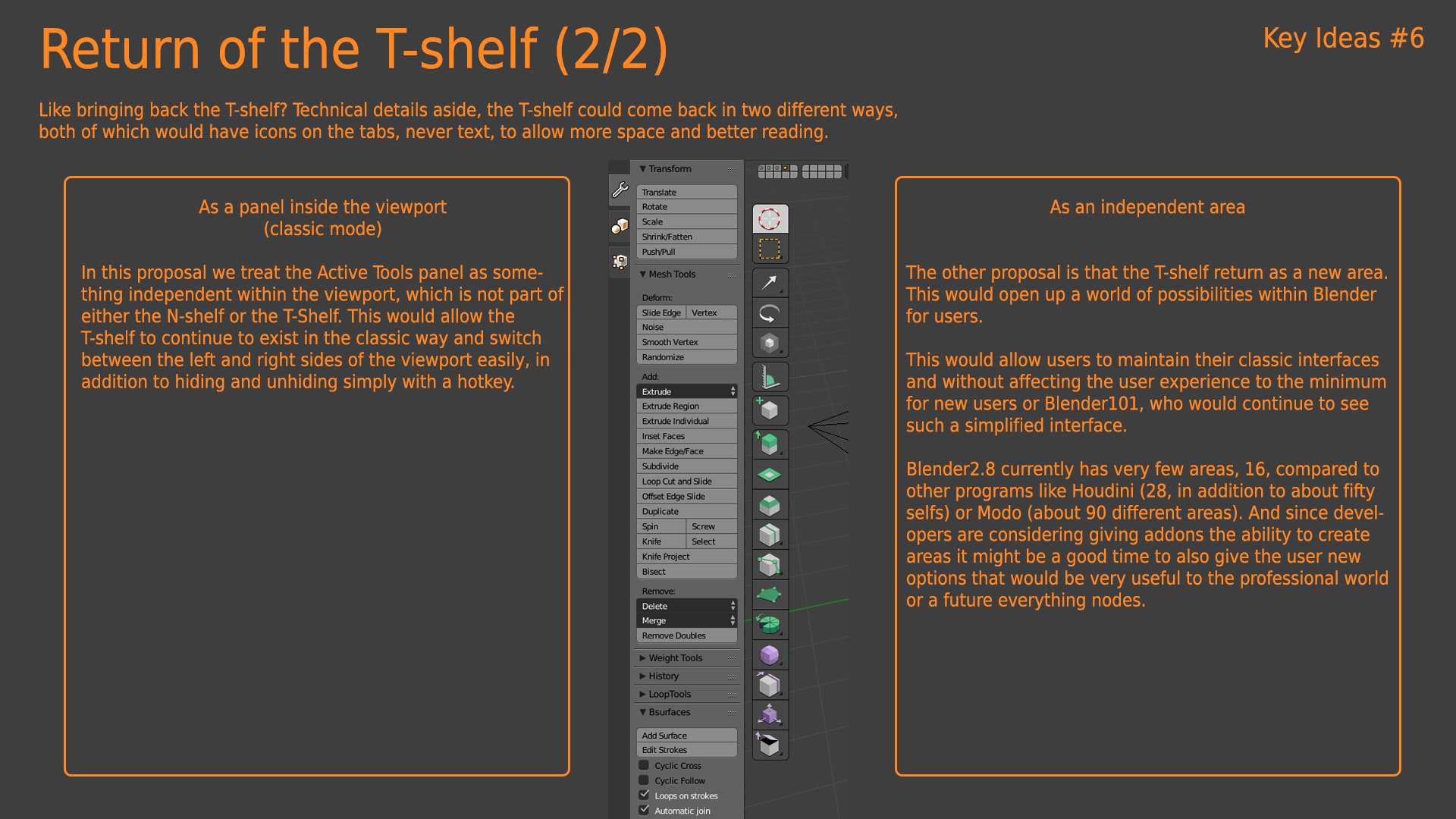
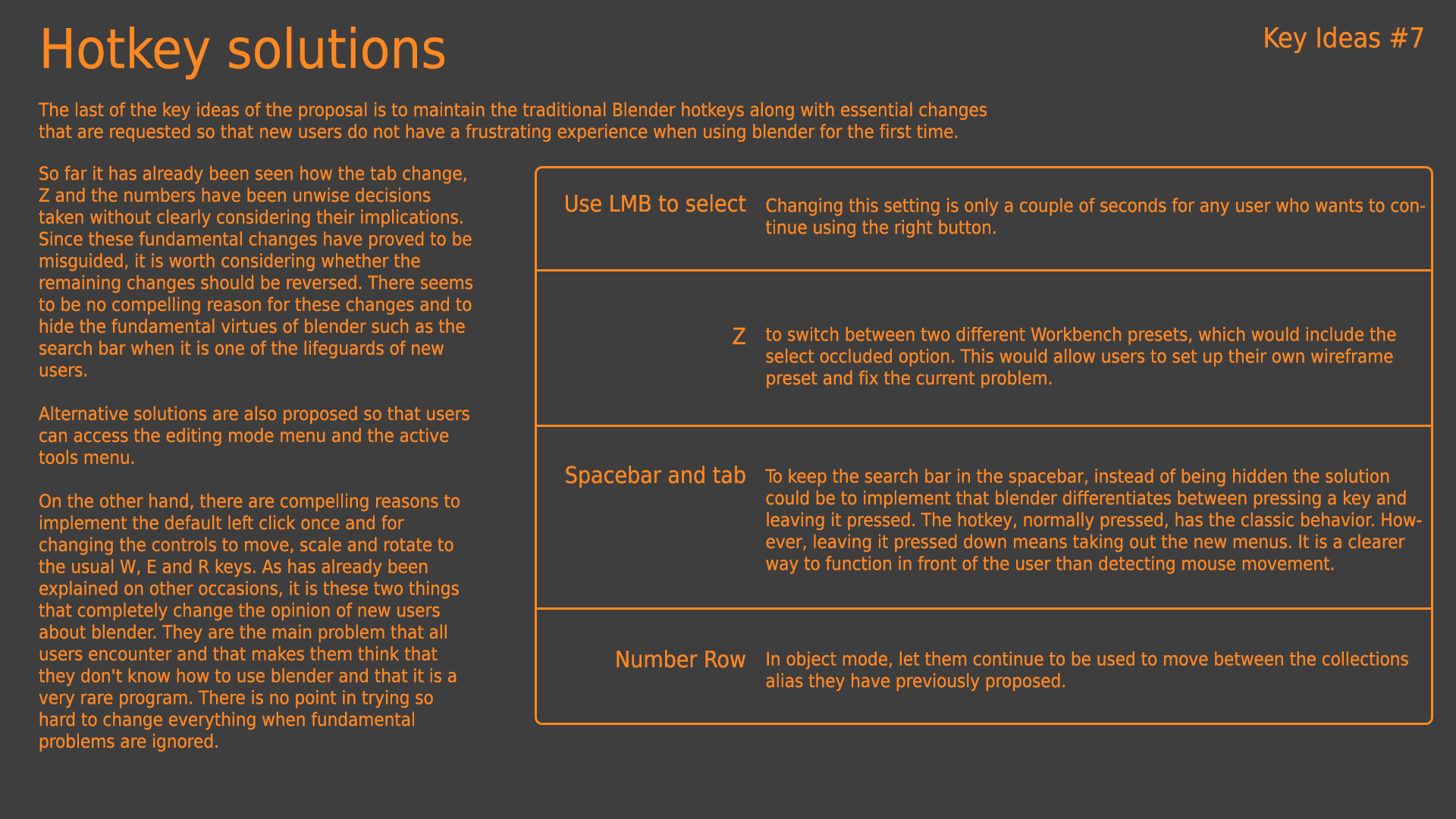
The basic idea behind this interface proposal is the return of the T-Shelf, allowing to block the interface and divide the Topbar into two different areas (as it is now divided into upper and lower bar). Some things, such as the return of the 1,2,3...0 hotkeys to show or hide layers are not so necessary because they have returned to blender2.8, which did not happen at the time of creating the proposal.
On the bottom of the Topbar, since its future usefulness is not clear, its content is not as important as the way to implement that area. Although I believe that some proposals could be made in this regard, different from those being made by other users.
About the T-shelf, I defend its return for several reasons... primarily because it is clearly a very elegant solution to all the interface problems but it is also what we were told that Blender2.8 would have when it came to requesting funds for the codequest, a user-configurable T-Shelf, and not its disappearance for no reason or no reason after the collection of funds.
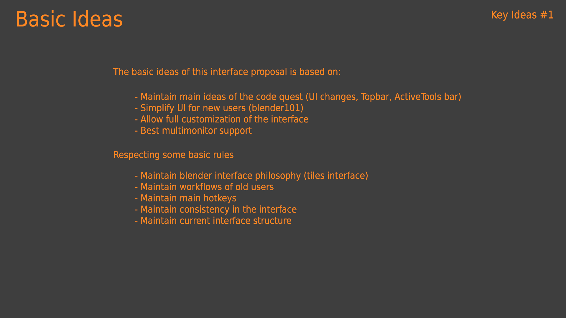
The basis of this proposal is a design that unites both the new ideas coming from the codequest without losing a single one of the current functionalities and workflows of blender. Combining all the ideas of the developers with the needs of new and old users, amateurs or professionals. The aim of this proposal is a transversal interface, which can be used for Blender101 and for the most extravagant poweruser.
Interface proposal mockups

Key Ideas

Extra Mockups
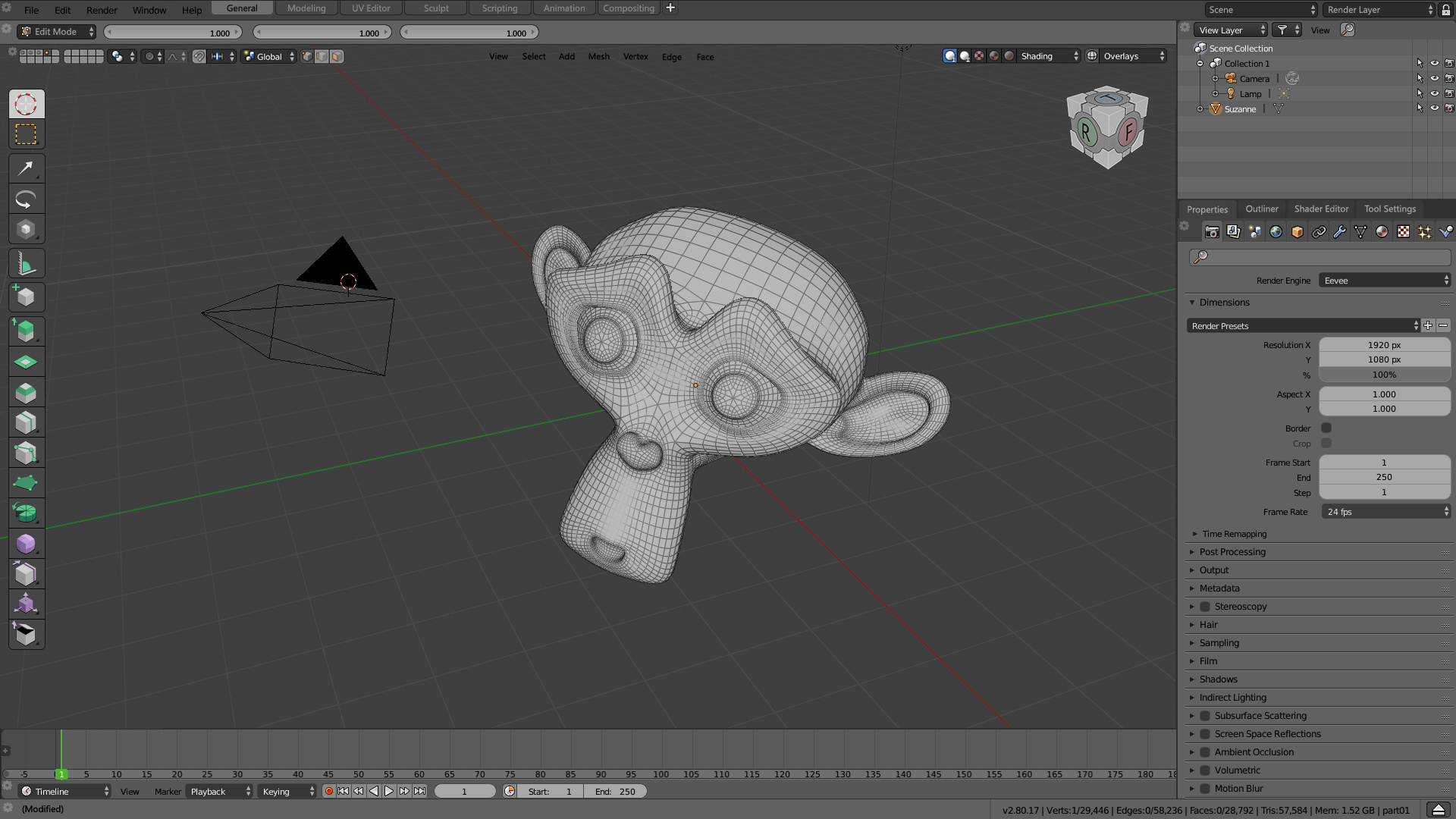
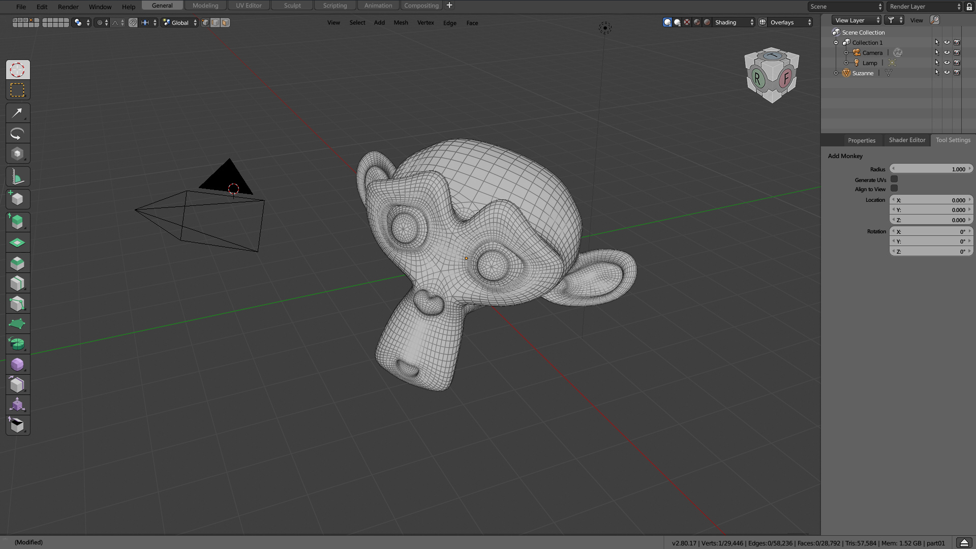
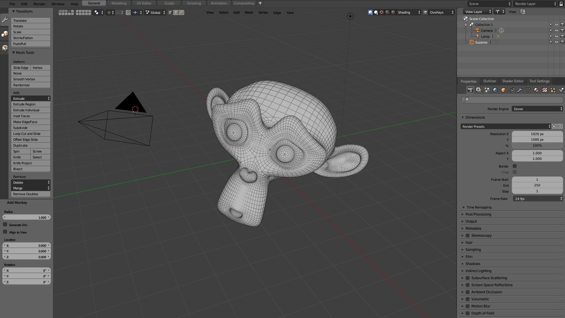

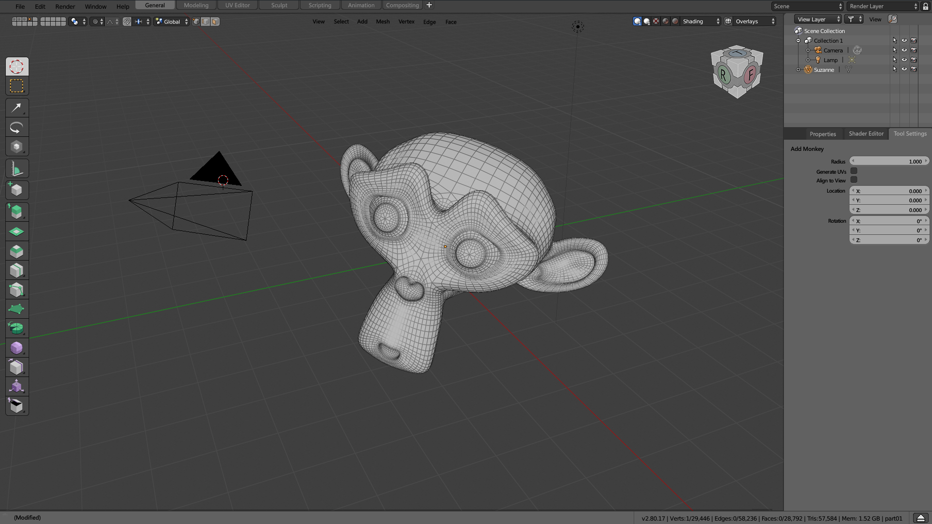
10 Comments
Some thoughts about your suggestion. I have already offered some suggestions here. Maybe you will find it interesting.
- Tabs - Bottom Stripe
@forestgumpovu4:
In general I understand some of the suggestions, but keep in mind that I try to bring together the ideas of the UI team, not just throw them away.
-Blocking the interface is basic, it's what new users fail the most, even though it hasn't happened to you and me. And frustrating them into learning is not a solution. I don't make the proposal for myself because I work almost all day with only the 3D viewport, I make a proposal for ALL users, new and old.
-That I proposes that the area menu contains the options shared by all the areas instead of being in the "view" menu mixed with options for rendering, displaying, navigation,... Doesn't mean I don't know these menus.
-Currently you also have a menu to join and divide areas, and I don't think you've ever been bothered if you don't know it.
-Empty spaces are spaces where there will be information when necessary, right now you also have free space in many places, like in the T-Shelf tabs, and nothing happens.
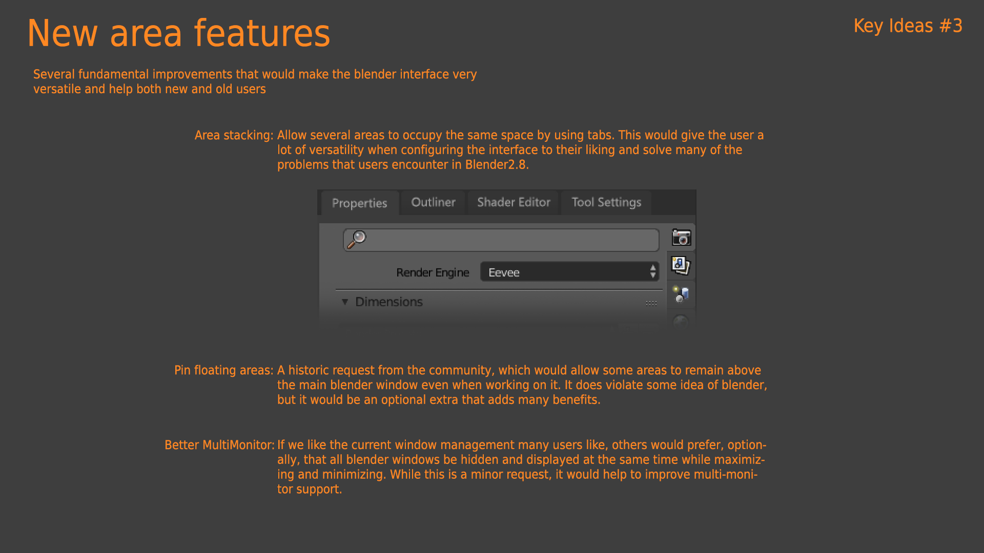
-I don't care about floating windows, but it's something that a lot of users ask for, and I wanted to add it because it doesn't bother me. And yes, there should be the option to make it floating because if it doesn't disappear behind the rest of the interface. I know Ton is not in favor of floating windows, but I wasn't in favor of many other things that are being done on blender2.8 that users have never asked for either.
uhm.. I don´t know if anyone already saw, but with "each" proposed solution to stay on the current grounds of the UI, Blender is looking more like MODO. I´m voting down on going back to a vertical TOOL bar. Sorry.
@3dcinetv: I don't care if blender naturally resembles another program. I only propose to respect the current concept of interface and customization, not to copy any other. If implementing tabs is to copy MODO (and to 99% of the programs)... all is to copy modo.
At no time does my proposal force you to continue to have the t-shelf, as I show in the mockups. I think it's pretty unfair to vote no to harm the workflow of thousands of users when it doesn't affect you.
@alberto3d.1984: I didn´t remove the (T)ool bar. The Devs did. Please focus on your critique when you say "pretty unfair to vote no to harm the workflow of thousands of users when it doesn't affect you." <- I didn´t eliminated the (T)ool bar. It was part of the blender manifesto back in January. Please check your sources. Thanks. Don´t aim it at me.
@3dcinetv: But you're the one who's here voting against it coming back when it doesn't affect you. Not the developers.
You're the one who wants to hide the fact that many users want the T-Shelf back. You're the one who's being selfish and trying to annoy the one who doesn't do anything to you.
I also made some similar proposals a while ago. blender.community/c/rightclickselect/1Bbbbc/
The T-side panel bar thingie always annoyed me, so I'm voting this down, too. I know you went to a lot of work, but I'm sorry. I'm just not a fan.
@rontarrant: I didn't know there was so much child here.
I can't find another explanation to vote no to a whole proposal for a feature that can be disabled and it doesn't bother you in the least. It's like voting "no" on all animation proposals because you're not an animator. It's so ridiculous....
@rontarrant: Generally, i find the option to vote down a proposal ridiculous. Some people, although not finding a proposal productive will not down-vote it out of courtesy for the uploader. That leaves the destiny of the vote count at the mercy of the taste of the ones that do have the down-voting as a habbit.
I'm up-voting this without looking at it's quality.