
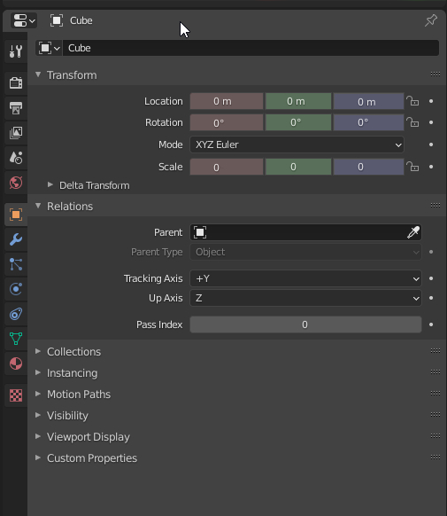
UI uniformity : Transform vectors treated as a single type on single line.
Transforms are internally not just 3 floats but a dedicated vector data type. So it would make much more sense if those were treated as a vector type on one line as well.
(For example the color, which is internally also vector type as well made of 3 floats, structure with 1 vector and 1 float when alpha, we dont have red, green, blue on 3 separate lines, so for uniformity, same should apply here.)
That would allow to save quite some UI space and readability as well. A color for each axis would also help visually. This would be nice change for properties, but also for nodes to make them simpler.
6 Comments
What about when you set a keyframe and the color has to change to reflect that? Also x, y, and z can be keyframed individually and the current UI allows each to have the diamond keyframe and lock icons next to it and that is very good for consistency with the rest of the UI.
* @thinsoldier * Agree on layout vs. keyframe diamond. I do like the color idea, though. Some options for when a keyframe/driver is set (ordered by personal preference):
Issue is, the current UI allows to:
With your proposal, we lose the second feature that is extremely powerful.
Agree but only for colors. I think the space is good and intuitive. Without the arrows to increase/decrease each value, it'll be harder for the beginers
* @Kdaf * Yes, subtle XYZ=RGB colors consistent with the gizmo would be a great orientation aid.
This would save so much UI space and the colored axes are a nice touch. <3