
Rendering Icons Proposal
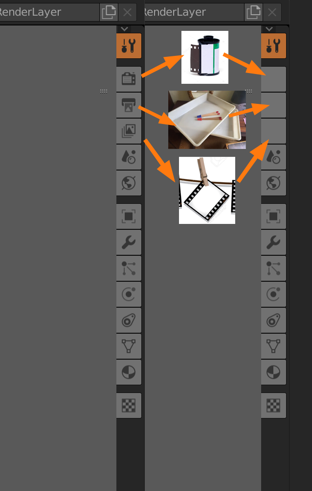
I like the new 2.8 icons. Somebody did a really great work. But still not perfect in all cases. I suggest in the 3 icons related with rendering, to make a simile with traditional photography process.
1- the process of to chose the right photographic tape for your shoot 2- the process of transform the tape to the paper in laboratory 3- the final laboratory steps, like choose the best paper shoots
Because, more or less, that steps still match with 3D art process. Hope you like this proposal, thks
1 Comment
the UI is locked right now, so it's not going to change for 2.8. That said, personally, I think the current icons work just fine. Your icons make sense to you because you understand the physical analogue between the icons and real life photo development, but plenty of people (like myself) have no experience with it and therefore it's just more abstract iconography that I have to memorize anyway. In that respect, the current icons are actually MORE intuitive, because a modern photography workflow is Camera->Filmstrip in some software like Lightroom->Stack of photos. which are what the icons are.