
Unified Timeline Editor
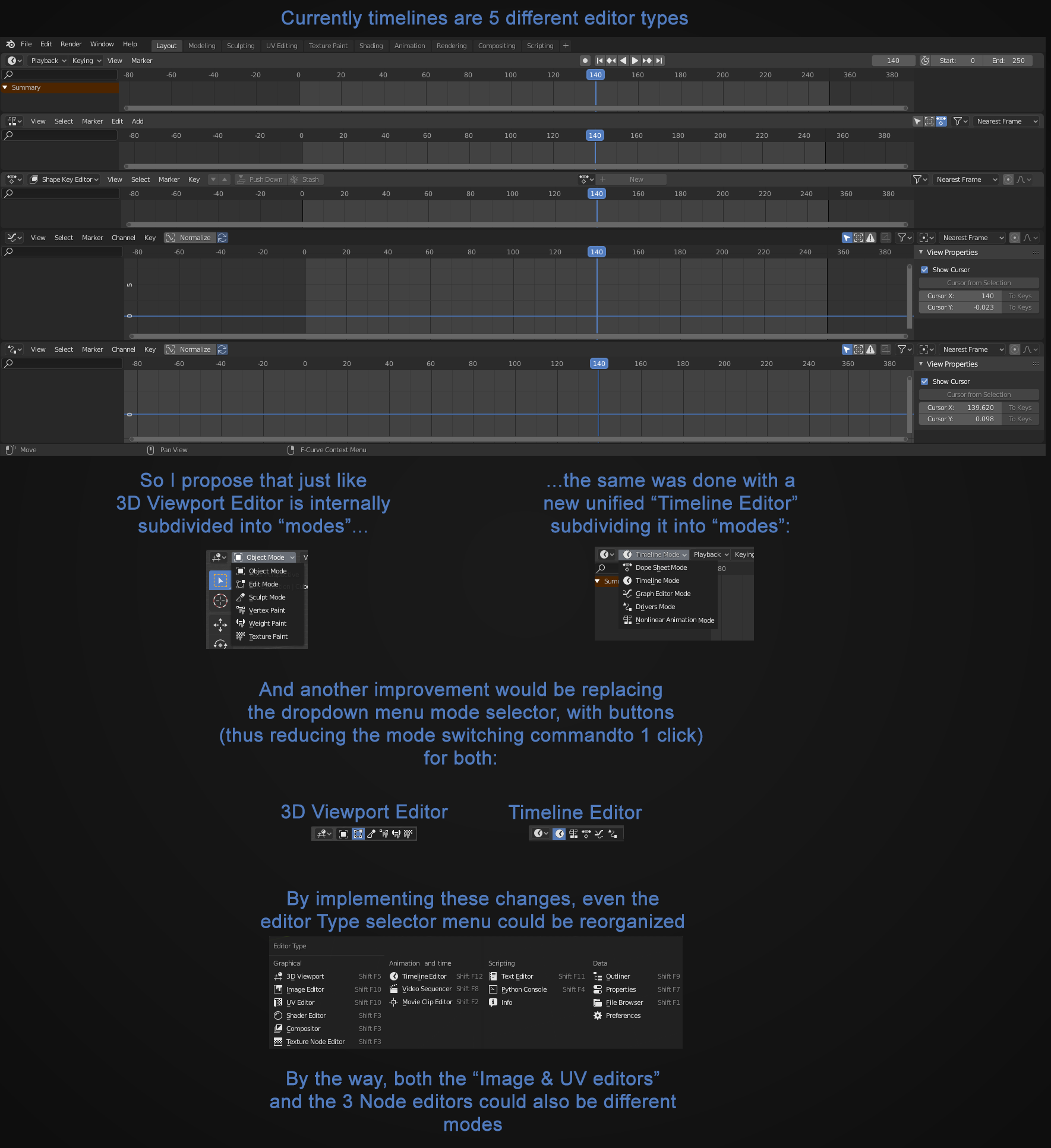
Since I started using blender I always though that there was no need to have 5 different types of timeline editors. Instead of this, would be better to have all of them inside a single editor, like the 3D viewport, and INSIDE it the software could present us different "Modes" exactly the way that 3D viewport already works.
Since blender is made up of different areas that could be split and joined togheter the way user wants, theres no need to have many different "area types" (editors) since they could work in different working modes, as we can see in the 3D viewport, wich is and had always been very well organized!
I also take the oportunity to reinforce the idea that I already proposed to present the different edit modes inside a given editor in a line of buttons, instead of a dropdown menu, since it would take a "1 click operation" to switch between modes insted of 2.
18 Comments
Actually i think it would be better to have 1 type of timeline editor with filters, so you can see keyframes for grease pencil, alembic data, objets, armatures, shapekeys, all in one single dopesheet, and just filter things out when you dont want to see them instead of hacing 10 stupid modes that dont work with eachother.
* @Luciano A. Muñoz Sessarego * Definitely would be amazing, no time wasted scrubbing through multiple timelines that never line up. It would be the same as filtering cameras, objects, lights, and everything. Please make a proposal for this!
* @Luciano A. Muñoz Sessarego * It´s a goog idea too!
I love this idea! I think the same could be done for the uv editor/image editor, and turn it into one editor called the 2D editor.
* @Quinten.Pillen * Exactly, I would also like to see the time editor called the "4D editor" , and then all the text editors merge and be renamed to "1D editor".
* @Quinten.Pillen * Yes! I was thinking about that, and not only the UV/Image Editors could be grouped toghter but also the 3 Node editors could be group as well!
i love this idea, it's ridiculous how many modes blender has, switching should be seamless & this might help a bit.
This is a great concept, even if it would require a lot of work. My suffering is not being able to transform some animations together - like NLA strips together with keyframes, but I guess this combination is individual for everyone, somebody needs to transform Grease P. keys with object animation e.t.c.
What I'd suggest is to double the 'summary' dopesheet line - to have one for everything in scene, and second for selection. I usually use the summary lines to animate everything, but have one editor to have the selection filter on, while the other to have it off.
* @vilem.duha * yeah, I had to do some retiming for an animation the other day. I had to do the dopesheet keys, grease pencil keys, markers, and sound separately. re-timing is a bit of a pain at the moment.
What you're proposing is similar to how it already was in 2.79. There are reasons the Editors got split. Having different Editors for each task frees the Header of the Editor from having to have a modes switcher, so it's less cluttered.
I'll guide you through an example to help you see how it works. Go to the default Animation Workspace and look at how it is. The Timeline Editor is right at the bottom and isn't even expanded so you only see the header and can use the playback controls and other general settings. This eliminates the need to have the playback controls on other animation type Editors (I just remembered someone who wanted to put the controls in the other Editors as well and it made me shudder from the clutter...).
On top of that is the Dope Sheet Editor. It looks fine as it is and the Header isn't cluttered. Now imagine you need to use the Drivers Editor and you want to put it right beside the Dope Sheet Editor. Look at how the items of the headers don't fit anymore and you have to scroll (you might have a high resolution monitor or even an ultra-wide one, but that doesn't excuse unnecessary clutter). Now take a look at the Dope Sheet Editor's own mode dropdown and imagine having the same thing before it. Now you see even less of the useful part of the header. And in your proposal there would be one in the Drivers Editor too, so even more clutter.
Do you see now why they were separated? Being their own Editor they only occupy the first icon dropdown on the left, making room for more useful things that are actually used inside the Editor itself. That's also the reason other Editors were split, so they could have more space for specialised things in the Header.
The reason the 3D View Editor has different modes is because there's just no way around it. You switch between 3D View modes way more often and it's the main workplace for most things you do in Blender. It's just that special of an Editor where the modes are an integral part of the Editor itself.
I do agree with changing some dropdowns to icons like in the case of the Dope Sheet Editor (and maybe even the 3D View?) where there are six items and it would be almost the same width but will get rid of one click (although you could argue that it's already one click if you just hold on the dropdown and release on the mode you want).
* @Alexander Chaplin Braz * I understand all of this, but I think we could work around this problem. Many motion designers and artists are used to have one single timeline space in the other softwares. And, as you said, in many cases to have a drop-down menu replaced by 6 square buttons would occupy the same space and would be a 1 click action.
* @Alexander Chaplin Braz * And more, looking here, we can see that the options, menus, buttons, etc, available in each "work mode" would expand and colapse in a way that will make room for the inline switch-mode buttons
why has nobody else liked this. 🙄🙄
I strongly agree with this direction. After Effects, Unity, and a Blender Addon called Blender Sensei do a much better job consolidating these. It is important Blender does too because it is designed to work on one monitor unlike Maya's mess. For one, the timeline and Dope sheet can and should be merged with no problem at all. Usually, the graph editor is added with a toggle but The NLA strips can be merged as well but that would take some work. I would definitely support another code quest for this.
* @wondraknathan * Yes, but I think that before they all became merged together, at a first time they could at least be individual "work modes" inside 1 area. I think probably this initial aproach wouldn´t require so much effort like literally merging them in one (witch would require a set of buttons, panels, tabs, menus, etc). So maybe it´s a good start.
Cool! And I'm definitely all for getting rid of dropdowns.
* @michael * Yes! In all those cases I´ve said, in 3D viewport, sequence editor preview, unv/iamge editor, all of dropdown menus tht deals with "modes" could be replaced by a string of buttons!
yeah, this is really good idea. +