
Pinning, detaching and layout improvements for popovers and drop-downs.
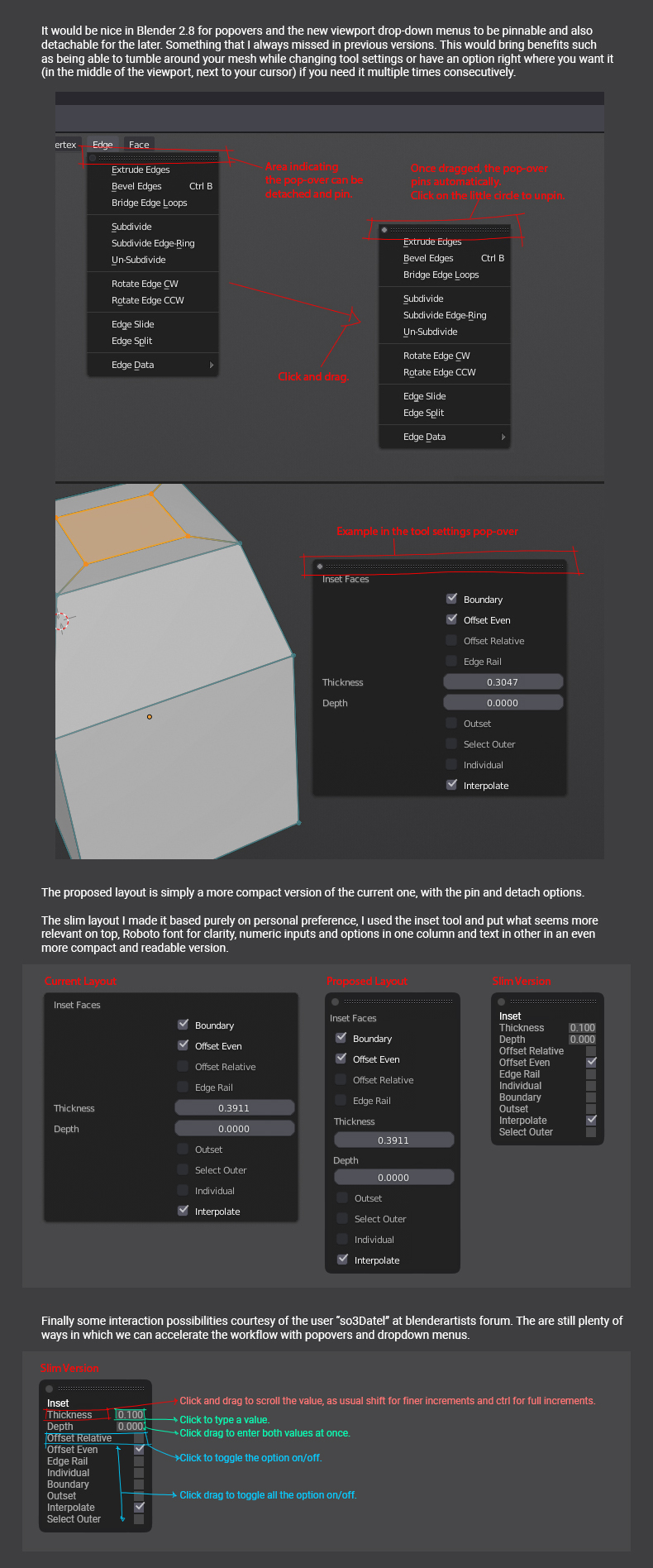
It would be nice in Blender 2.8 for popovers and the new viewport drop-down menus to be pinnable and also detachable for the later. Something that I always missed in previous versions. This would bring benefits such as being able to tumble around your mesh while changing tool settings or have an option right where you want it (in the middle of the viewport, next to your cursor) if you need it multiple times consecutively.
Please click the image for the mockup and explanation.
25 Comments
Softimage, Maya, C4D and others have this, and I can't overstate how USEFUL this is. I hate having to popup over and over again to change items - also hate having to use headers over and over again. I want to build a mouseover + click once workflow to use all the tools hidden away.. option to tear and pin floating panels would be awesome.
Great proposal. For power users having redo last panel hanging out in 3d view is much more convenient than constantly bring it with shortcut. You can't please all users with default, just give them chance to customize layout however they want.
I love this, it reminds me a bit of how the tool panels work in Illustrator (and other Adobe programs in general). I really hope to see this functionality making its way into Blender 2.8 :D
@Julian Perez: Yes it would be neat indeed. Currently, the Red, Green, Yellow, Blue do not make too much sense. For example, when a user wants to extrude a face,,a pop up can appear with the options of
These 5 things an appear each time someone clicks on 'extrude' or 'inset', perhaps bevel can have its own options?
@eemk117: This is just an example with the inset tool, every tool should of course have it's own set of options. The colors are only to show possible interactions with sliders and checkboxes
@pintorfj: great. I agree. I hope we get some response from the developers if this will be implemented one way or another.
@pintorfj What you are suggesting is actually pretty standard on apps like c4d etc... The main issue in blender (besides detaching) is that the menus don't stay visible/on top when your mouse is not hovering it... If they could stay on top, there would be no need for a pin feature either.. So once the menu is detached it must stay there on top until you explicitly close it... Oh and btw, be able to dock the detached menu anywhere on the interface like c4d would make things even better... See this gif:
@theredwaxpolice: I use Maya daily and it's dropdowns can be detached but they turn into floating windows, this proposed method is more elegant I think and similar to how Modo does it iirc. Not familiar with C4D but it seems to have lots of great features.
Totally down for this !
This is not toooo far off the concept in the workflow here: blender.community/c/rightclickselect/DCbbbc/lock-watch-and-update-modes-for-individual-panels
@ondraise15: I wasn't aware of that one, sounds like a good idea too. Everything that involves pinning and detaching is good in my book
I was just going to post a new topic on this but saw your post. I agree with this. However, I'd just like a pop over for certain situations. Please see the link provided. I'm on my phone so can't upload pics that I want to show. devtalk.blender.org/t/pop-up-menu-for-extrude-bevel-inset-faces-and-the-like/652 Basically, a simple pop over as you mentioned for operations such as: extrude, bevel, inset, etc., something like 3ds max has and perhaps other software has.
Somebody asked about this in one of the livestreams and the response/problem was what happens when you switch modes and the panel doesn't exist, or in two different modes you open panels in the same place and then you go into a mode that both panels can be opened, they would be on top of each other.
I'm not against it though, just mentioning that, I wouldn't care if they overlapped plus I really really like the parameters in the menu idea,. I think in general we should have more control over what panels are where and be able to move them about, stick them against a side or something wherever I want (like photoshop), have them auto-collapse and hide themselves. That would be awesome.
@alansartlog: Yeah , that definitely is an issue. William was poitning it out in the phabricator thread, although it seems logical for them to dissapear as you are exiting the mode where those options live. It would be nice to try it and see how it feels if they decided to implement it. I wouldn't mind for dropdown menus to stay greyed out if you exit their mode, especially for those cases when you want to toggle back and forth between edit and object mode.
@pintorfj: Autoclose on mode change, makes sense.
Has anyone read the Blender UI paradigms since the distant 2008 and before? wiki.blender.org/index.php/Dev:2.5/Source/UI/UIParadigms This and many other proposals, sometimes 'exotic', respect it?
@Niobio Cappelli: Yep, 10 years ago, trends change and workflows evolve, besides this doesn't break any of that because it is optional.
@pintorfj: you have not read this document, true?
@Niobio Cappelli: I believe you are refering to the non-blocking non-overlaping part of it?
@pintorfj: Throughout the document, the sticky button can solve a speed problem with the 'classic' hotkey. Well, you read this document that IMHO did not know existed. My goal was to make the paradigms of the UI Blender read
@Niobio Cappelli: I'm not sure I follow you. You are trying to lecture me in the Blender paradigm without understanding my proposal, I'm familiar with the sticky modes for the active tool and I use them daily but this proposal tackles not only tool settings but all pop-overs and dropdown for tools and modes.
@pintorfj: who tries to follow the development of the blender 2.8, knows of a implement of the new and configurable right bar N, I think it will be called, Property area. if William and the Blender developers have not changed their mind. Personally don't like waste 3D area with panel, as you write in Blender Phabricator, with greyed area of inactive tools
@Niobio Cappelli: I read about the new N panel, sounds interesting but I don't think this proposal interferes with that. I personally like the tool options to pop under the mouse cursor. I do agree the mode changing seems to be an issue though but then again this optional so the default behavior doesn't change. I hope they can come up with a solution that satisfies most folks.
@pintorfj: I do not see many people around this proposal here and I think this, as a part of the other proposals that I have read, is a waste of Code Quest time and resources of William and developers, As always IMHO and peace
@Niobio Cappelli: That is fine, everyone is entitled to their own opinion, thanks for sharing yours.