
Enlarge the Splash Screen
It would be nice if the splash screen was 2-3X wider, so that recent file names weren't displayed as truncated.
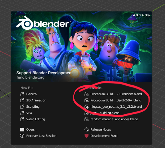
I see that the current width appears to be determined by the ratio/width of the pretty image, but the image is the least useful element of this dialog box.
10 Comments
Lets make blender be better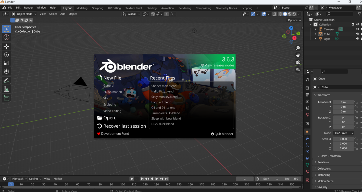
Of course splash-screen could be better, but just "3x wider" is funny, it would literally get full screen on a 15 inch laptop.
It's only 1/3 of the screen on my 13" laptop.
(But yes, 3x larger - on any screen, is certainly more than we need.)
I mean, you shouldn't say "just enlarge the splash screen" you should say "more space for file names..." there may be different solutions to the issue.
Just opened up blender on both my work laptop and pc with a bigger monitor and didn't have problems with either. Are you sure you're not naming your files extra long to prove a point? Also I think the point of the splash is more for new users and to look pretty than it is for you to actually remember which project you're using because in most cases you're working on the latest file or opening it directly. Also this seems like it could be fixed by moving the right columb a bit to the left since there's plenty of space
Here's 2 examples that I didn't even personally name:
GooEngine_ToonShader_Demo_3_6_01.blend
higgsas_geo_nodes _groups_3.1_v2.2.blend
Here's one of mine:
Building_FULLGEN_v2 spline windows DV1.blend
Those names don't seem pointlessly long to me.
I didn't have to fake it.
Wrong. I might be working on a previous version 3 back.
Well, one has to - when the dialog box doesn't show the full name.
Then let's go full-stop on that, and remove all the text from it completely, instead of offering users a dialog box with cut off text.
The box on my screen is 495 pixels wide. Who's the targeted new user, whose system can't handle a wider dialog?
Professionally I think those filenames are good if you want to be clear what's inside for someone you're sending them to, but I'd never name anything inside a production that way.
The screen shows the begging and end of the name so shouldn't versioning be clear?
But as I said if it's really a problem I guess the column could be moved to the left for more space
You can't just move the right column to the left, because the width of the text on the left changes depending on the language selected.
Not necessarily, no.
Consider this example:
Files would be displayed something like:
The v1 is split, or unsplit? The top v2 - same question.
It's not 1998; we're not using 800x600 monitors. Why's that box got to be small enough to work on a mobile phone?
BTW, tooltips shows the full name, just in case.