
Convert the N-shelf to the olf T-shelf
Since the loss of the old T-shelf many users, especially those who use tablets, we have lost much of the functionality of blender and simplicity to reach many options and parameters.
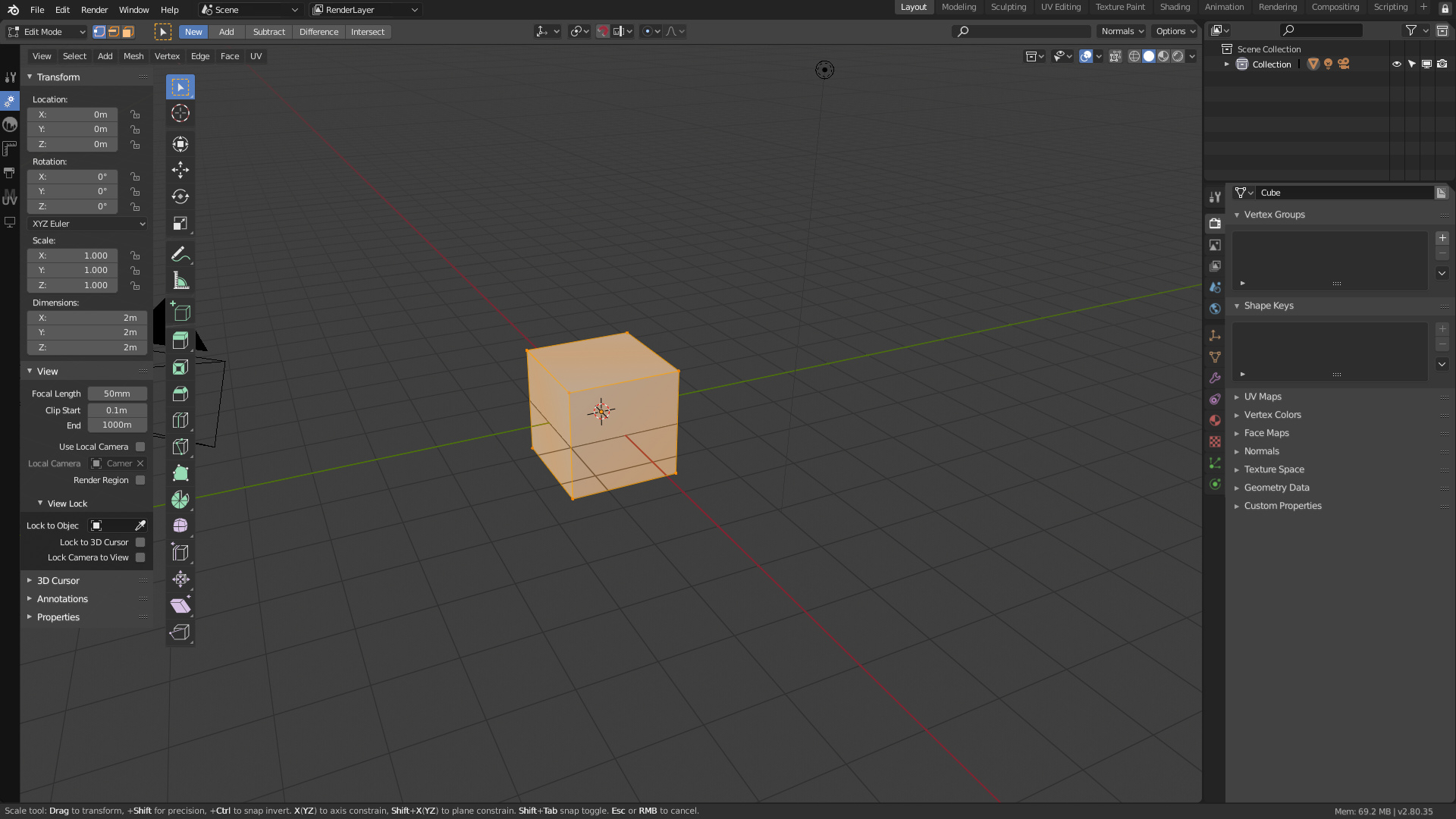
As the N-Shelf is becoming the new T-shelf my proposal is very simple, to make a few small changes in the N-shelf to allow the user to want to maintain the behavior of the old T-shelf without compromising the current interface changes at all.
The idea is improve the N-shelf to this
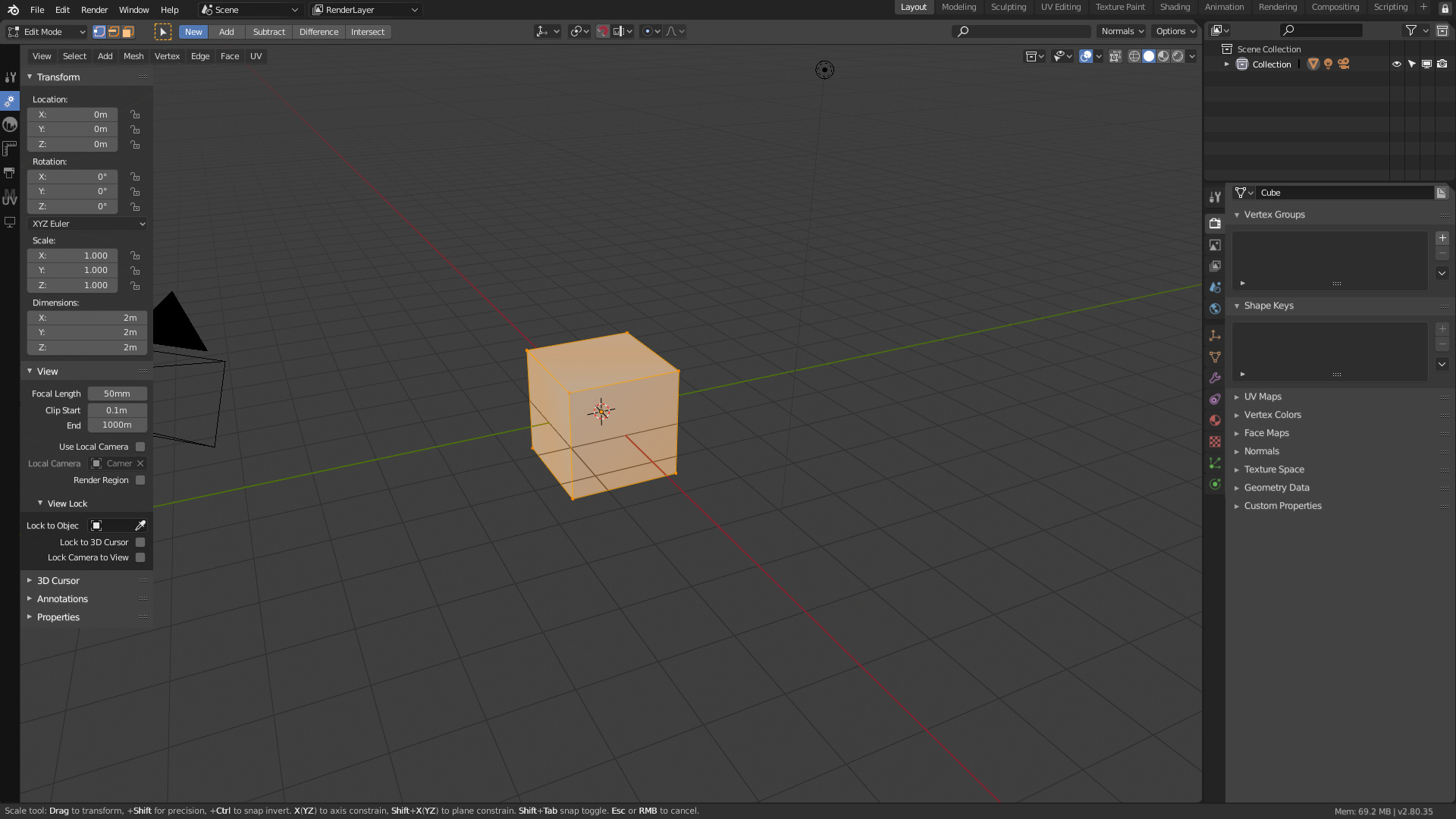
Allow the N-shelf to be placed on the outside of the editor, compared to the active tools bar
This already happens in the UV Editor, so I don’t see any difficulty in changing it. It would allow to place the N-shelf to the left of the active Tools bar and have a better structured interface.
Allow to place in the N-Shelf the tool properties bar
I don’t think there’s anything more users have asked for than to be able to access the tool’s options again from inside the editor without having to depend on the property editor.
Update the behavior of the N-shelf tabs
Let the Nshelf ONLY show the tabs if no tabs are marked. This would allow something that is currently not possible, and that is that the uusaruis know of the existence of the N-shelf without having to have it constantly on screen. It would also be desirable to be able to order these tabs.
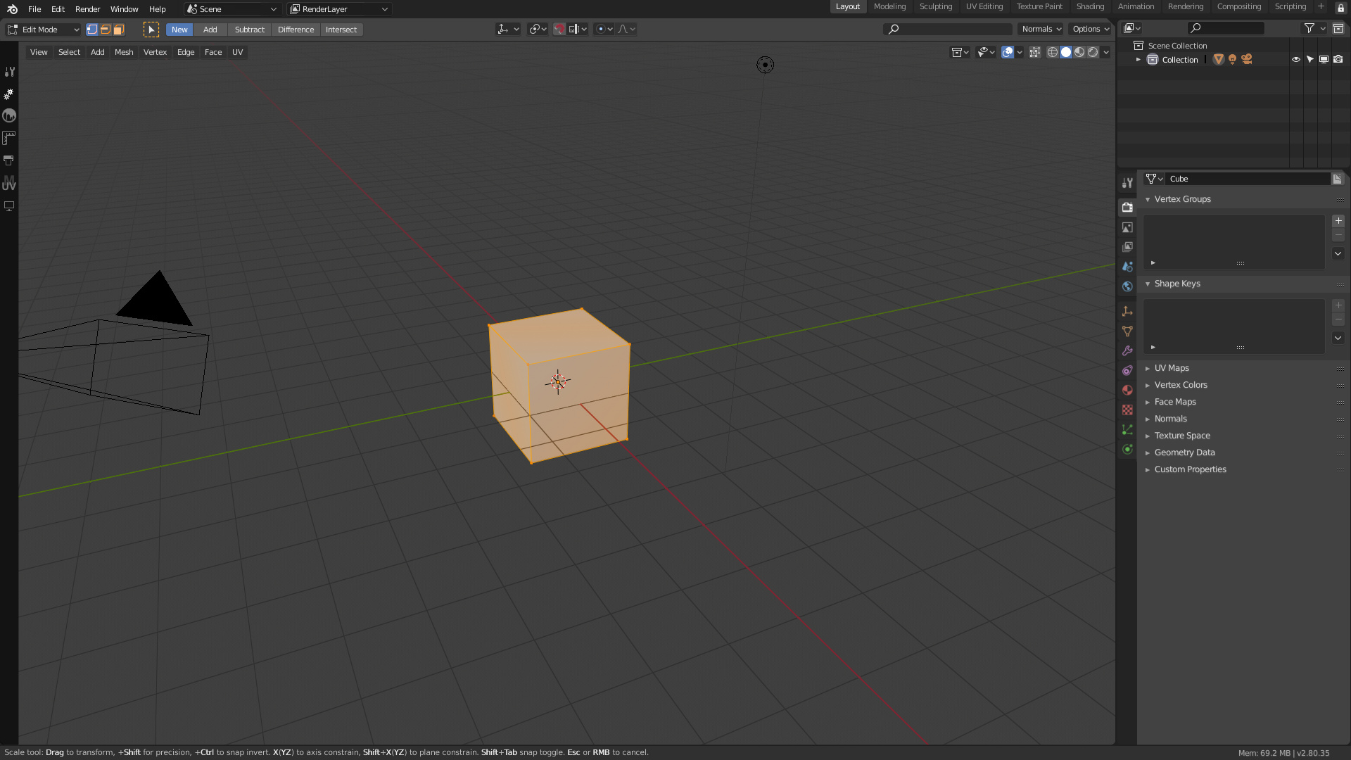
Change the text of the tabs for icons
Taking advantage that Blender2.8 is redoing all the icons of the program would be a great improvement to force Nshelf tabs to use icons instead of text. The N-shelf is already becoming unusable with so many addons and many times it is hard to find a tab. If any addon does not want to use a custom icon to put an icon with the initial of the Addon.
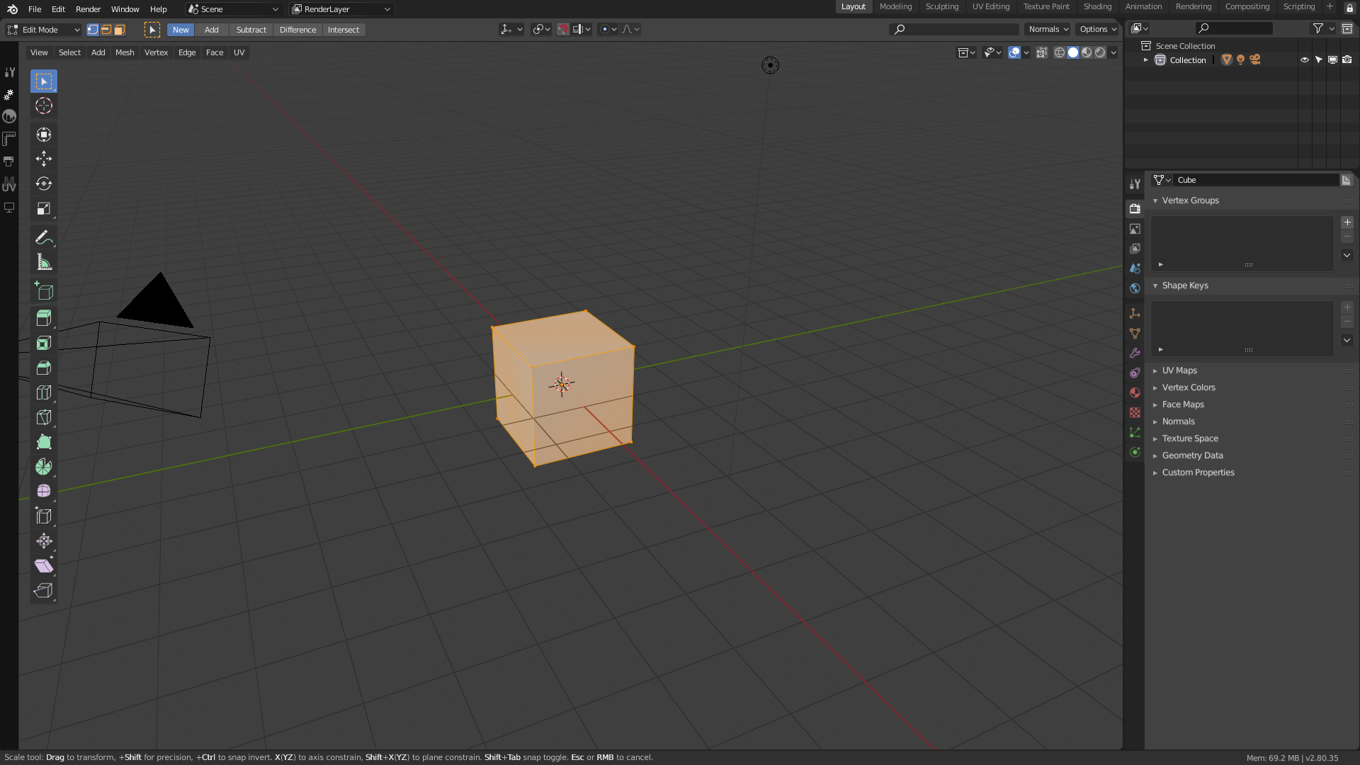
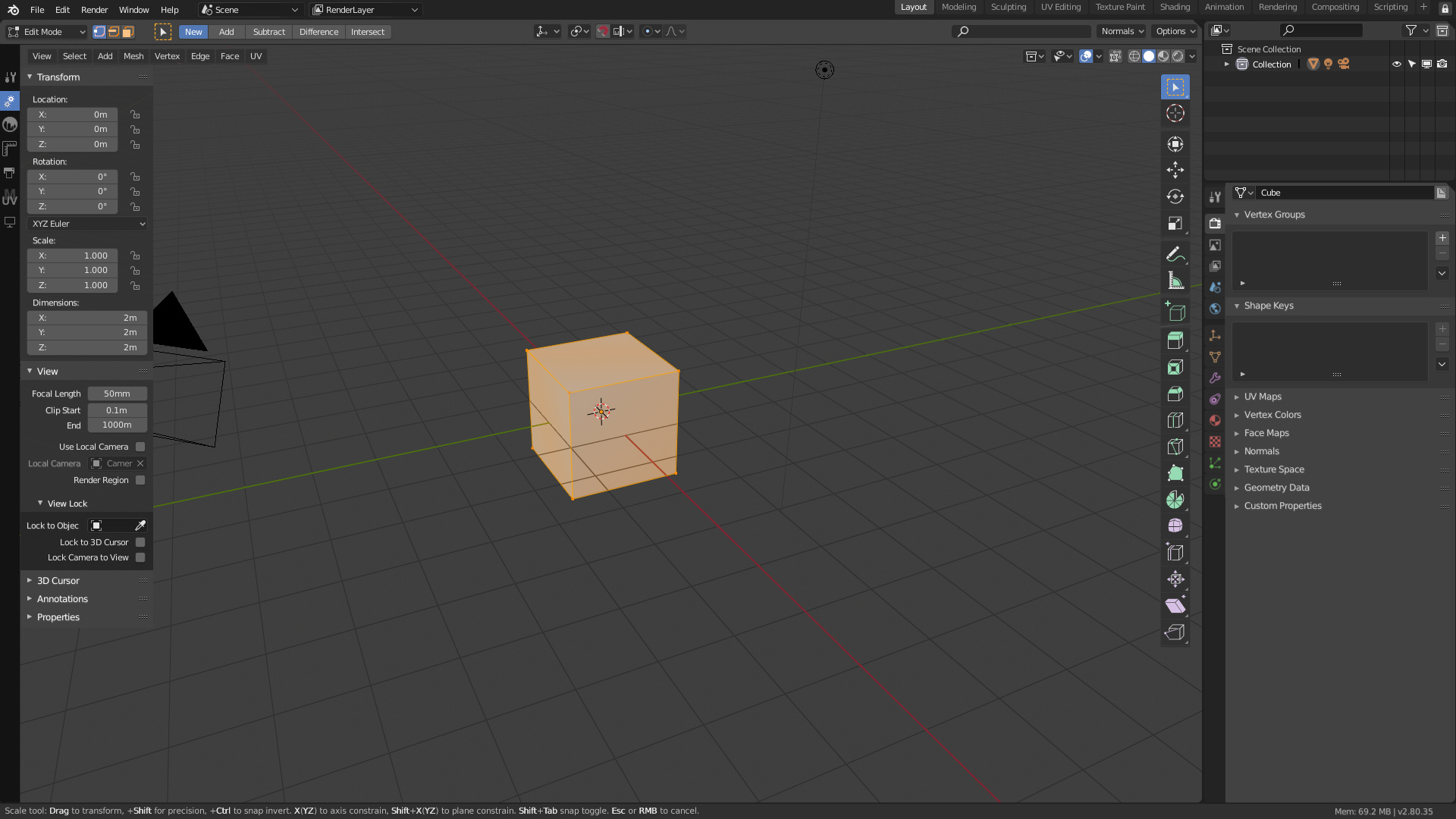
Other mockups
7 Comments
I like the idea of giving an option, but I'd like to see the toolbar stay in place.
* @Josephbburg * Do you prefer to have the N-shelf at right of active Tools bar? breaking all the viewport layout?
* @Alberto * Oops, didn't see this, but yeah. I like the mockup that keeps the toolbar in place.
OMG, Please don't!
I like it except that the tabs on the left take up more horizontal space. I might like the idea more if you selected the mode based on a dropdown.
I agree with many of the options your screenshots offer, such as the colors on the icons that are really a plus for the visual reference.
The topbar that does not protrude above the outliner.
Keeping the T button for all actions and options (actions such as adding to a group, making local, bake the action, adding rigidy body, or adding primitives as is currently the case in the T panel, while keeping the new space panel for beginners) It is really cool, and allow to don't go in submenu for actions, like action to make a render, action to flip normals...
Why this post have so mutch fews upvotes ?
I would love for something like your last screen shot to be a T shelf actually about tools.
If you look at the layout of the properties, with the vertical tabs, it's the perfect visual language to have the same thing on the left.
The icons could open different options in the "T shelf" depending on the current activated tool, sort of like tabs. It could also be easily toggled and replace the top bar for the better.