
Use top bar as a place to put custom command buttons ( Similar to Quick favorites)
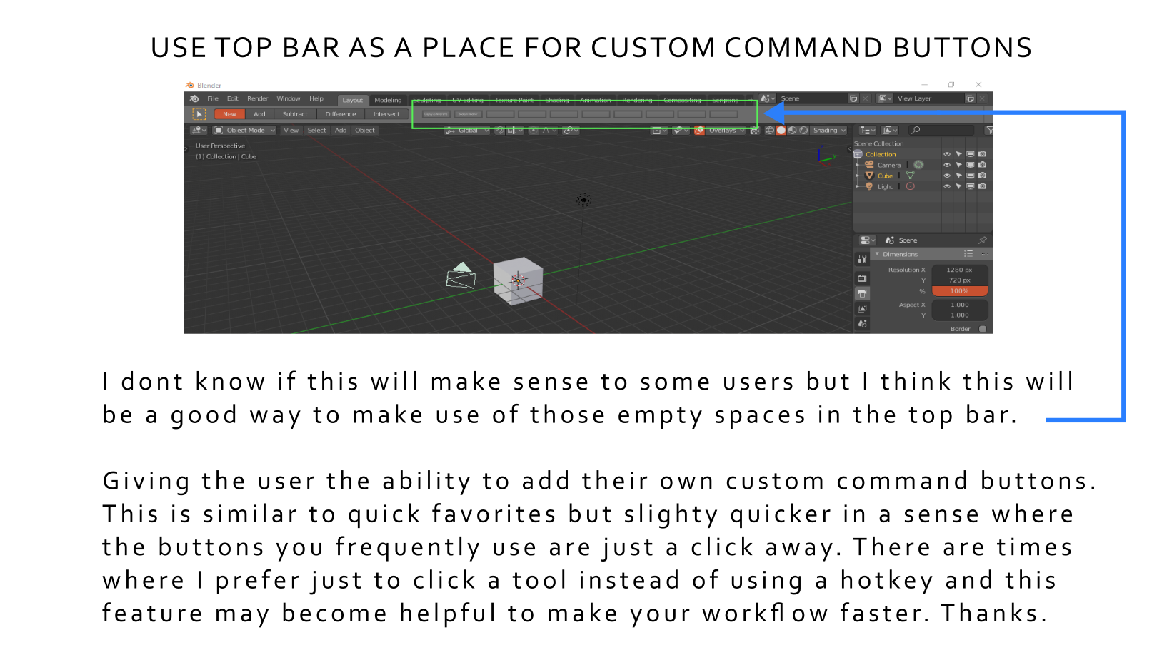
Hello Guys. I am not sure if this will be helpful enough but I have thought of an idea to make the top bar which currently seems to have some space available to be a place to put some custom command buttons similar to quick favorites.
26 Comments
eh.. this gives me strong zbrush vibes which I don't love. is there any context to the buttons, or is it just a hodgepodge of whatever shortcuts you use? It kinda moves away from the streamlined aspect of 2.8 and is reminiscent of pre 2.7x clutter to me.
* @testure * From what I know the additional top bar is still available, it is just not in the default startup.
I think you can enable it in the view settings. This is just an optional preference and not a fixec feature.
* @testure * I disagree. Streamline is in the eye of the beholder, I understand the goal of streamlineing but it's a impossible target. IMO fill every blank space with a button. Get the tools out of the drawers and into the light.
* @othoap * sure, take all the tools out and put them in the light. lets continue this analogy- as a woodworker, you've cluttered up your workspace and now have to drag your project out into the driveway. Not every tool is needed all the time, just opening up the toolbox and dumping it on the table isn't helping anybody. Organize your toolbox better so that when you need a tool you know where to find it rather than just relying everything to be out always.
* @testure * This comes to the specific type of project you are doing. That is why it is best to be just an optional feature where you can leave it hidden or you can show the top bar without those buttons. If you decide to show the top bar and assign a custom button then that is when the optional feature comes in.
The proposed feature is not significantly many and this wont cause too much clutter. If your familiar with photoshop,illustration, and after effects then these buttons will just be fine.
In some project instances, I would like to illustrate it to somerthing like an artist using a set of colored pencils. Imagine if the artist chose to have a very neat and tightly organized setup for their tools. They decide to return each pencil to a covered container every time they are not using it. Can you imagine how long it would take them to finish a single artwork? This is just an exaggertion but I think you get the point of what I am trying to illustrate.
* @johnpdelacruz26 * Why not try to implement a simple UI/hotkey editor that can be customized with easier means than python scripting. A good basic interface is suuuper important but at some point the individual workflow takes hold and different tasks need different solutions. So at that point everybody will want to individualize tool colections and access.
So give the users a radial/popup menu editor that can hold these things. Do what you think works best for yourself - let other do what is best for them.
* @motionblur.of.doom * Agreed I would choose the option of easily, codeless customizable pies and popups rather than a shelf hanging there obstructing the view like in cluttered Maya UI, it gives me PTSD to be honest =). Also, most likely, there will be additional problems with customizable shelf maintenance if there will be API changes from build to build and you'll have to wipe your shelf clean and revert to factory settings again and again (you already have to do that with quick favorites, not having the access to delete items from it) and if you're a new and unexperienced user you'll find this quite problematic. I'd say devs should probably concentrate on perfecting existing strong features of blender UI and make them more customizable rather cluttering the area around the viewport with new and new features that might end up problematic to maintain. Also, IMHO shelf-based workflow teaches user very bad habits compared to hotkey workflow and pie/hotkey-binded pop-ups workflow as you divert attention again and again from the center of the screen, avoid working in full-screen mode as much as possible (relying on the shelves), thus, you're not concentrated on the composition anymore, when hotkeys and popups in the center of the screen are binded to a key it's not breaking your flow and diverting attention from composition as you rely on muscle memory of your fingers, it's like touch typing really, that's why blender workflow is so blazing fast when you get into it. Even when I was working in Maya I always advised everyone not to rely on custom shelf tools and jump into viewport. Please don't spoil Blender UI with shelves, it might seem cool at first but then it will turn into a nightmare to maintain and will teach users bad habits.
* @Chingiz Jumagulov * I think all UI ideas should be automatically an considered an Option. Meaning if you want it use it, if not then don't, end of story. Maybe we need to start all of our request with MIO (Make It Optional) IMO
* @motionblur.of.doom * You are right. I hope some pie menu editor add-ons will be updated to 2.8 those things are helpful.
* @Chingiz Jumagulov * There are times where clicking some buttons are preferred in a situation but this is less compared to the benefits of being familiar with the hotkeys.
I guess the pie menu editor and the quick favorites menus have some potentials in the further development of blender.
* @othoap * That is funny. That is what I am always thinking whenever I propose a feature but in a degree I have never come to think of it specifically to request it in a general manner.
You can start submitting a proposal regarding it. I will give it a vote just to create a conversation in the development community.
Excellent analogy. You're 100% correct.
@johnpdelacruz26 Look into Pie Menu Editor, it will change your blender life.
* @othoap * I am already using it. I believe the pie menu is just limited to number of command features.
If it happens that the pie menu will allow more command features, buttons that are a click a way in my opinion is still faster than working your way into the pie menu which can be too crowded if it has too much options.
* @johnpdelacruz26 * I've 7 buttons in my "Header" made with PME
* @othoap * I have found a pie menu editor addon that has a lot of options but I am not sure if this will work in blender 2.8. The version may only be compatible with 2.79
It is available in gumroad: gumroad.com/l/wazou_rmb_pie_menu_v2
* @johnpdelacruz26 * Yes Cédric Lepiller is an amazing developer. But I don't think his will deal with Headers. I know PME will. blenderartists.org/t/pie-menu-editor-1-15-20/662456/1301
Not being able to have a custom toolbar is what's stopping me from using Blender and its complicated tool search. It's like doing a wood working project. The tools you use the most often are already out and ready to use. It's an option that is the users choice.
OMG it will turn into Maya with all it's glitches of shelfbars please don't! =((
I haven't tried maya but if these may cause glitches, that changes the conversation.
it doesn't have a lot of sense since topbar don't exist.
* @Alberto * I think it is still there but only optional.
Could this be good? blender.community/c/rightclickselect/CHbbbc/
I kinda like the idea but I think it might be better if Blender Core was to incorporate a custom solution to create forms and pie menues with other menas than by scripting alone (yes, I know there is an addon on Blendermarket for that).
While it might be a god thing for a short term/a few buttons, it might in the long run be much more necessary to create a true custom workflow for whatever it is that you are doing which may need a lot more space than the few slots on top.
So I'd rather have a good visual form editor and a visual keymap editor to show which keys are taken and which are free.
* @motionblur.of.doom * I have been using Inkscape for a while now. While a lot of people are not too comfortable with too much buttons for they feel like its too much clutter,I have found that those buttons like in Inkscape where they are just a click away, in my opinion they tend to help your workflow faster.
There are instances where you just prefer to access a command with just a click away in comparison to clicking its equivalent hotkey. Now this is just my opinion and other users may observed it differently.
* @motionblur.of.doom * One solution I could think of regarding the space is making the top bar custom buttons move, scrolling from left or right using the mouse wheel may be a good feature.
Giving a limit to the number of custom buttons will also be a good idea just to make it more organized.