
Support for Adding a Custom Drawing to the UI Layout
In blender's UI layout, custom item types can only be added by modifying the source code, or by a very complex python code to make it work in every layout, or a simpler code but limited to window regions. \What I propose to make custom UI element types possible is adding two new templates to bpy.types.UILayout for custom buttons and fields, and some extras for items to put in them. These would be as follows:
bpy.types.UILayout.template_custom_field(callback, args)
callback: Draw calback for drawing the field. Same as the callback argument in bpy.types.Space.draw_handler_add
args: Arguments to be passed to the callback. Same as the args argument in bpy.types.Space.draw_handler_add
For custom buttons, the template would be this:
bpy.types.UILayout.template_custom_button(callback, args, use_resize_y, use_resize_x, resize_y_icon, resize_x_icon, height)
callback: Draw calback for drawing the inside of the button. Same as the callback argument in bpy.types.Space.draw_handler_add
args: Arguments to be passed to the callback. Same as the args argument in bpy.types.Space.draw_handler_add
use_resize_y: Boolean, optional, default False. Allow button to be resized along the Y axis by a control point.
use_resize_x: Boolean, optional, default False. Allow button to be resized along the X axis by a control point.
resize_y_icon: String, optional, default "GRIP". Icon of the control point for resizing along the Y axis. Only used when use_resize_y is enabled.
resize_x_icon: String, optional, default "GRIP". Icon of the control point for resizing along the X axis. Only used when use_resize_x is enabled.
height: Float, optional. Height of the button. Default is the default height of all buttons in blender.
Both these templates would return a sublayout that other custom items or built in items can be placed in.
Some other functions that would make it easier to create custom fields and buttons from scratch are these.
cursor(position)
position: 2D Vector. Position of the cursor in the layout or custom field or button
image(id, use_file_image, file)
id: Image data block to display.
use_file_image: Boolean, optional, default False. Use an image from a file rather than an internal blender image.
file: String. File path to image. Only used when use_file_image is enabled.
There would of course be some other functions, such as for creating basic shapes, or gradients, or 3d object, but they can't all be listed here. Below is an example of how this could be used to make a custom interface for a property group.
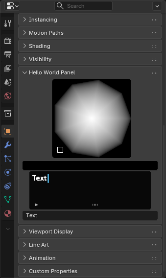
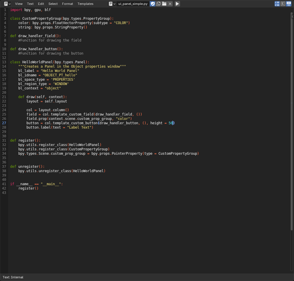 The draw callback functions have no code in them, because it is not needed for an example, but below is an image of what it could look like in the UI.
0 Comments