
Visual (color) indicator on UI, which edit mode is active
When rapidly switching between Edit mode, Object mode, or the other editing modes, very hard to see, which mode is Blender in, especially when the mode selector drop down is not visible on the screen. This can be annoying, sometimes user doesn't even realize what's happening because he is in an other editing mode that he thinks.
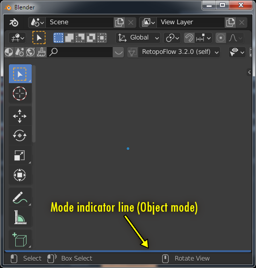
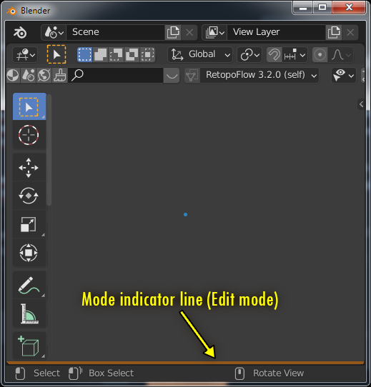
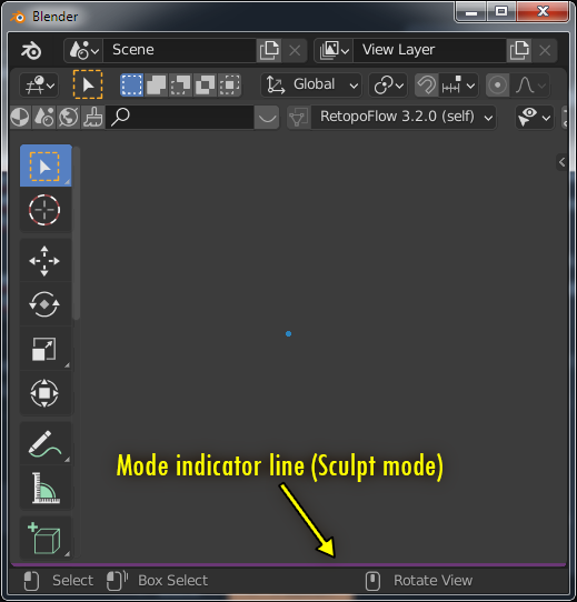
My suggestion is an unobtrusive, but always visible coloured line somewhere in the 3D scene view.
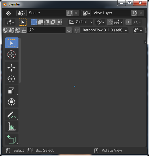
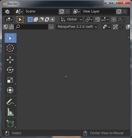
Look at the next two screenshots, and try to tell, which mode is active. Not trivial, isn't it?
 .
.
My suggestion:
16 Comments
I like the idea of color coding in general. It can be brought even further a bit - color names can be associated with the mode name, e.g. by the first letter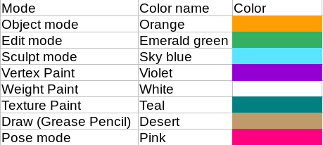
Interesting idea, but it is an unnecessary double abstraction. If users familiarized with the color-mode associations (this takes about 1 hour or less), they not have to look up, which colors first letter is matching with the actual mode. They just know it, feel it.
It might be unnecessary, but also might be very useful. For example, X, Y and Z axes are red, green and blue in that order, because: name more iconic triples then XYZ and RGB =)
I really like this color idea. I've tricked out my interface into the colors that I like. As I'm flipping around with key commands, it's really easy to press the tab twice so instead of being in edit mode, I've slipped into Object mode. If the color changed from my usual orange menu bars to green, I immediately know I've switched without having to focus on the menu drop down. Another click and I'm back to edit mode. I also switch between vertex, edge and face mode a lot. Visually, edit>edge with nothing selected and object mode look mostly the same.
Then any mode need own color (eg. Pose, Object), I think it can spent the needs around faster reconization mode and turn off some bad behavior with functions that not working in current mode when need switch. I observing this type in my work that I forgot that is not this mode what needed : )
Could your problem be solved with "Theme" settings?
No. Currently there are no separate color settings for the individual editing modes.
How about to change this proposal into; Theme. New Color Options for Edit, Object ...? What do you think about?
The problem with this is that no such UI object that can be coloured, a new one need to creatve, even if it is just a thin line somewhere or border around viewport. I considered vieport background colour, but in Blender background color can be part of the scene itself, so using it as indicator is not acceptable.
It is not very hard to see. The tools set change, the viewport's content change. You just have to learn it.
Adding a color line doesn't help: you still have to learn which color is what.
This is not about memory, it's about usability, ergonomics and comfort. Even a guinea pig can memorize 5-6 editing modes, with color coding or without. The question is how fast can the user recognize, where is he/she.
Please look at the first two screenshot. Do you think, is it evident, which one is the Edit mode, and which one is Object mode? Ok, ok, I know... If you look very closely, you can see the scrollbar next to the toolbar, which is an implicit sign that this is probably the Edit mode, where there are more tool buttons by default. But is it really intuitive? Not, extremely not. And addons can add arbitrary number of buttons to the toolbar, so its size is not fixed at all.
We humans (and the most animals too) identify the most things using our color vision and the good UI designers deal with this ability.
Coloured borders, backgrounds are common in UI design. For example 3DS max use red border to indicate keyframing mode, Unity editor use a shaded background when play mode to warn user, screen recorders often use red border to indite recording/streaming in progress, and almost every midi editor use colors to show editing mode.
You manipulating - you have installed some add on which change UI... Bad addon design which change UI badly and usage of this badly designed addon is problem of addon developer and user who decided to use this addon.
Blender by default has 100% distinguishable UI difference between modes if you managed somehow to forgot in which mode you are right now.
No, I am not manipulating, Retopoflow is really installed in my Blender, but true, in this case it helped me to demonstrate a serious problem. I have a lots of addons, without them Blender would be a one legged Tarzan, and addons tend to add custom buttons on the screen, it's normal.
I don't think, addon developers should be blamed because they use UI space what Blender API offers them. The host system is responsible for managing UI elements, and force addons to follow rules, not let them to ruin user experience.
Well, you request is about adding yet another "clue" to tell the user which interaction mode is ON.
Issues I have with this idea:
I can't talk for other people, but I feel I am not alone thinking this idea is not worth developer time. Blender being in a environment where getting something worked on and pushed to the main branch takes a lot of time and effort, and a lot of other more needed features are delayed because of the lack of dev-power, we need to be strategic about what should be worked on for now.
I know, there are many-many more important goals to make Blender better, I just dropped in one of my ideas. Probably this will be just an item at the end of the long queue of never realized suggestions. I am using Blender for about 1 year, and in my experience I found it quite annoying, but maybe I am alone with this frustration. I hope this feature can be achieved (at least partly) by a python script, then I can implement for myself.
And yes, actually every interaction mode would deserve a dedicated color, or other visual indicator. These small things make a software fun to use. Among others, Apple's succes is rooting in this. Micro-interactions, consistency in UI behaviour, ergonomy. I hate Apple for its business politics, but I wonder their power in design. My earlier suggestions are related to user-interactions too, and I believe, these are not need too much code-line or algorithmic head-ache.
About the screen resolution: My example shots are not life-like, but if you use splitted screen (I often use 4-5 viewport workspaces), viewports can be too small for some UI elements. And when switched to full screen (CTRL+ALT+SPACE) mode, cursor is the only clue about editing mode.
EDIT: I read the Blender devtalk forum, and accidentally found this:
devtalk.blender.org/t/script-to-change-background-color-upon-mode/18303
This mini script does almost what I wanted.
Thanks for the script, I was looking for a similar feature and came across this thread.
In terms of prior art, Unity has this functionality built in to be able to distinguish between when a game is running or not. That's because editing things in a running game may not be saved and may be reset when the game is stopped. The entire editor UI colour can be changed to indicate which "mode" you're in.
Yes, it's technically easy to tell whether a game is running or not, by virtue of being able to play it, and that some of the UI changes. However, this is an invaluable feature that a lot of Unity courses recommend to setup straight away, as it gives an extra dimension of information that can help prevent errors and confusion when using the UI.
I have a similar colour change set up in Vim for modal text editing.
In terms of accessibility, I have a neurological disorder and seeing/remembering what mode I'm in can be tricky, and it seems to be easier for my brain to adapt to a colour change (almost like a traffic light) than to notice which tools and gizmos are active at any given moment or when switching between workspaces.
I'm going to try out the script now; just wanted to add my opinion as I think it's a good feature even if many may not feel like they want it by just reading the proposal. Nonetheless, I suspect that many who've never used this kind of feature in a different piece of software may find that it really does help to distinguish editor modes.