
2.8 Proposal Work Faster and more space to work
Hi guys,
This is a little proposal about how blender can gain faster and workspace.
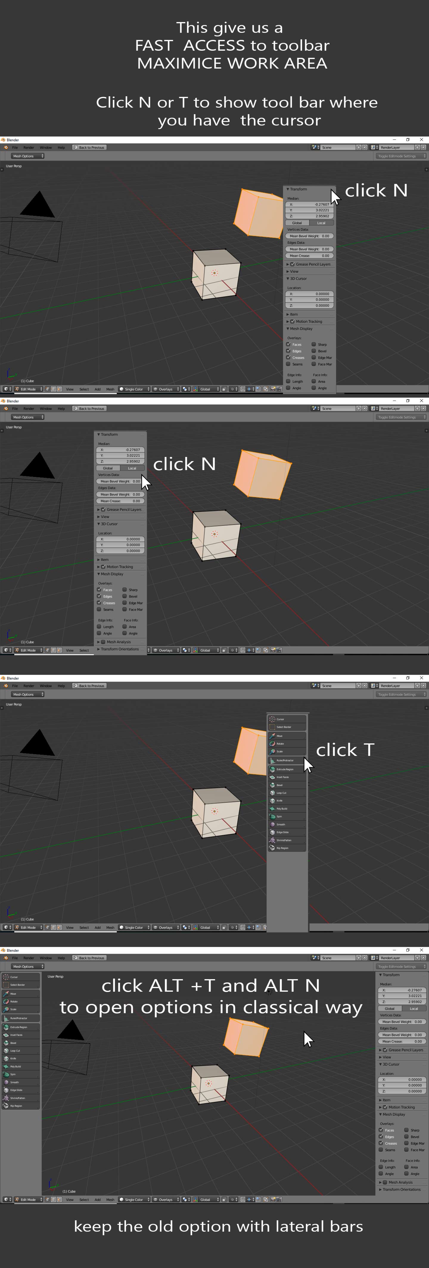
To have the options in cursor position and hide when you finish to use.
And we can keep the option to have the panels in classic way.
If we can pening the toolbars in the position of the cursor (faster acces to tool) , and only show them when are used (Maximize workspace)
8 Comments
I would rather have the possibility to set up the most used functions in a Pie Menu. Having the Panel Appear would take too much effort and time to get to where you need to click. (This is especially problematic on large monitors; I work on a 43" 4K.) I find that the Panels have become to overwhelmed with features, buttons, etc. If you count addon's; sometimes these panels can become almost unusable.
@mcolinp: Yep, I believe Blender should really encourage pie menus as a part of the mainstream workflow in the 3d viewport. Well designed and fleshed out pie menu designs are sufficiently more efficient then clicking to panels, if not needed. Especially with the vast amount of tools which can not be dedicate to hotkeys, pie menus offer a solution to this problem.
@fudushae:
I totally agree. I think what needs to happen is a way to toggle a current tool options dialog using something like the Spacebar. Having every possible tool and plugin loaded into two panels is not elegant, efficient, or effective.
what about custom menus like zbrush
@dorianborremans: Yes, zbrush have an strange interface but some ideas are great, like this posibility of work with all spacework free, calling all menus when you need. Or the posibility of create your custom menus only draging buttons to the menu that you want. also the posibility of create hotkey for everything button.
Yes, I absolutely agree with the pie menus are the faster option but i think it's impossible to have all options in a pie menu.
Blender already have float windows, you can render in a float window, Blender also have float menus like add, or F6. I think most of us prefer that the options come to us and keep cleaned the window.
So This is my proposal:
You can keep the old metod with the tools in lateral position , if you prefer to go there each time that you have to change, but it would great to have one more posibility, to can to call the tab to my position on the screen an keep clean the screen and gain speed.
I like this, however there are users who do not like or have a strong aversion to the notion of floating window/panels and popup dialogs. I myself would love to have this option so I can keep most of my mouse movements within the 3d viewport as much as possible. Hopefully 2.8 can developed where there is the best of both worlds where floating movable/dockable ui elements is an optional route to workflow, rather then a core implementation to keep the 'split windows/panels' users happy.
@fudushae: My suggestion; is to make the option window toggle; or have a triangle with another circle/x button next to it. When the triangle is clicked; the options appear. When clicked again they hide. Also perhaps a way for the dialog to be dragged to a desired location and left there while working.
Autodesk Alias (& Maya) both use a paradigm where the marking menu (Similar to Pie menus) have an "Option Box" next to each menu item. Clicking the mouse on this box, brings up the "Options window" for that tool; though if the user does not click this box, no window pops up . . .