
Merge Modifier/Particle/Simulation Tabs
I believe it used to be so, that Particles and Simulations were in the same column as Modifiers. The only reason they were separated was because they were taking too much vertical space, and pretty much "overpowering" the whole column. I believe that separating them out was not the best solution.
These are the problems:
- Now we have these Modifiers that just say "Go to particle tab to look at the settings", which i believe is not that good of a design.
- Each of these tabs (Modifier, particle, and simulation) have their own unique way to control them. Modifiers have
a column. Physics have "Add this simulation" buttons. Particles have a list... But still, they all still appear in the modifier column... It's a bit of a mess. 3) Even when physics and particles are separated into their own tabs, that does no solve the original problem. The modifier stack can still easily become vertically long... Especially now, in 2.8, where every setting will become one column... And by the way, it is inconsistent with how blender deals with lists anywhere else in the interface... 4) Since the properties editor header is so horizontally short (especially now in 2.8) any extra button in it takes up too much space...
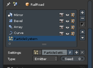
So, the solution to all is pretty simple. I've made this mockup a long time ago in photoshop:
(Left - Current design; Right - Proposed design)
You could view modifiers one at a time, or multiple at once by shift-clicking them. Each modifier could have more than one panel. For example, particles and physics already have multiple... Maybe it would be a good idea to have modifier presets, just like we already do with particles...
P.S. The same design should apply to constraints then too.
13 Comments
I'm not 100% convinced that merging all of them is a good idea.
Merging the forces and particles to 1 UI is interesting as they're linked, although pinning things in multiple properties panels is still a good way to have access to all the controls when simulating, so that still needs to work. Also, if you have multiple groups of forces affecting different systems how would you show that in the UI? Additionally, the order of the particles between modifiers is also important, so there's no solution for that in this setup.
Merging modifers in to this would be too much. Being able to have multiple modifier panels open at the same time is way faster than having to click on each individual one in a list to show its properties change things. Also, you can keep an eye on the parameters of the entire stack more easily in the current setup.
I use mods and particles all day and agree that the general UI for these can be improved. But there's a lot more at play than just a list of what's in your scene. If it's redesigned it needs to be able to show the relations between different forces and systems in the scene. For example one force can be shared between multiple systems, while other might be specific to one system.
@Midge "Mantissa" Sinnaeve:
I remember seeing a similar proposal years ago, I wonder why it never happened
Inspired by the Blender Pro template?
@ondraise15: Never heard of it ;)
@visprotis: They built a tempate where the modifier stack is merged with the particles and constraints in the UI - via a template overlay.
I like the idea (especially if they would include copying/presets for all modifiers) but it has a problem: Even if you could see multiple modifiers it would be harder to reorder modifiers without seeing their contents. One way to get around this might be to allow custom naming and/or displaying the modifiers below it the old way. Maybe select would just auto expand them?
@alansartlog: Naming/Renaming things in such lists was always available in other parts of blender... This wouldn't be an exception. Ctrl+Click and you can name it whatever. Also, even now, when you have multiples of the same modifier, they appear with a unique name (Adds ".001" to the end). Also, I don't see how the current way modifiers are displayed makes it easier to see how they get reordered. In a sense, it's even worse, because you cannot usually see the full name of the modifier. The text box is too tiny. If they are not expanded, each similar modifier looks identical. However, that never bothered me. :)
Sorry, I actually just realized you can rename modifiers. It never occurred to me to click the name :facepalm: In my defense in the theme I use they look very dark and not clickable.
So long as you can select multiple and see them all and still have a way to reorder them from there as well as the list I'm down with the idea.
It would also be good to apply to the constraints tab.
even if its just modifiers it make more scene in a menu like that.
You mad man, I LOVE this idea! This would make the Properties Editor more efficient!
Really, really, really good idea!
This is a great idea!